Windmills, tulips, trains
Railway posters for Holland tourism
 Nederlandse versie
Around 1900 foreign tourists discovered the Netherlands, attracted by colorful descriptions in travelogues and travel guides. These stories and articles painted an image of a country full of windmills, flower fields, farmers with wooden shoes, women in traditional costumes, cheese markets, fishing boats and Amsterdam canals. Artists from the Netherlands and abroad, who came to work in 'unspoilt' villages such as Marken, Volendam and Katwijk, also contributed to the exotic picture.
The cliché images were eagerly applied on posters meant to attract British, French, German and later also Americans tourists to Holland. In reality, early 20th century Holland was already quite different, as demonstrated by the presence of the railways themselves. But the visual language of clogs, windmills and tulips would remain unchanged during the rest of the century. Only the design styles changed, as well as the railway companies that issued the posters.
Chemin de Fer du Nord
The first tourist poster for train travel to the Netherlands was published in 1895 by the French railway company Chemin de Fer du Nord. The reason of its publication was the (non-official) World Exhibition that took place in Amsterdam, but it could also be used apart from this event. Beneath the red letters Hollande white space was left for the optional print Exposition 1895. The poster shows the windmills of the Zaan district, the Amsterdam Prinsengracht canal, a bouquet of tulips and two small portraits of women in traditional costume. The Paris-Amsterdam train journey took 10 hours.
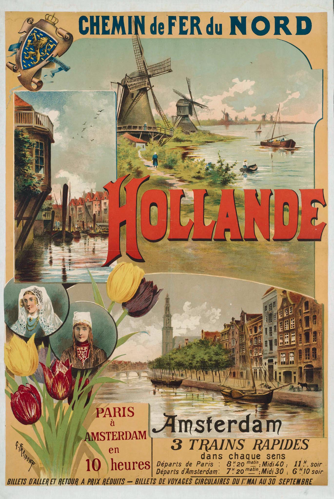
The poster was by Gustave Fraipont, a Belgian-French artist who designed many tourist posters and also illustrated books. Apart from the Nord company he worked for the French railway companies État and Chemins de fer de l'Ouest.
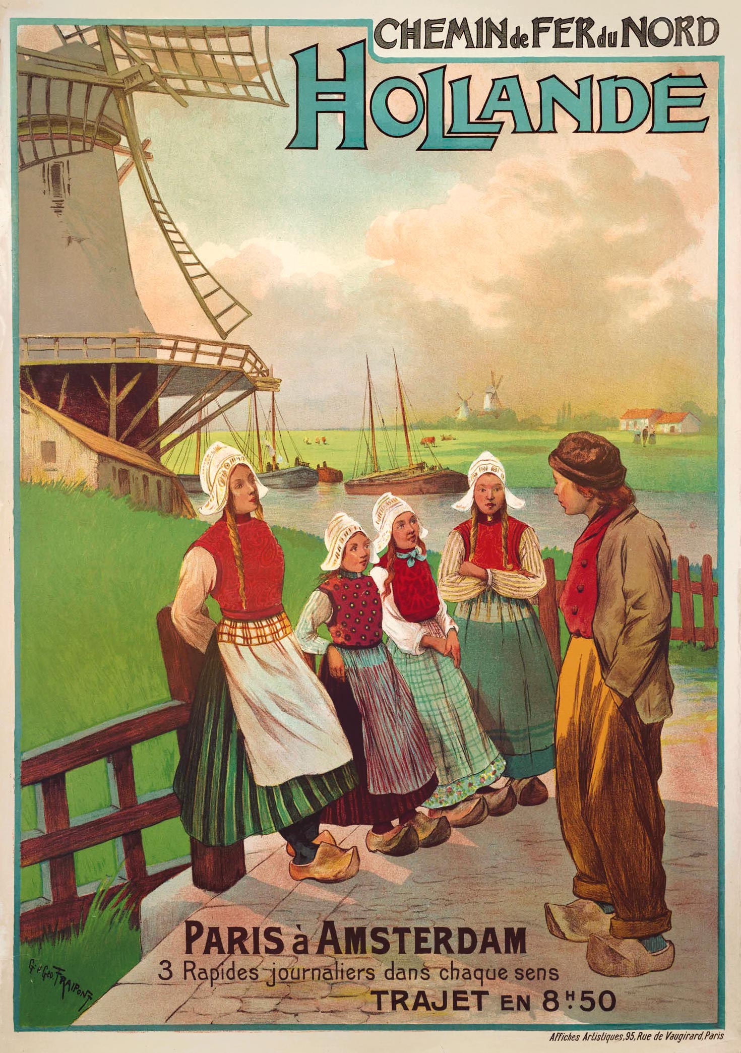
Around 1900 Fraipont created the next Holland poster for Nord, which was much less crowded and had a more modern design. Instead of multiple scenes Fraipont chose one strong image: a group of girls and a boy wearing traditional costume and clogs. Obviously windmills served as the backdrop. The travel time from Paris to Amsterdam was reduced to 8.50 hours.
Chemin de fer Hollandais
Around 1900 the Netherlands had two major railway companies that competed with each other: the HSM and the Staatsspoorwegen (State Railways). The Hollandsche Spoorweg-Maatschappij (HSM) had developed from the 'Old Line' from Amsterdam via Haarlem, The Hague and Delft to Rotterdam. Staatsspoorwegen was a commercial company that operated on the government-built railways to the north and south of the country. At the turn of the century both companies began to focus on foreign tourists.
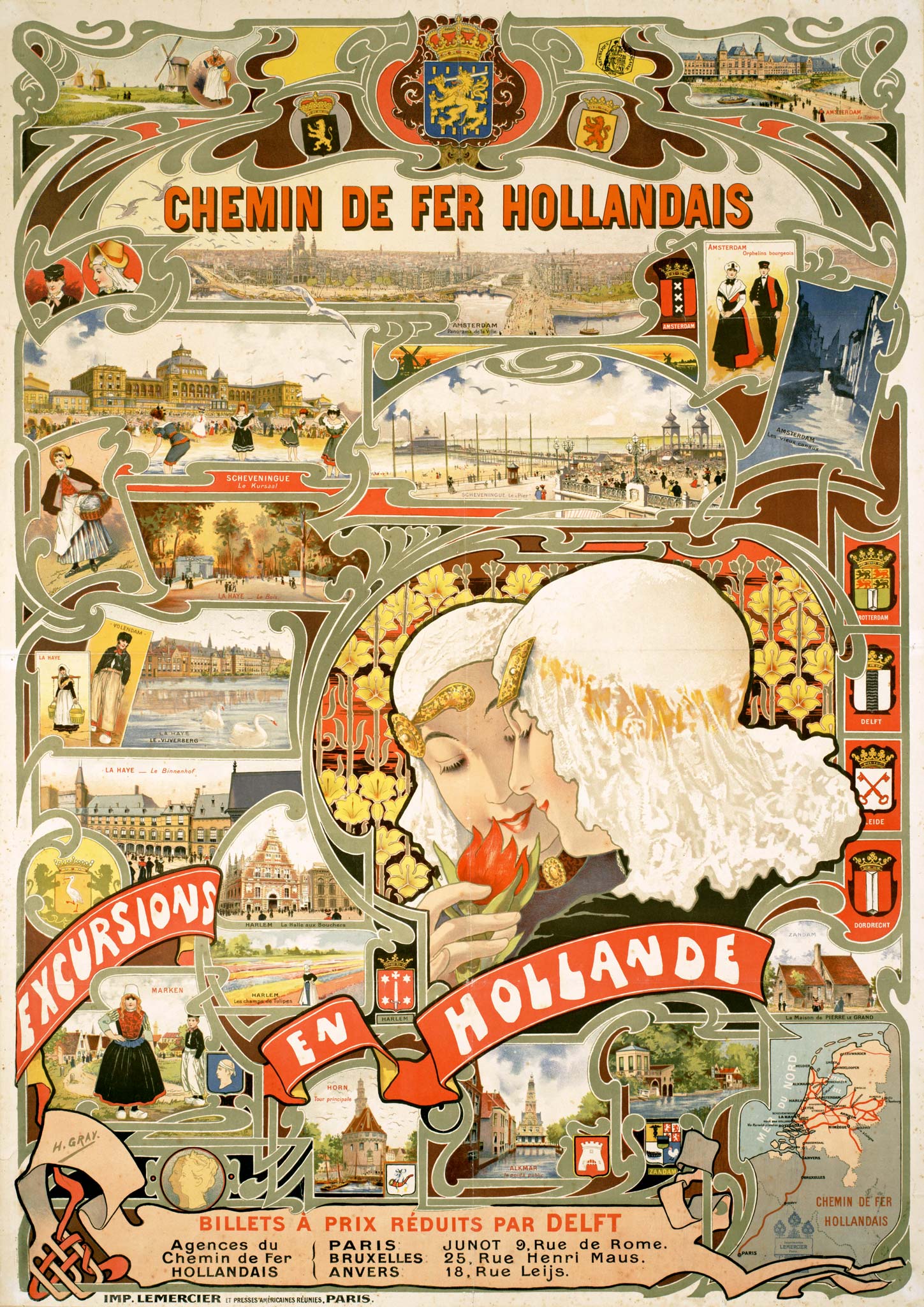
The HSM, called Chemin de fer Hollandais in French, ordered a poster design from Henri Gray (1858-1924) in Paris. Around 1890, at the advent of the illustrated poster in the French capital, Gray was already noted for his bicycle posters. He was an all-round artist who also illustrated books and magazines and designed cabaret costumes. Framed by Art Nouveau-style curves, the HSM poster shows all kinds of Excursions en Hollande including Amsterdam, Haarlem, The Hague, Marken, Hoorn and Alkmaar. The pier of Scheveningen, which opened in 1901, is also depicted, as is the Kurhaus hotel. The poster also features two women in traditional costumes smelling a red tulip.
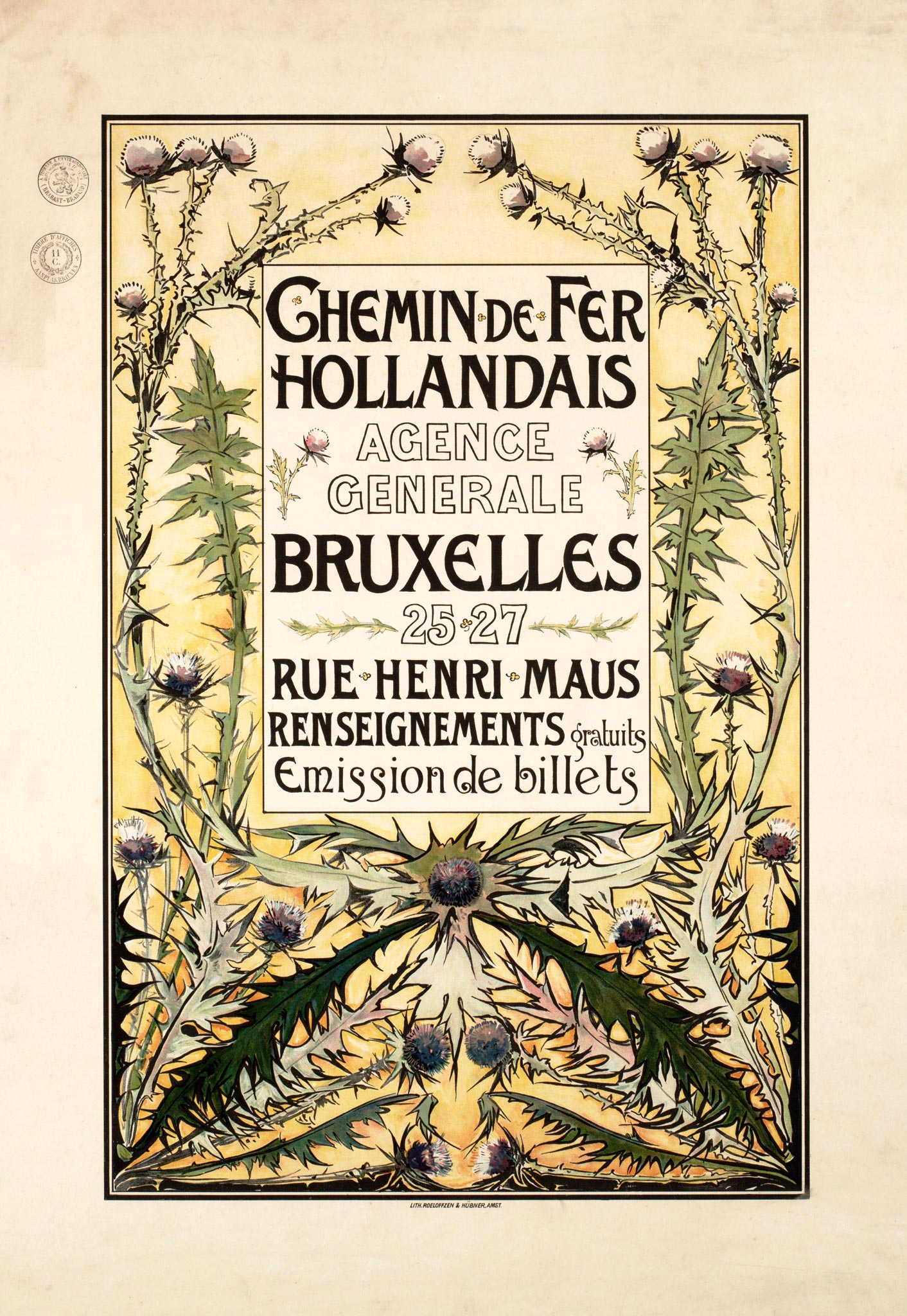
A poster by Willem Wenckebach focused specifically on the Belgian market and the Brussels HSM agency. It was very different from Gray's poster: more decorative than informational. Floral motifs were en vogue during the Art Nouveau period, and the sea holly depicted may also have referred to the Dutch coast — an original representation of the Holland theme. Wenckebach specialized in depicting flora: he also made watercolors for Jac. P. Thijsse's Verkade nature albums, a popular collectable series.
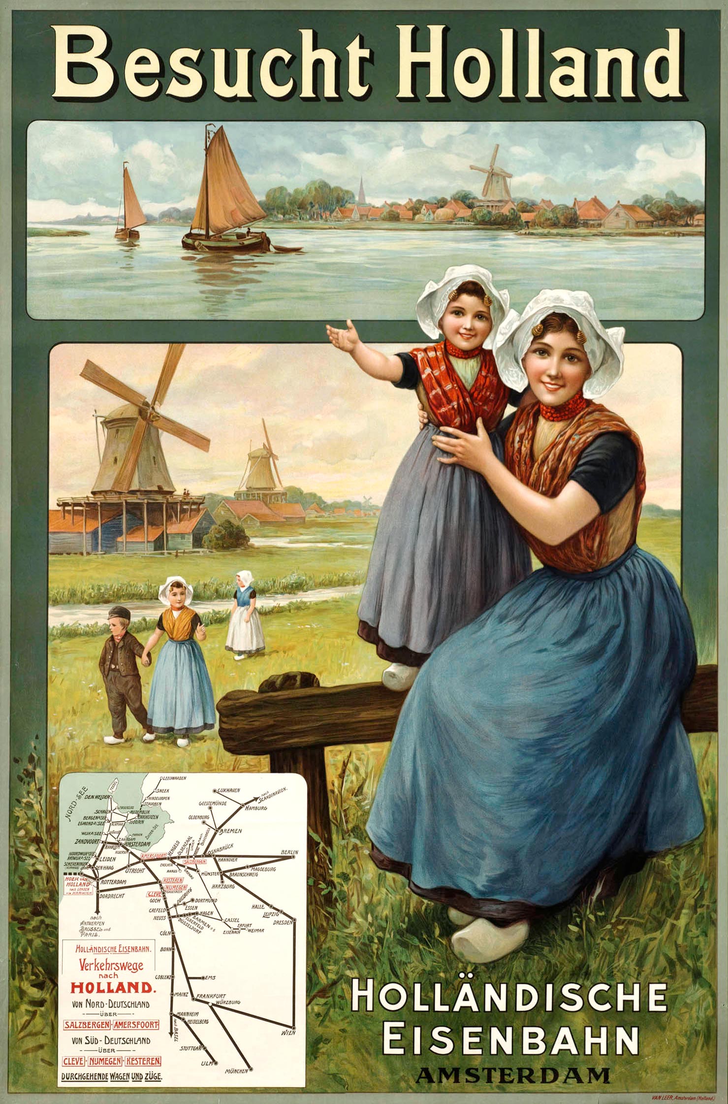
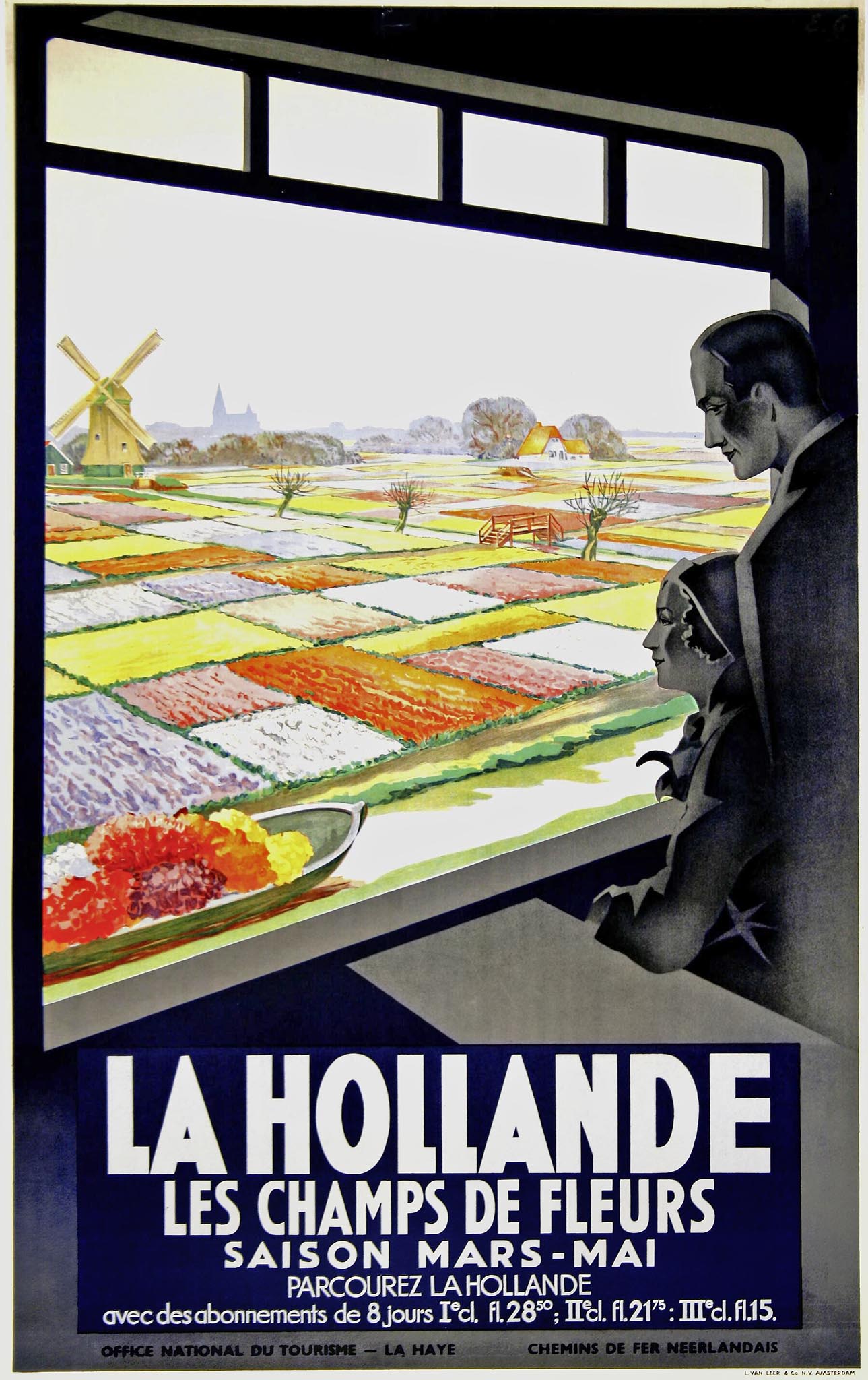
Around 1910 an unknown designer made a fresh green poster, printed in chromolithography by Van Leer in Amsterdam. Against a backdrop of water, meadows and windmills we see a sweet young mother with child as well as some other children in traditional costume. The German version featured the text Besucht Holland and the French version Visitez la Hollande. In an empty box at the bottom left, optional information could be printed afterwards, such as the announcement of three express trains a day between Paris and Amsterdam, or a small map showing the most important rail connections to Germany.
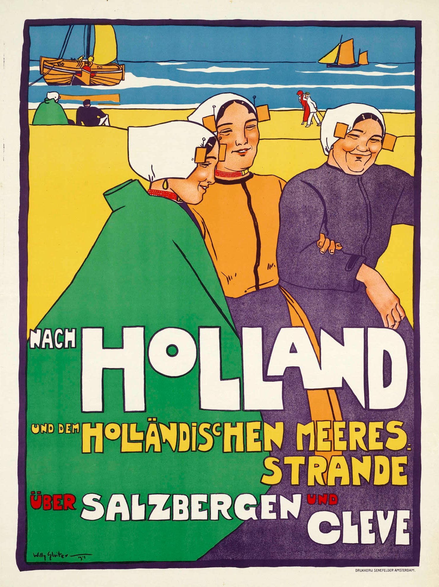
German and Austrian bathers were of great importance for seaside resorts such as Scheveningen and Zandvoort. Of course they arrived by train. In 1914 'gentleman artist' Willy Sluiter created a HSM poster with 'three joyful, frolicsome smiling fisher-girls'. The cartoonish and colorful style of Sluiter's poster was very innovative compared to his sugary predecessors. A special German version contained the text Nach Holland und dem Holländischen Meeresstrande über Salzbergen und Cleve. Due to the outbreak of the First World War the poster was hardly used.
Chemin de fer de L'etat Neerlandais
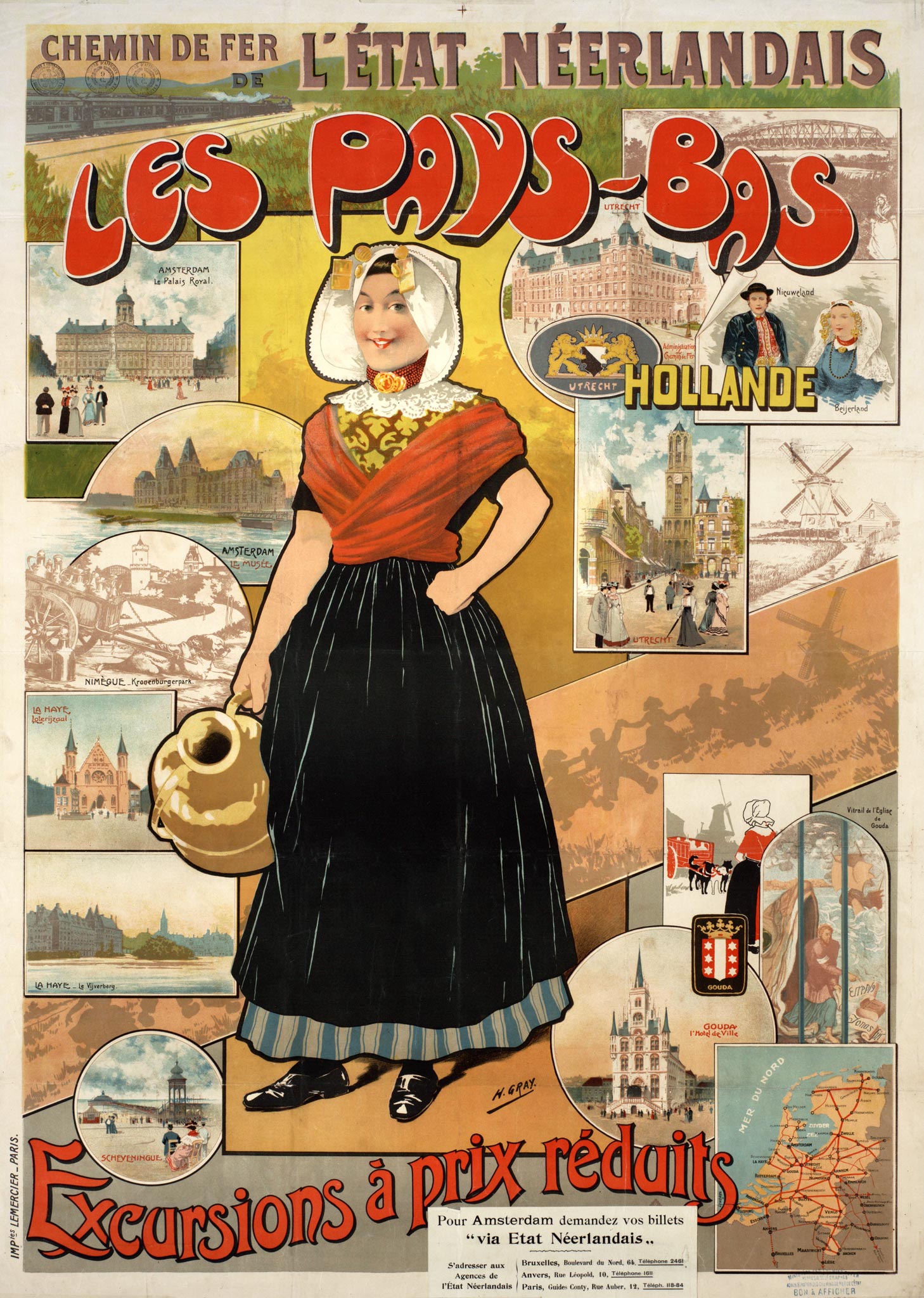
The other Dutch railway company, Staatsspoorwegen, called itself Chemin de fer de L'etat Neerlandais or Netherland State Railways abroad. Like its competitor HSM it commissioned Henri Gray to design a poster around 1901. It was printed by Lemercier in Paris, close to the intended target audience. Surrounding a traditionally dressed Dutchwoman with a jug are pictures of Amsterdam (Royal Palace and Rijksmuseum), The Hague (parliament), Scheveningen (pier), Utrecht (Dom tower and railway headquarters) and Gouda (town hall and stained-glass windows). There is also room for various traditional costumes, a railway map of the Netherlands and — in the upper left corner — a train with Wagons-Lits sleeping cars.
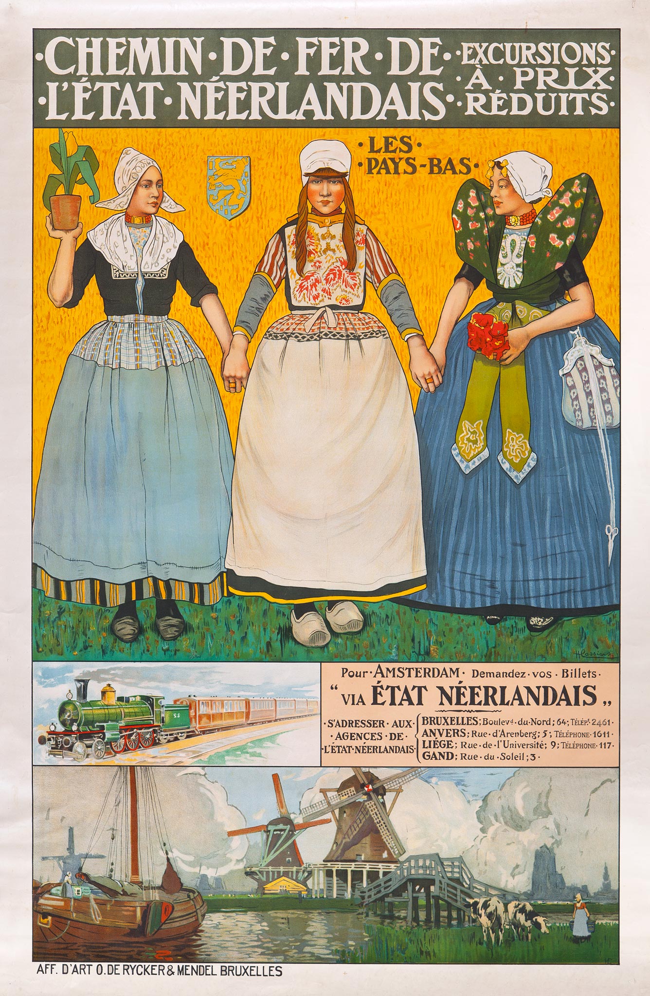
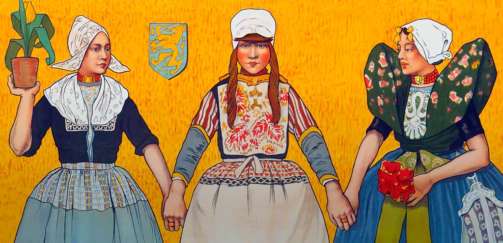
Another poster for the French-speaking countries was designed by Henri Cassiers, a Flemish artist who also created posters for the Red Star Line and other shipping companies. He had been intrigued by Holland for a long time anyway and often depicted Dutch traditional costumes in his other work as well. By placing the three women - in the costumes of Volendam, Marken and Axel - against a golden background, the resulting poster resembles an icon, as if the women are saints. One of them holds a pot with a tulip. Cassiers also depicted a train with an SS (Staatsspoorwegen) locomotive and a rural scene near Dordrecht at the bottom.
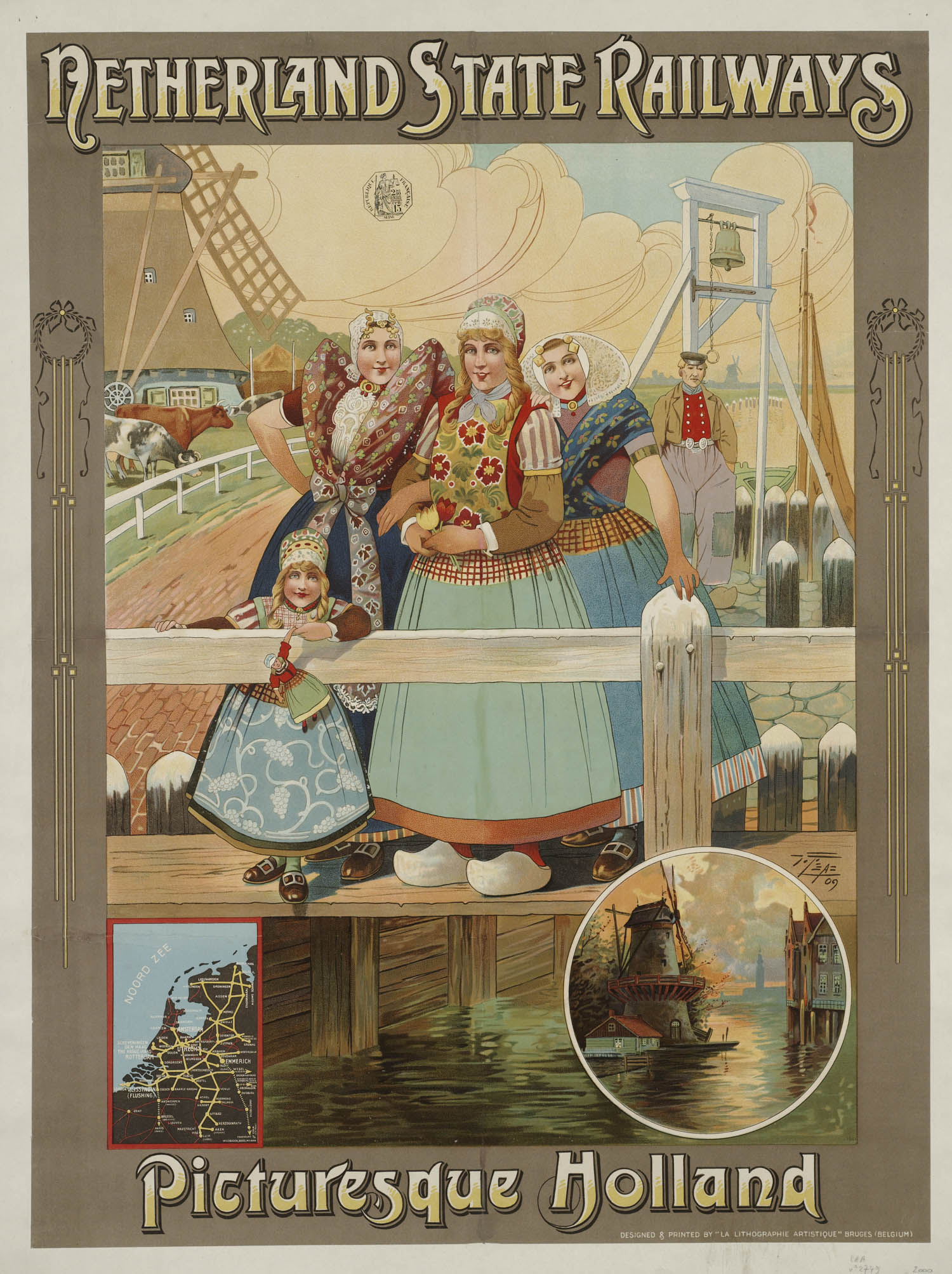
Cassiers' poster fitted in with international artistic interest in authentic Holland, which brought many painters to artist's villages such as Katwijk, Bergen, Volendam, Domburg and Laren. Equally artful was the 1909 Staatsspoorwegen poster designed by another Belgian artist, Victor 't Sas. He created many tourist posters for Belgian seaside resorts, but Picturesque Holland was one of his most refined designs. The poster was printed by La Lithographie Artistique at Bruges.
Netherlands Railways
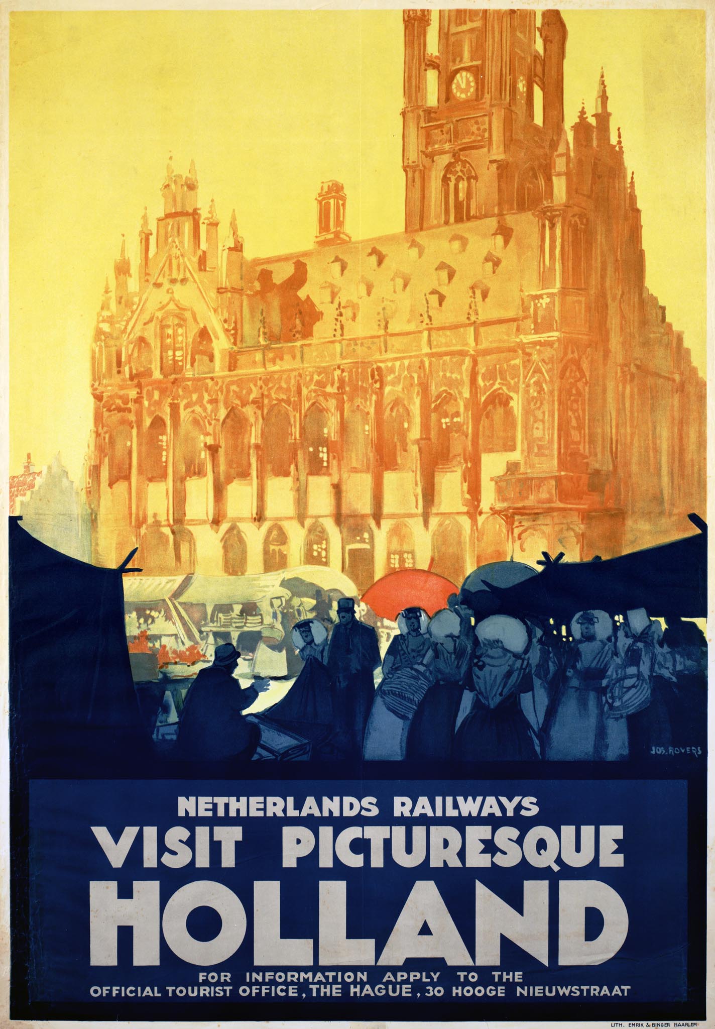
In 1917 the Nederlandsche Spoorwegen (NS; Dutch railways) were formed, a partnership between HSM and Staatsspoorwegen. Because the competition had ended the railways did not advertise much in the 1920s; hardly any railway posters were issued. There was, however, 'propaganda' aimed at foreign tourists, in particular British and Germans. This publicity was arranged by the Dutch general tourist office association ANVV in close collaboration with the railways. The head of the publicity department of the Nederlandsche Spoorwegen, Cornelis Krayenhoff (1865-1948), was also the ANVV chairman for a long time. Netherlands Railways or Niederländische Eisenbahnen was printed on all posters, but information requests were handled by the official ANVV tourist office at The Hague.
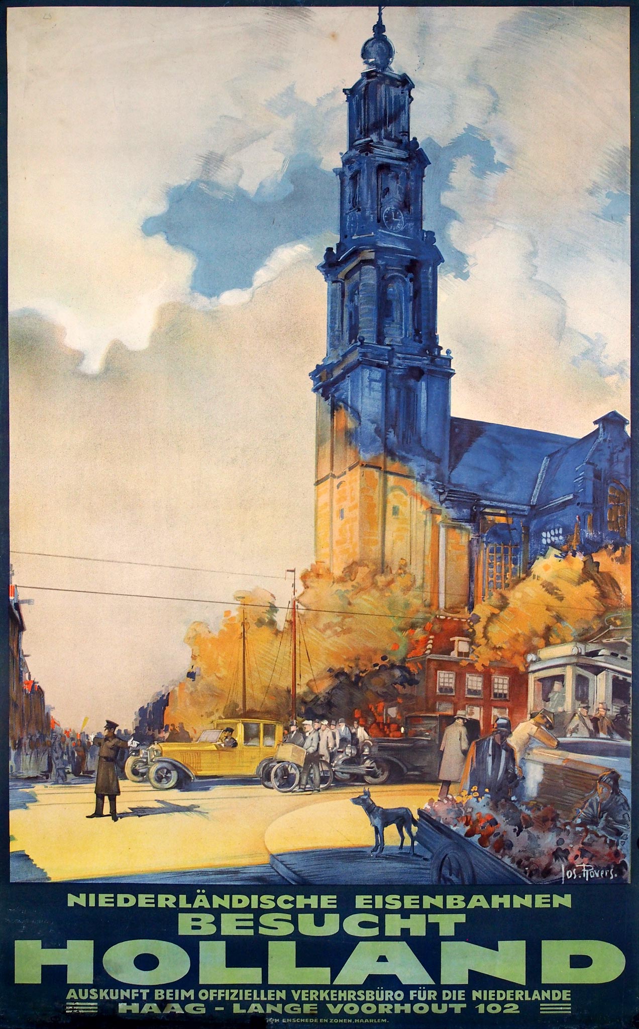
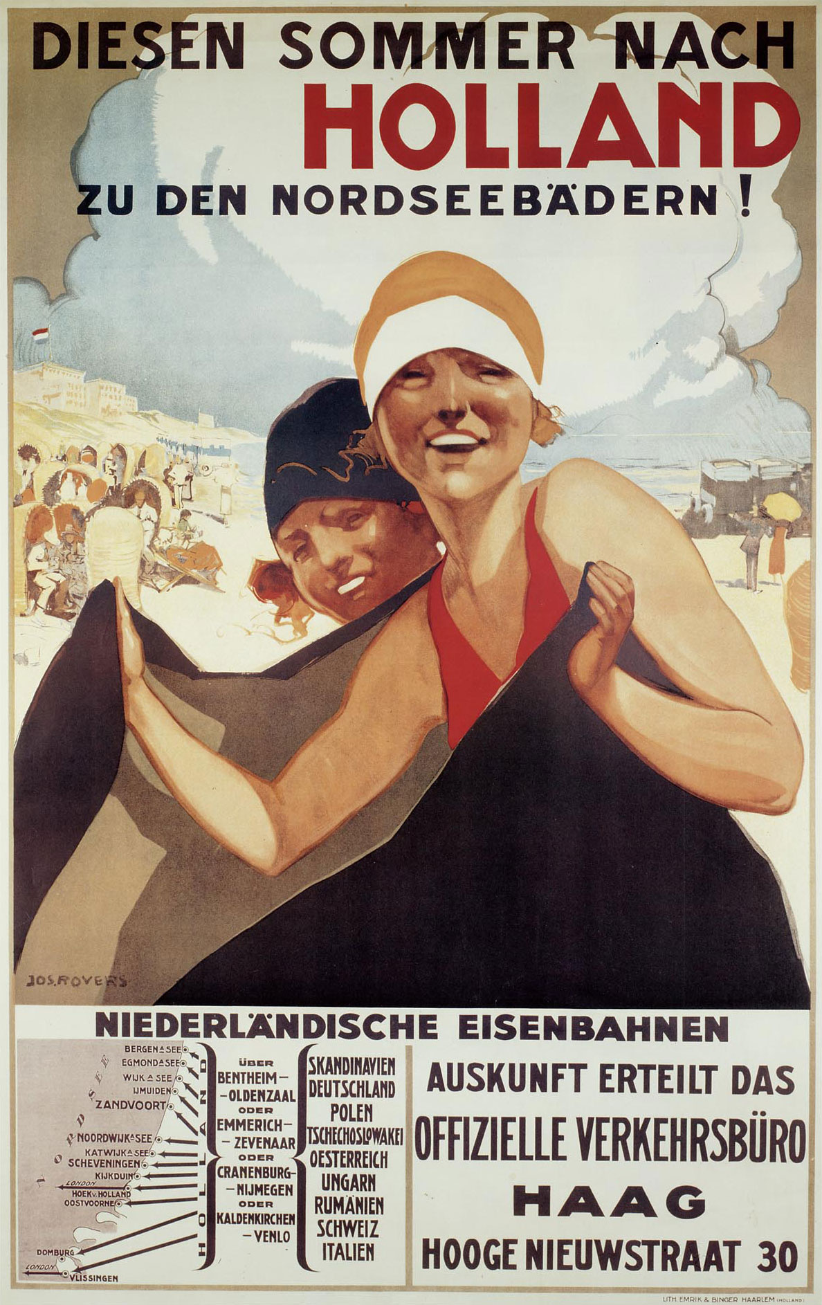
Around 1926 Joseph Rovers was the designer of the Holland posters. He worked in Haarlem as a painter, illustrator and book designer and also created posters for shipping companies and the 1928 Olympic Games at Amsterdam. The Haagsche Courant newspaper wrote about the Holland posters: 'We do believe that these pictures will attract attention'. Advertising magazine De Reclame was less positive: 'Roovers is more a painter than an advertising artist… His posters lack something typically Dutch'. A poster depicting the town hall of Middelburg was praised for its beautiful colors, but 'it is a pity that the tower is not completely visible!'.
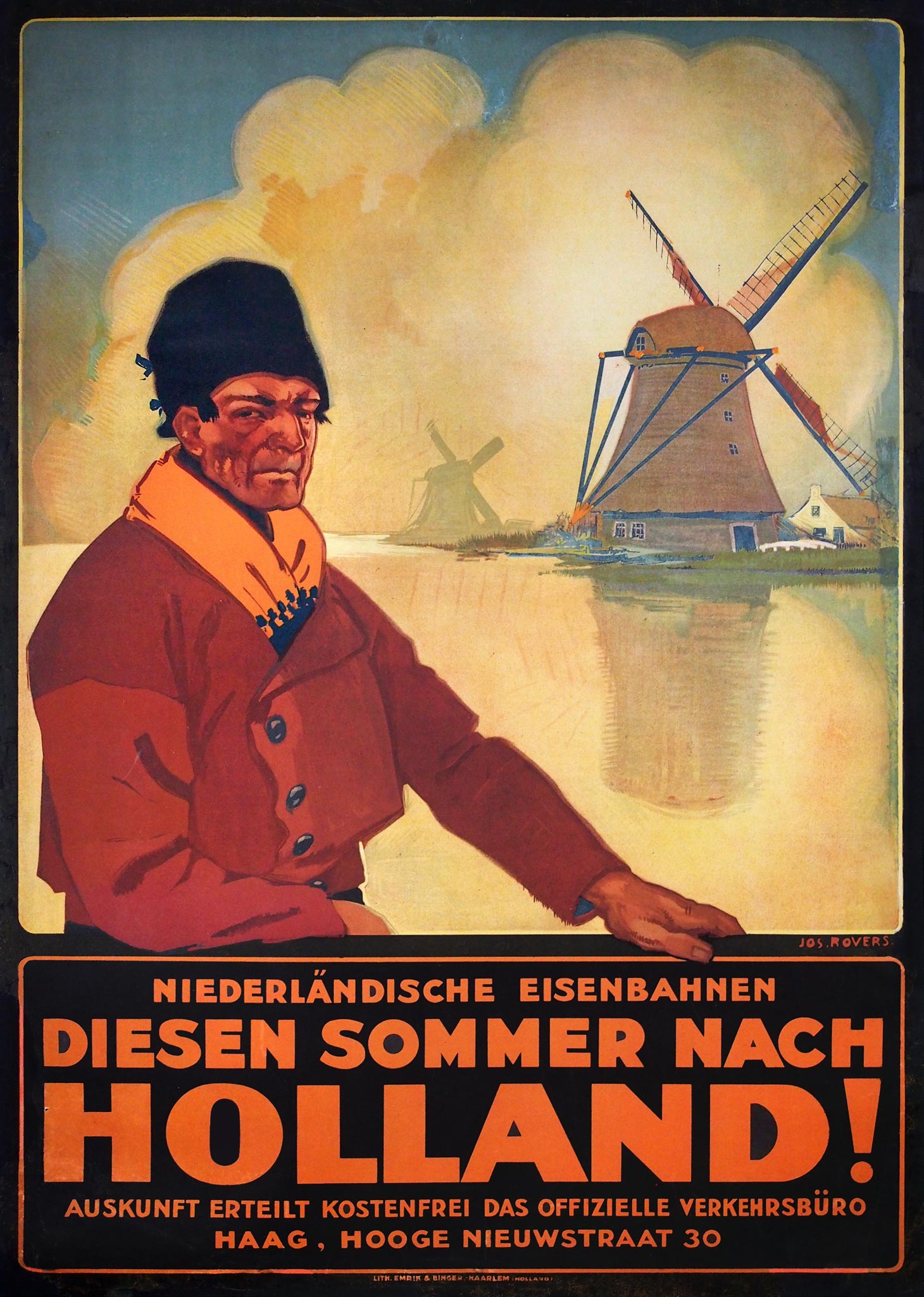
The poster with a Volendam fisherman was considered a 'very unbalanced and conventional print' and the one for the Dutch sea resorts could 'serve for every seaside resort in Europe'. Rovers also created a poster with flower fields and a quite modern city scene near the Amsterdam Westertoren.
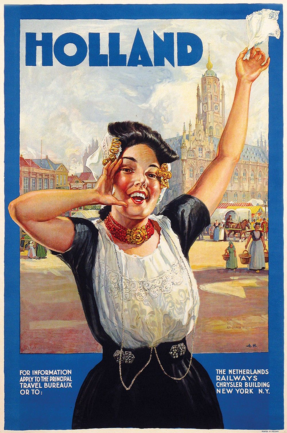
Extra effort was needed to reach American tourists. In 1927 the Dutch railways, in collaboration with the ANVV and the Dutch-American Chamber of Commerce, appointed a representative in New York, G.H. Ravelli. From a small office, from 1930 onwards in the Chrysler Building, he maintained press contacts and distributed brochures and posters. Ravelli had a propaganda budget of only $12,000 a year, while Germany and Switzerland each had $300,000 dollars available. Nevertheless, about 30,000 Americans visited the Netherlands in 1927.
One of the posters that referred to The Netherlands Railway, Chrysler Building, New York was created by Albert Hemelman. It showed a young woman in traditional costume, calling and waving a white handkerchief as if she was waiting for the Americans, against the backdrop of the market square in Middelburg. Hemelman, who often worked for the ANVV, was a painter of harbor views and ships and created many posters and calendars for shipping companies.
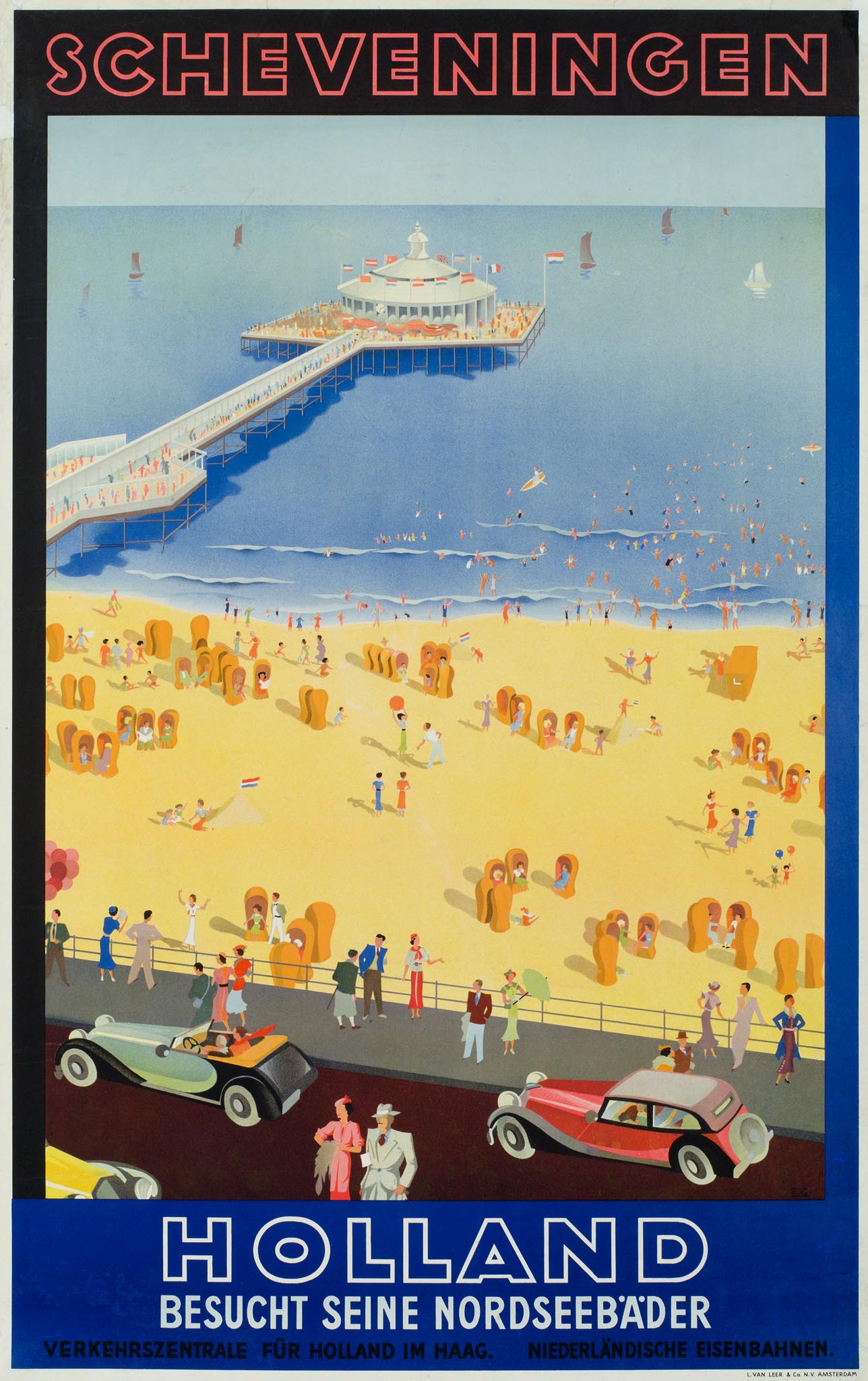
In the 1930s the Dutch railways and the ANVV tourist office association continued to publish posters together. One of their most important designers was Emmanuel Gaillard (1902-?), a Frenchman who had been living in Amsterdam since 1927. At the Van Leer & Co printing company he worked on designs for the Dutch railways as well as Philips, Van Nelle coffee and several shipping companies. Gaillard created an international poster for Scheveningen with its pier, beach and boulevard full of fashionable people and expensive cars. Around 1935 Gaillard also designed a poster with flower fields, seen from a train window. Shortly after the war this poster would be reissued in a more stylized form.
London & North Eastern Railway
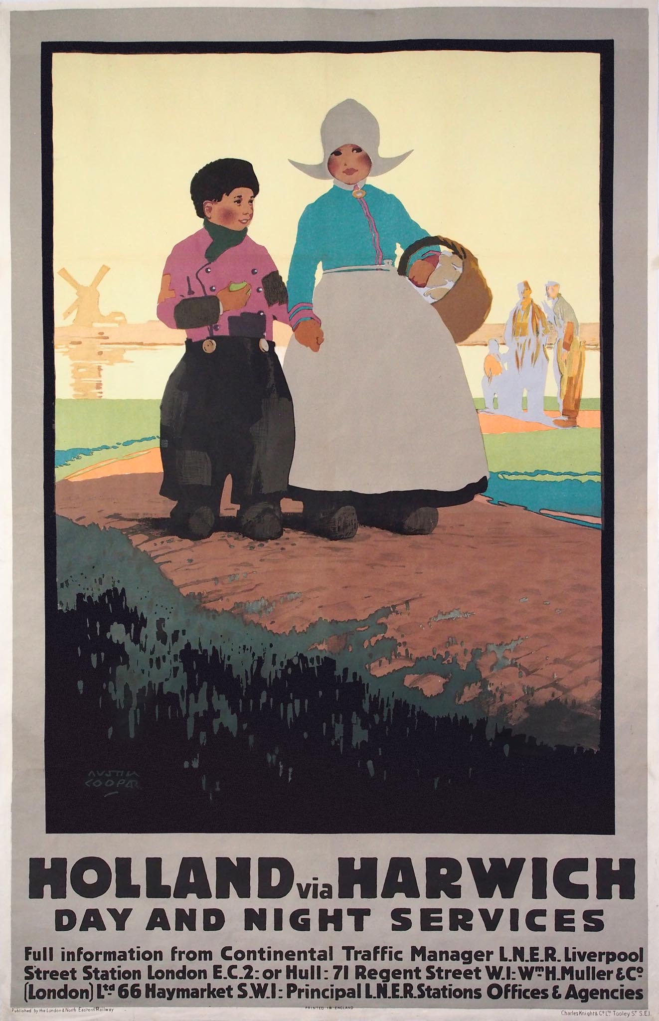
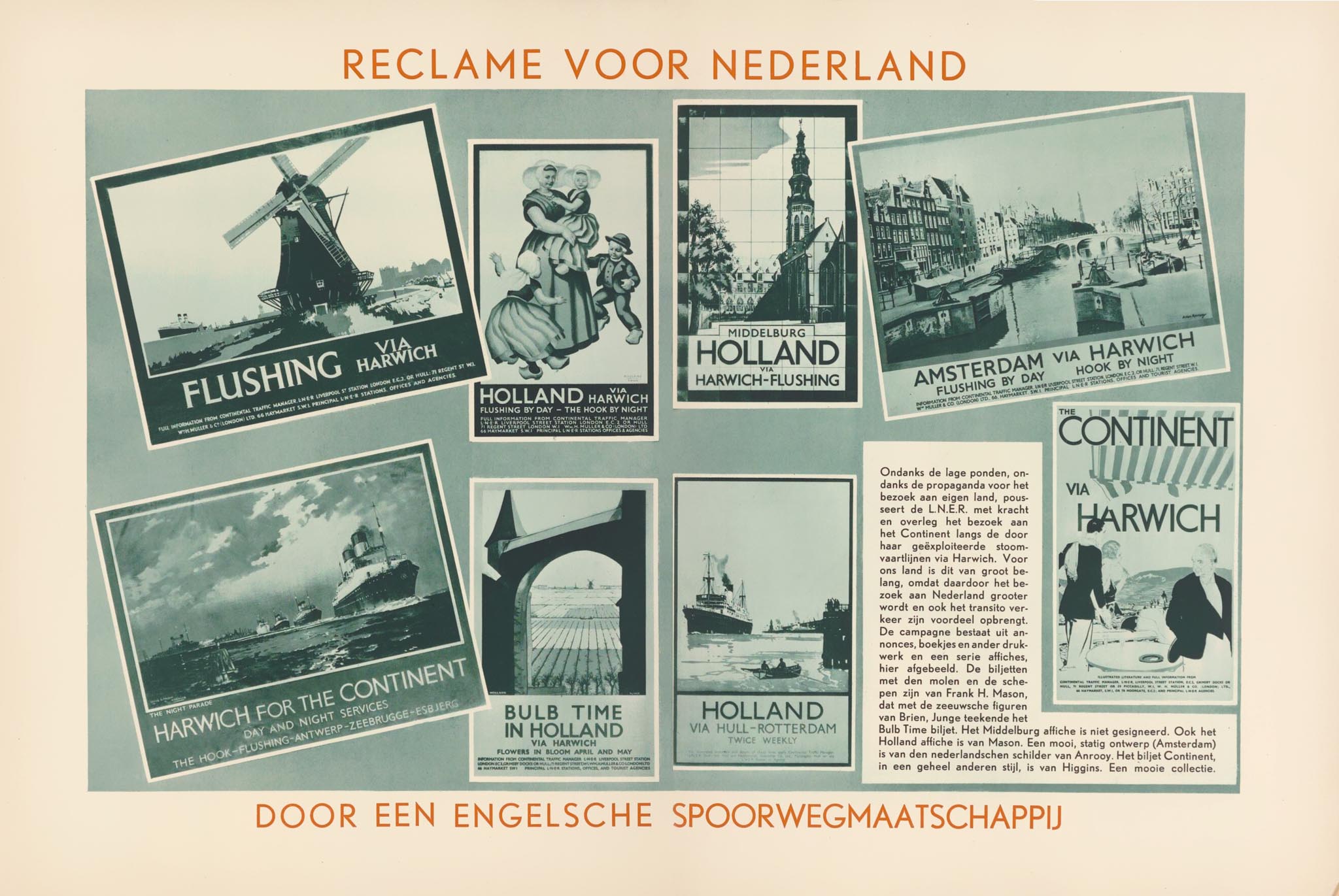
The railway company that issued most posters for travel to Holland during the Interwar periode was not Dutch but British. As the operator of the Harwich-Hook of Holland ferry, the London and North Eastern Railway (LNER) had good reason to promote travel to the Netherlands. The fact that the LNER issued so many Holland posters was simply because it was the most active and progressive railway company in terms of publicity and design. Shortly after the merger that created LNER, William Teasdale was appointed as advertising manager. He was able to establish a consistent corporate image, following the example of the London Underground, while at the same time offering artistic freedom to designers.
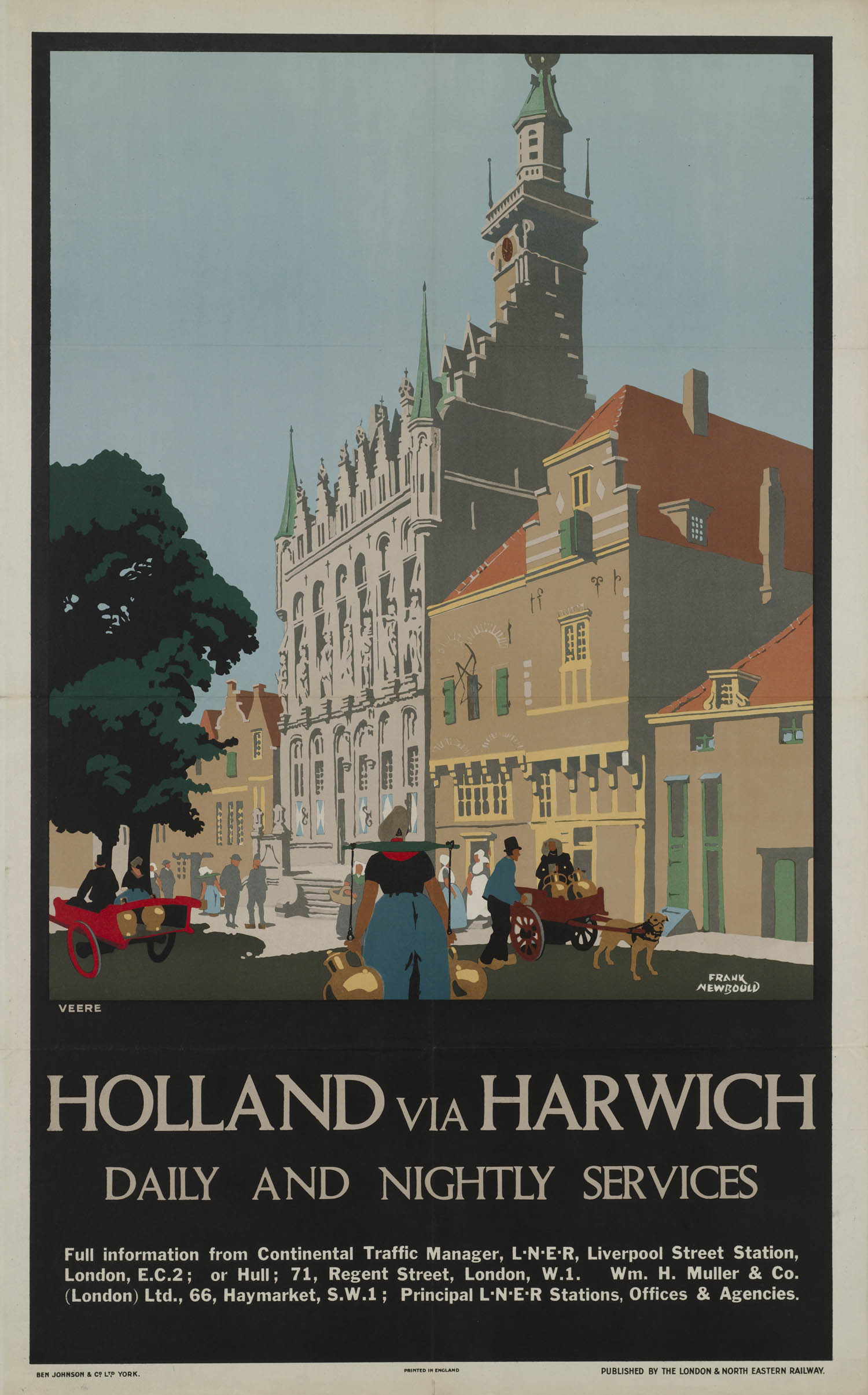
Teasdale carefully selected his designers. In 1926 he offered the five most successful ones a contract: they were not allowed to work for other railway companies, but would receive a guaranteed number of assignments each year. These were the designers who created most Holland posters. Austin Cooper, a Canadian by birth who also worked for the London Underground, portrayed two Volendam (?) children in traditional costume on a dyke. Frank Newbould, who specialized in landscapes and cityscapes in flat color planes, designed a poster of Veere, a town in Zeeland.
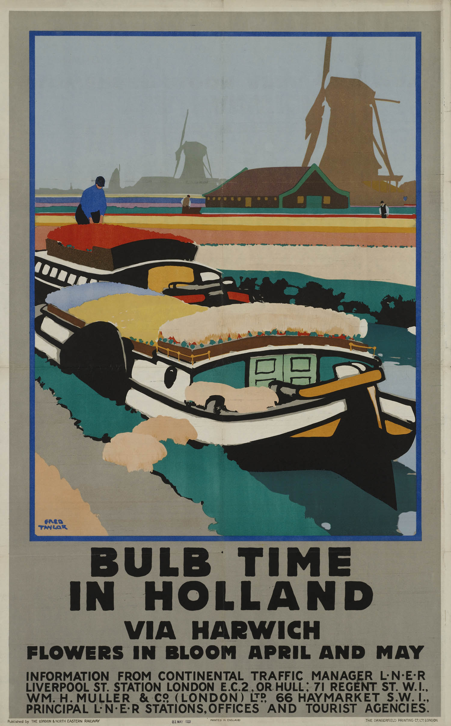
Bulb time in Holland, with colorful barges between flower bulb fields, was created by Fred Taylor, the best-paid LNER designer. Maritime painter Frank Mason created an atmospheric evening scene with a windmill on the waterfront. On this poster the Gill Sans font was used, the standard LNER lettering from 1929 onwards.
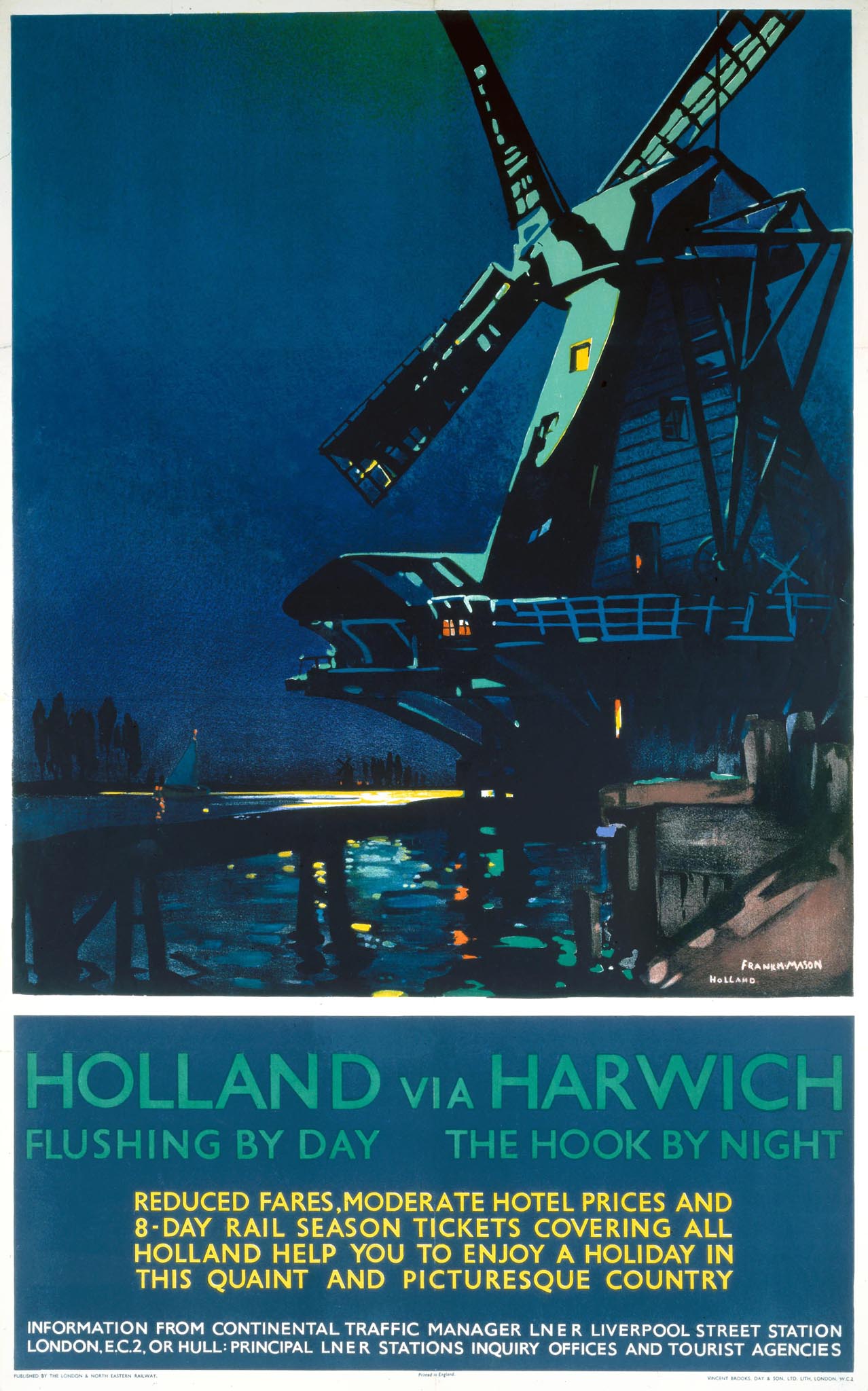
In 1934 Dutch trade magazine De Reclame published an article about the many LNER Holland posters, titled Advertising for the Netherlands by an English railway company. 'This is of great importance for our country because it increases the number of visitors to the Netherlands and also benefits transit traffic.' Commenting on the examples of posters printed with the article, including from Frank Mason and Dutch painter Anton van Anrooy (1870-1949), the magazine wrote: 'A beautiful collection.'
Netherlands Railways
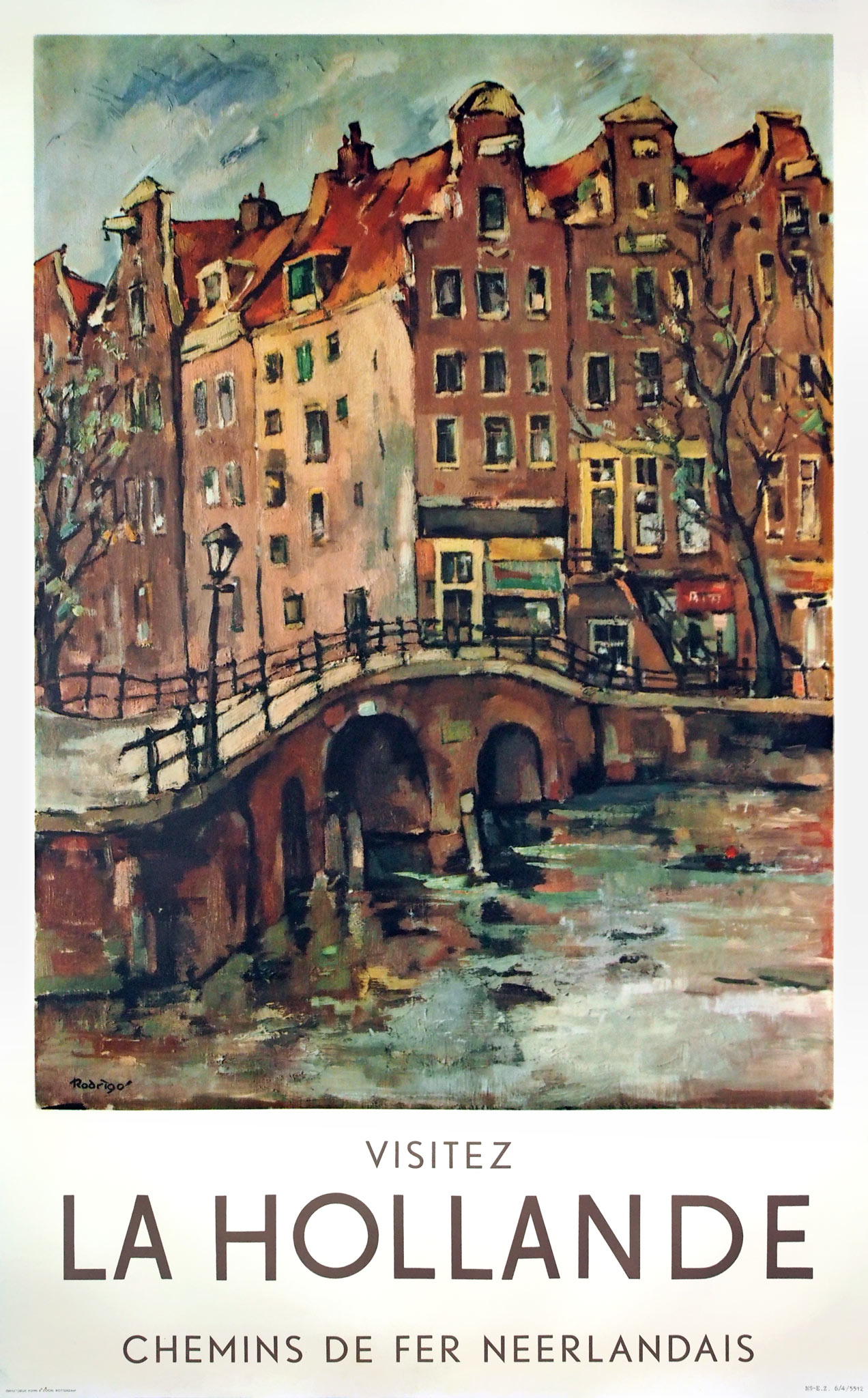
After the Second World War the Dutch railways took foreign promotion in its own hands. Around 1955 a poster series elaborated on a successful formula applied by the French and British railways: artistically painted images of cities or regions in a white frame with promotional text in simple letters. For this purpose Jan Rodrigo (1921-2013) painted a cityscape with Amsterdam canal houses. Rodrigo worked as an advertising designer at the Dutch railways, but was also a painter of landscapes, cityscapes and travel impressions.
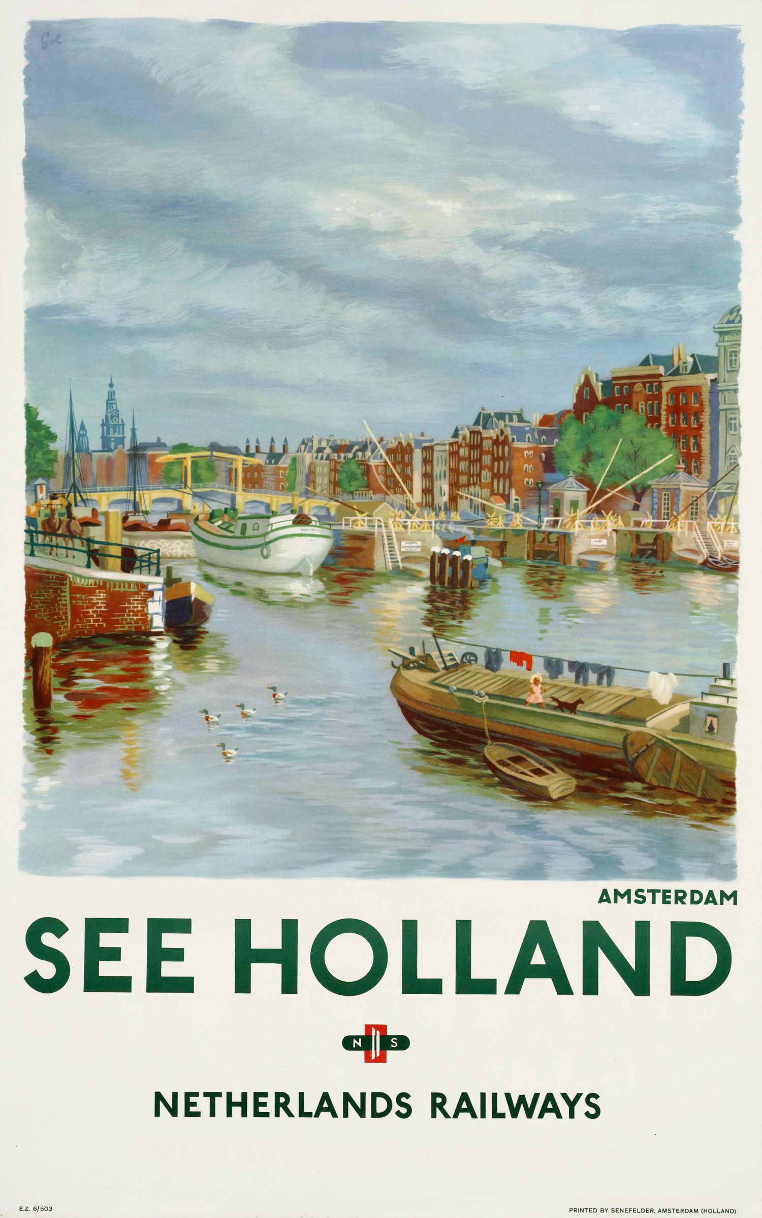
For the same poster series Rodrigo painted a wind-driven sawmill as well. Arthur Goldsteen (1908-1985) was also inspired by the Amsterdam canals for a comparable poster. The result was brighter and fresher than Rodrigo's, but less artistic. Goldsteen was born in Germany and had settled in Amsterdam after an active period in Paris. Around 1950 he designed many posters for the Dutch railways, and while employed by Prad Advertising Agency also for Artis Zoo, Polaroid, Velpon glue and Dutch dairy.
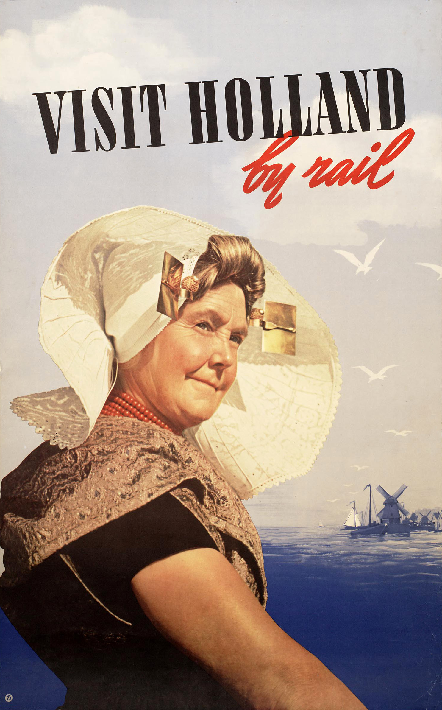
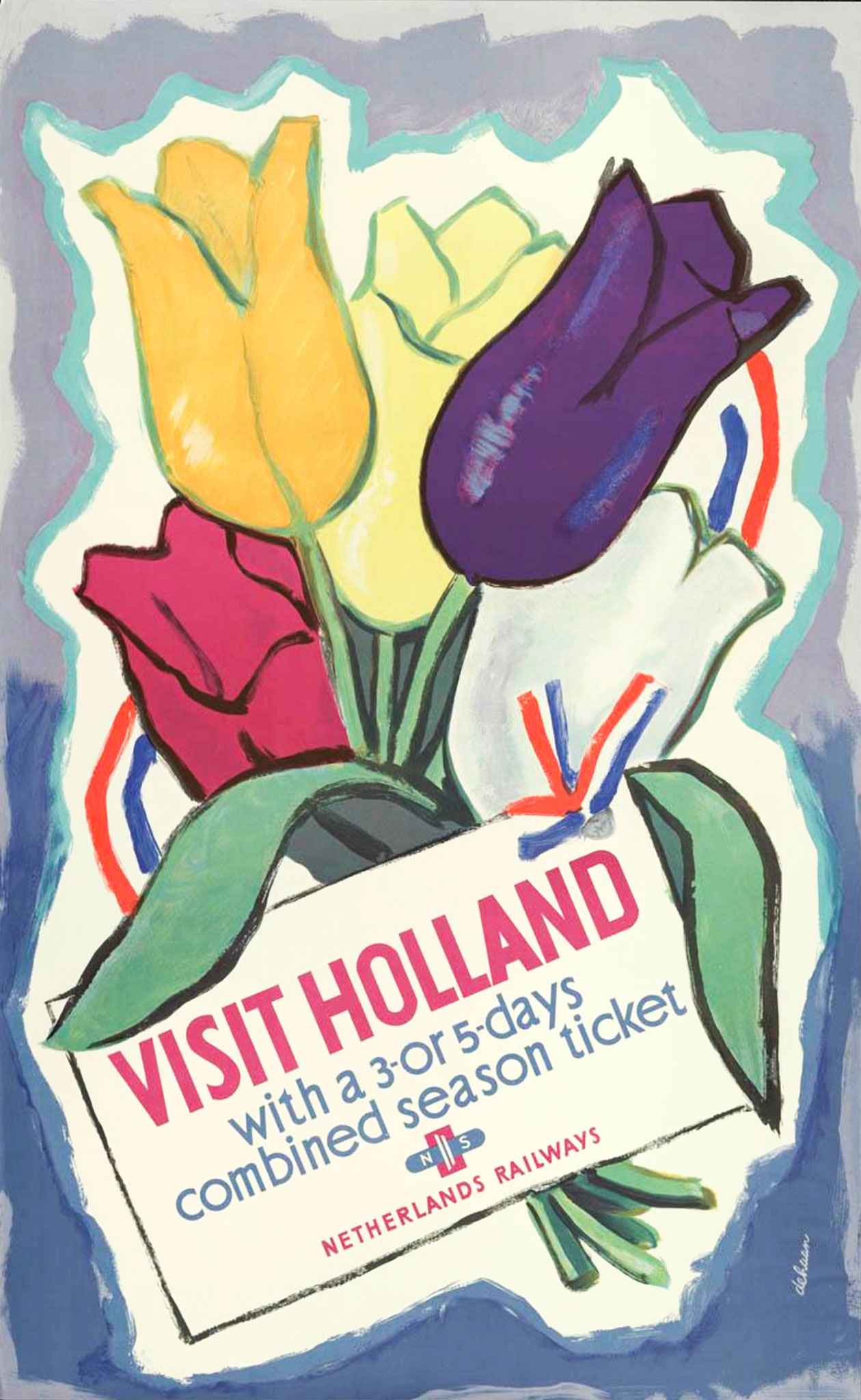
Most railway posters from this period include the NS logo that was designed in 1946 by Jan de Haan (1917-1975). He was an advertising designer at the propaganda department of the Dutch railways and one of his creations was a poster for holiday passes with a bouquet of tulips, wrapped with a red-white-blue ribbon. An unknown designer with the initials E.D. created a photo montage of a woman in traditional Zeeland costume, including iron ear pieces with gold plates. Visit Holland by rail was the most common slogan.
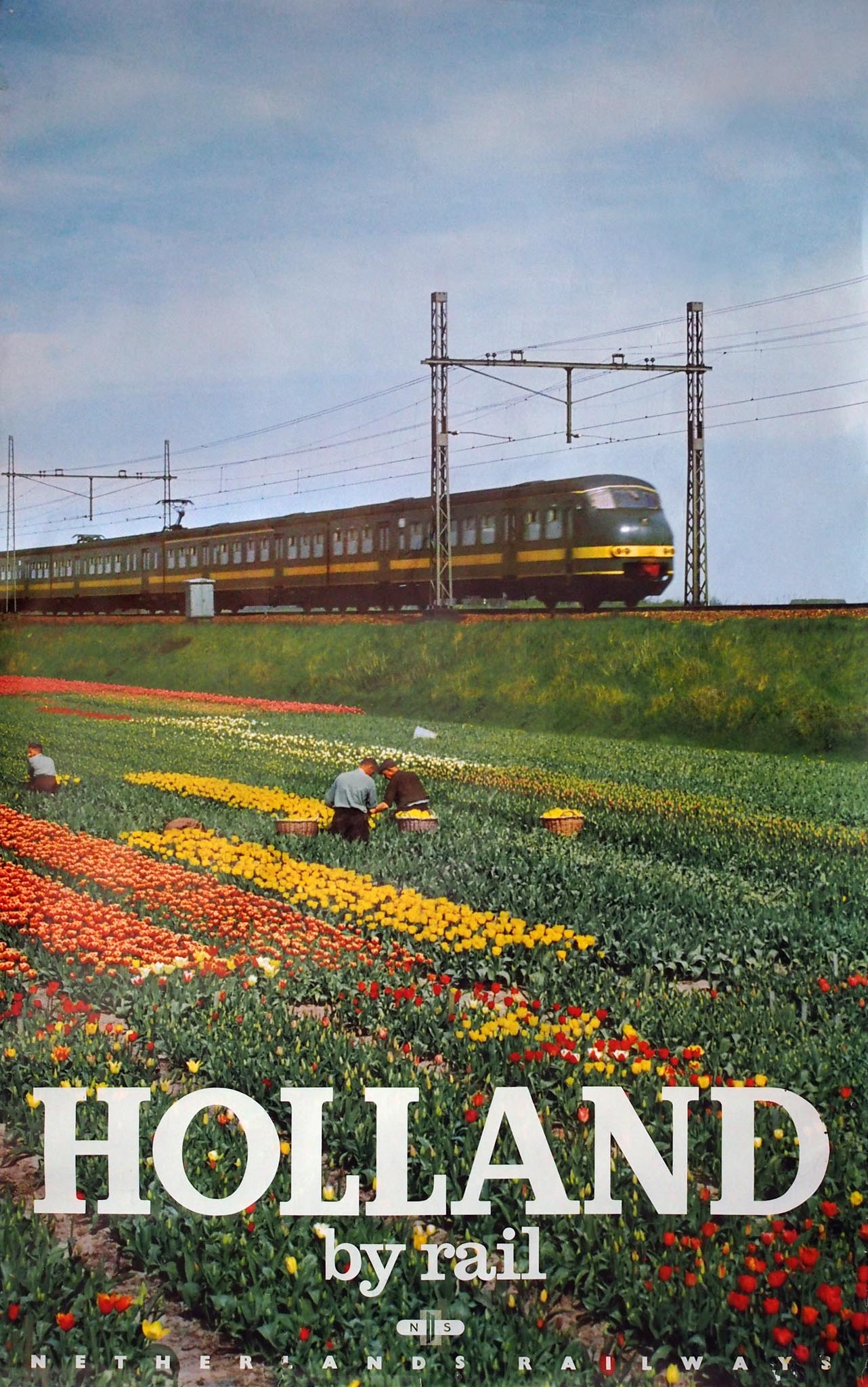
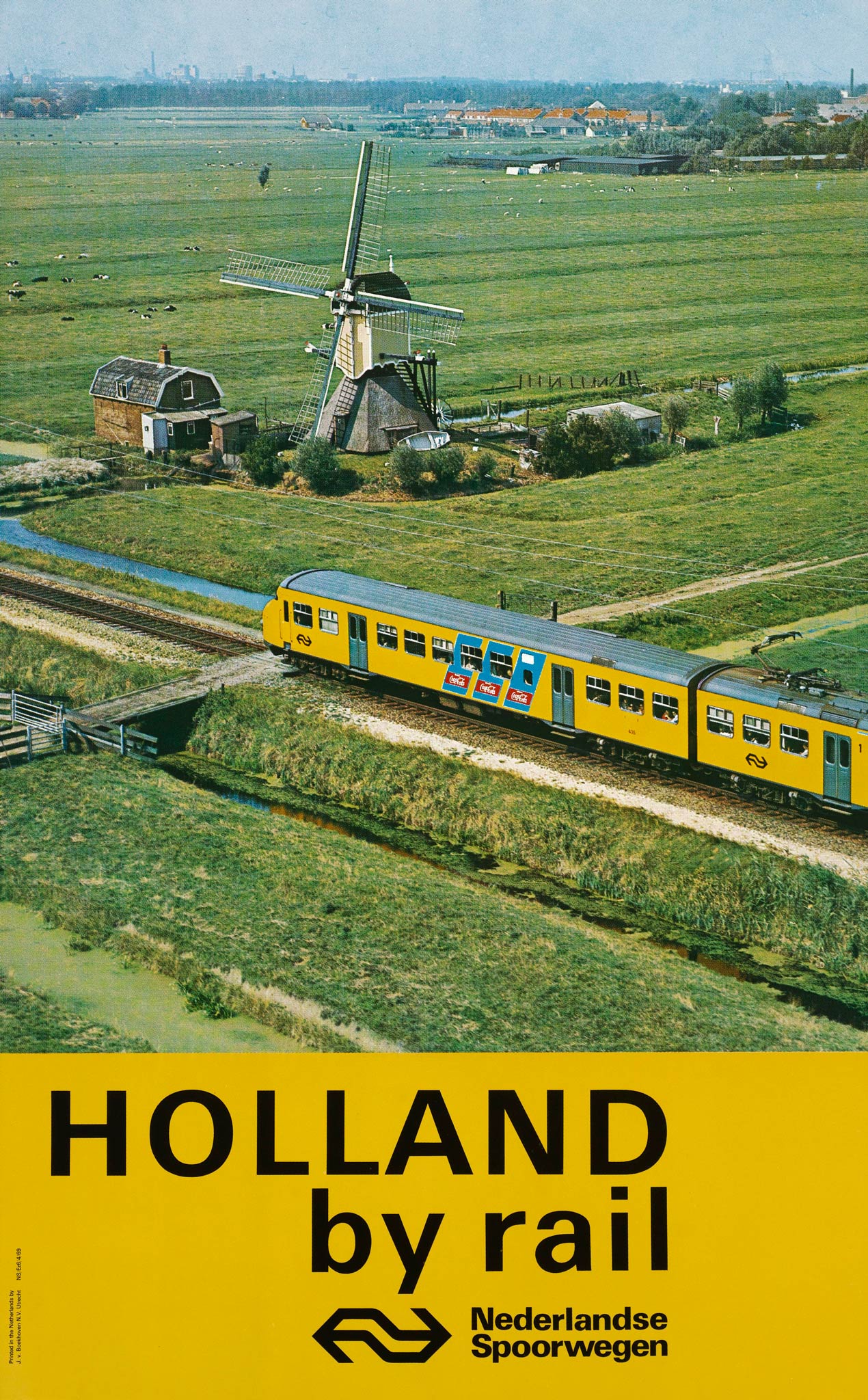
The railway company's corporate style of 1968 not only introduced the new NS logo on posters, but also the bright yellow color and Univers typeface. However, typical Dutch landscapes remained the main motive.
SNCB, BR and SNCF
In the 1960s, 70s and 80s railway companies in neighboring countries occasionally promoted train travel to the Netherlands. They applied age-old clichés such as windmills and tulips, but in a more contemporary form. As on the NS photo posters, modern trainsets formed an interesting addition to the traditional elements.
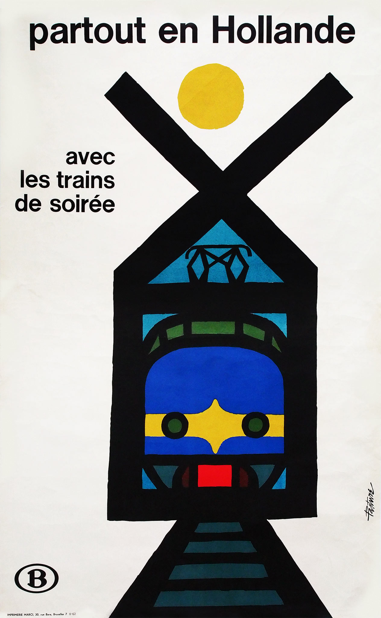
In 1962 the Belgian railways published a poster with the front of a navy blue Benelux trainset, which was derived from the well-known Hondekop. Despite a windmill as a symbol of Holland the poster was not old-fashioned. Designer André Pasture (1928-2006) created an abstract icon out of this outworn symbol. He carefully aligned the text in Helvetica.
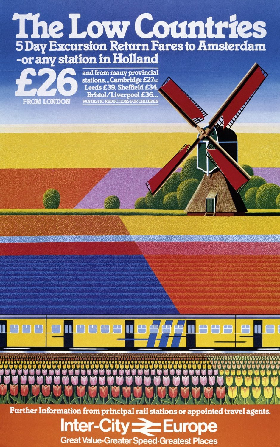
British Rail, in a 1982 campaign for InterCity Europe, promoted travel to the low countries. In addition to tulip fields the colorful poster also features a yellow Mat '64 trainset. Another British Rail poster from 1987 with a photo collage called Holland 'enchanting and different'. This slogan still appealed to the same exotic image that attracted artists and tourists to Holland around 1900.