Spearheading Design
Corporate Identities for European railway companies

The corporate identity of the Dutch Railways is 50 years old in 2018, currently celebrated with an exhibition at the Spoorwegmuseum. The Dutch Railways' new house style was not unique, but part of a European trend. The desire to give the railways a modern look coincided with the emergence of large professional design agencies.
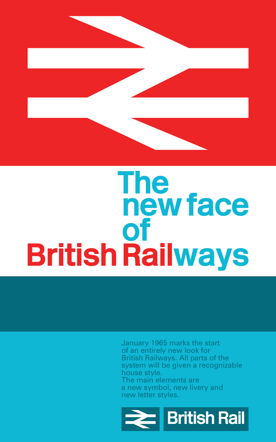
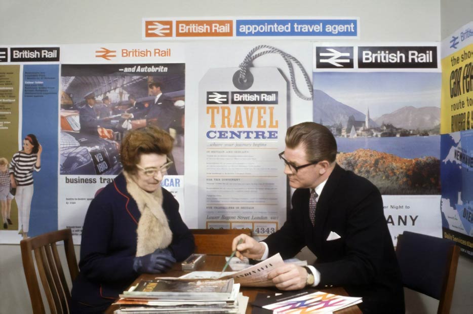
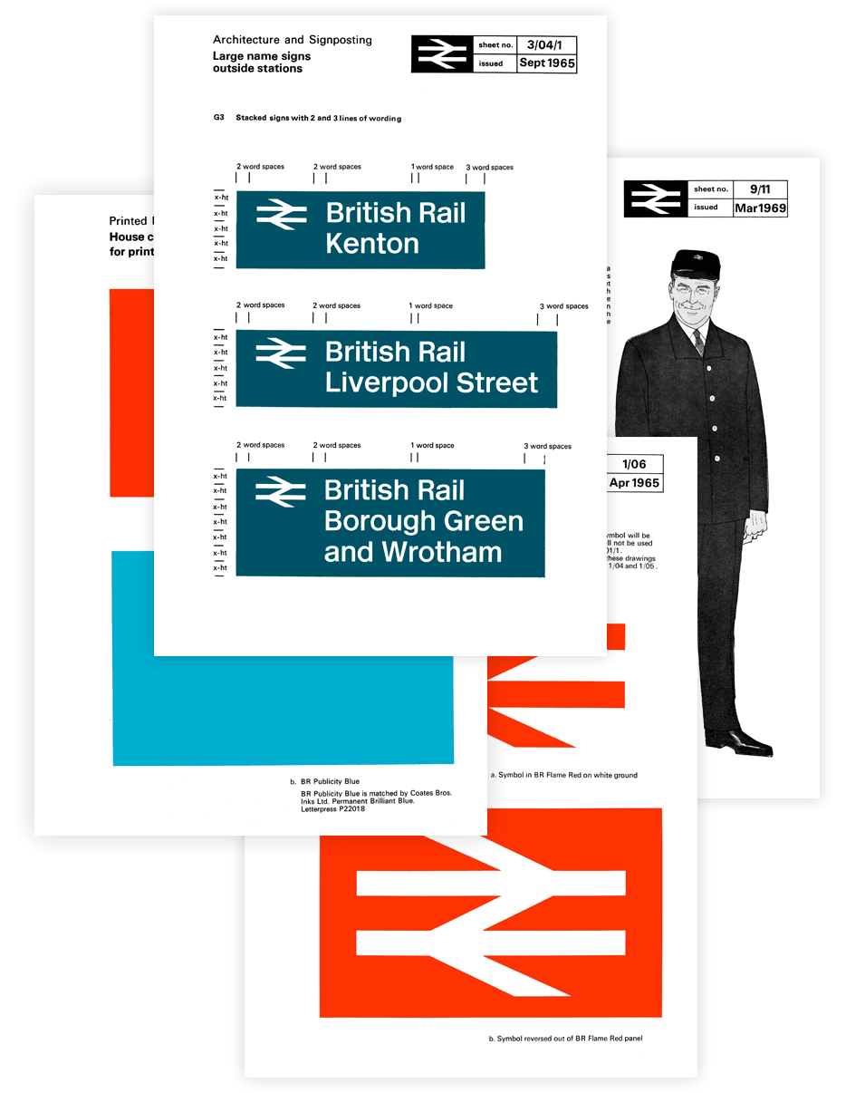
British Rail's new corporate identity of 1965 had a major influence on railway companies on the continent. This applied to the logo symbol, consisting of two arrows, but also to the comprehensive and consistent approach, which included train colors, typefaces, uniforms, signage and advertising.
In the middle of the 20th century many European railway companies still had logos and emblems dating back to the previous century. Obsolete symbols were dominant, such as escutcheons, lions and especially the winged wheel — a speed symbol based on the wings of the Roman merchant god Mercury, protector of travelers.
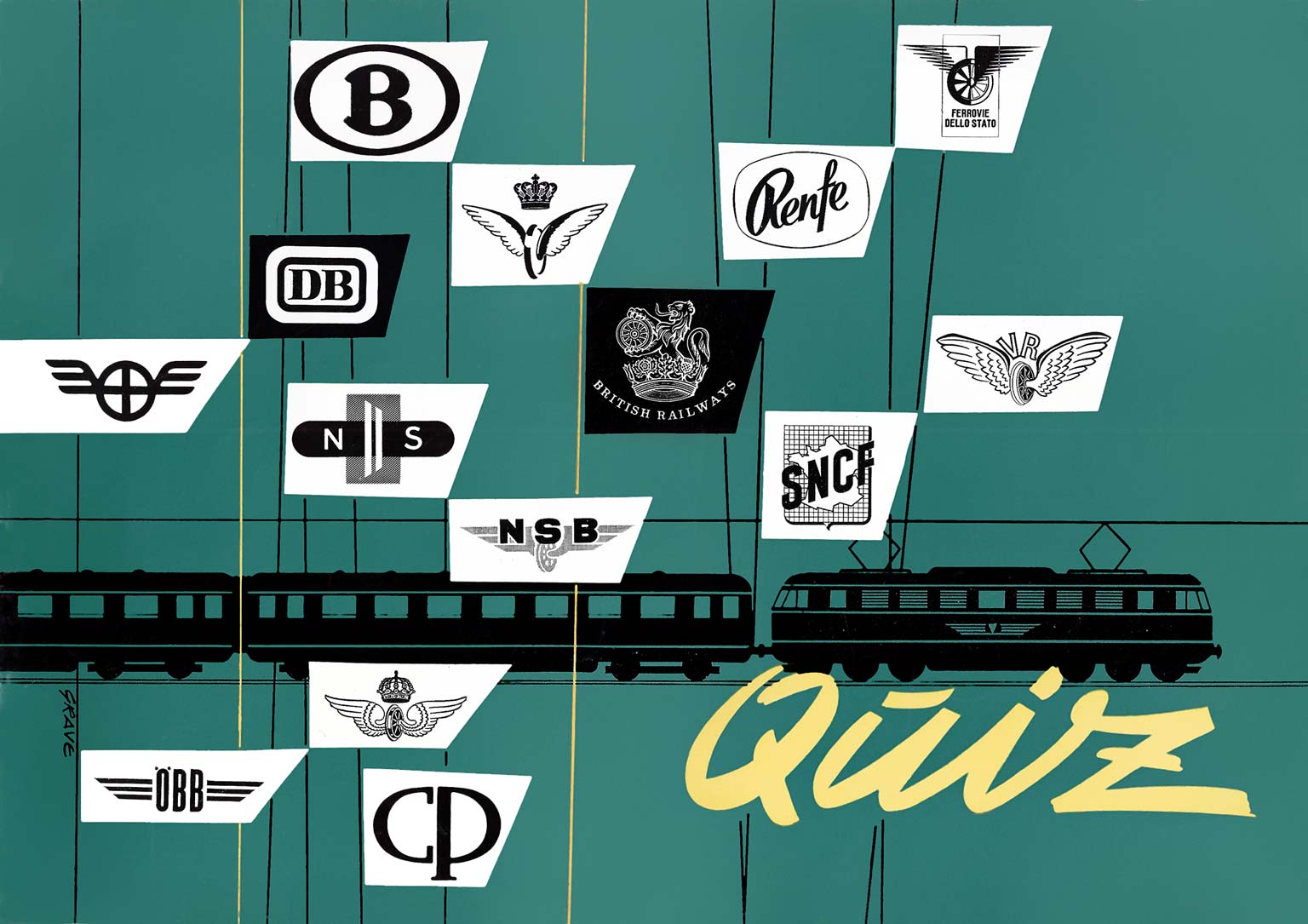
When the technology of the 19th-century was replaced — steam becoming electricity — the symbols were also up for renewal. A quiz by the International Railway Union (UIC) from 1960 featuring the logos of 14 European railway companies shows that this process had only just started. A decade later the picture was completely different.
Belgium (SNCB)
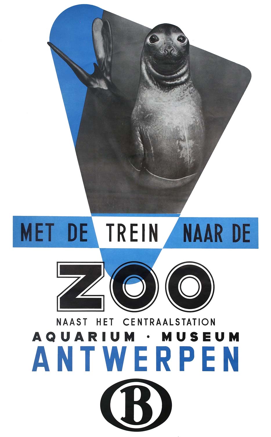
The Belgian railways already had a logo that can be called modern since before the Second World War. It is still in use after more than 80 years. In 1934 a design competition was held for an emblem to replace the long, bilingual inscriptions: Nationale Maatschappij der Belgische Spoorwegen (NMBS) and Société Nationale des Chemins de fer Belges (SNCB). The jury was chaired by architect Henry Van de Velde, who was the artistic advisor to the railways in the 1930s.

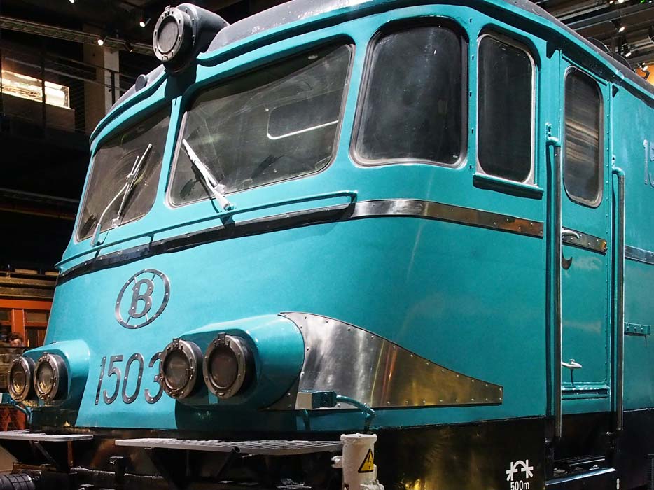
The winning entry was created by Jean de Roy, a draftsman working for the Belgian railways. His design consisted of a bold B inside a double circle. It reminded some people of the Bentley car emblem. The use of a single letter was an elegant solution for the bilingual SNCB/SNCB abbreviations. The final version was made in 1936 by Henry Van de Velde, who replaced the circles with ovals. The top and bottom of the B also followed this shape. The oval shape was inspired by the bronze factory plates of steam locomotives.
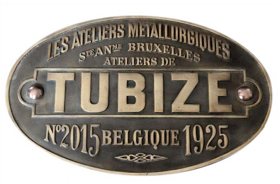
From 1936 onwards the B sign was used in advertisements such as posters. On carriages and box cars the logo was only displayed in small size along with the serial numbers. The old winged wheel was still used on the front of locomotives for a long time. In the post-war years the B logo was no longer present on all railway posters. Around 1960 it was applied consistently again, when the B also appeared on the front of new locomotives, first as a metal emblem and later applied in paint. The logo only became part of an overall corporate style in the 1980s.
If any minister of transport would ever sink so low that he plans to replace the B sign of the Belgian Railways for something more contemporary, I will tattoo that B on his uncivilized forehead with glowing needles. The magnificent North and South stations of Brussels are already a rapidly fading memory, when you consider their current dismal state. They find Antwerp Central Station a nuisance and would prefer to get rid of the SNCB altogether. This is all well and good.
But the B must stay.
Germany (DB)
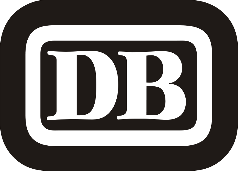
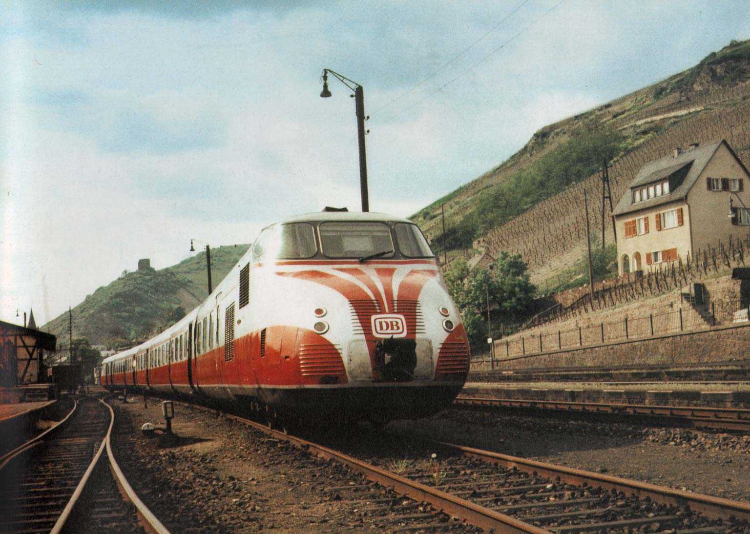
Along with the new Federal Republic of Germany the Deutsche Bundesbahn (German Federal Railway) was created in 1949. A simple DB abbreviation was put on the front of new trains, sometimes combined with a stylized version of the winged wheel. Soon a more distinctive word mark was required. In 1955 Eduard Ege designed the so-called DB-keks (DB biscuit).
Ege was a painter, graphic artist and woodcarver. Especially the latter is obvious from the logo design with inverted shapes in bold lines. The rounded corners were based on locomotives number plates. Although the black version eventually would become the best known, the logo was first applied in white on the 1955 experimental VT 10 501 'Senator' trainset. It was subsequently applied on other trains upon replacement or maintenance, a process that took years. The emblem was also used on posters, albeit not very consistent during its first years.
The DB logo did not come with a complete corporate style, but in 1966 a campaign style was designed that fitted perfectly with the logo. To compete with the growing car traffic, WER (the Bundesbahn publicity department) hired the McCann advertising agency in Frankfurt, a subsidiary of the American McCann Erickson.
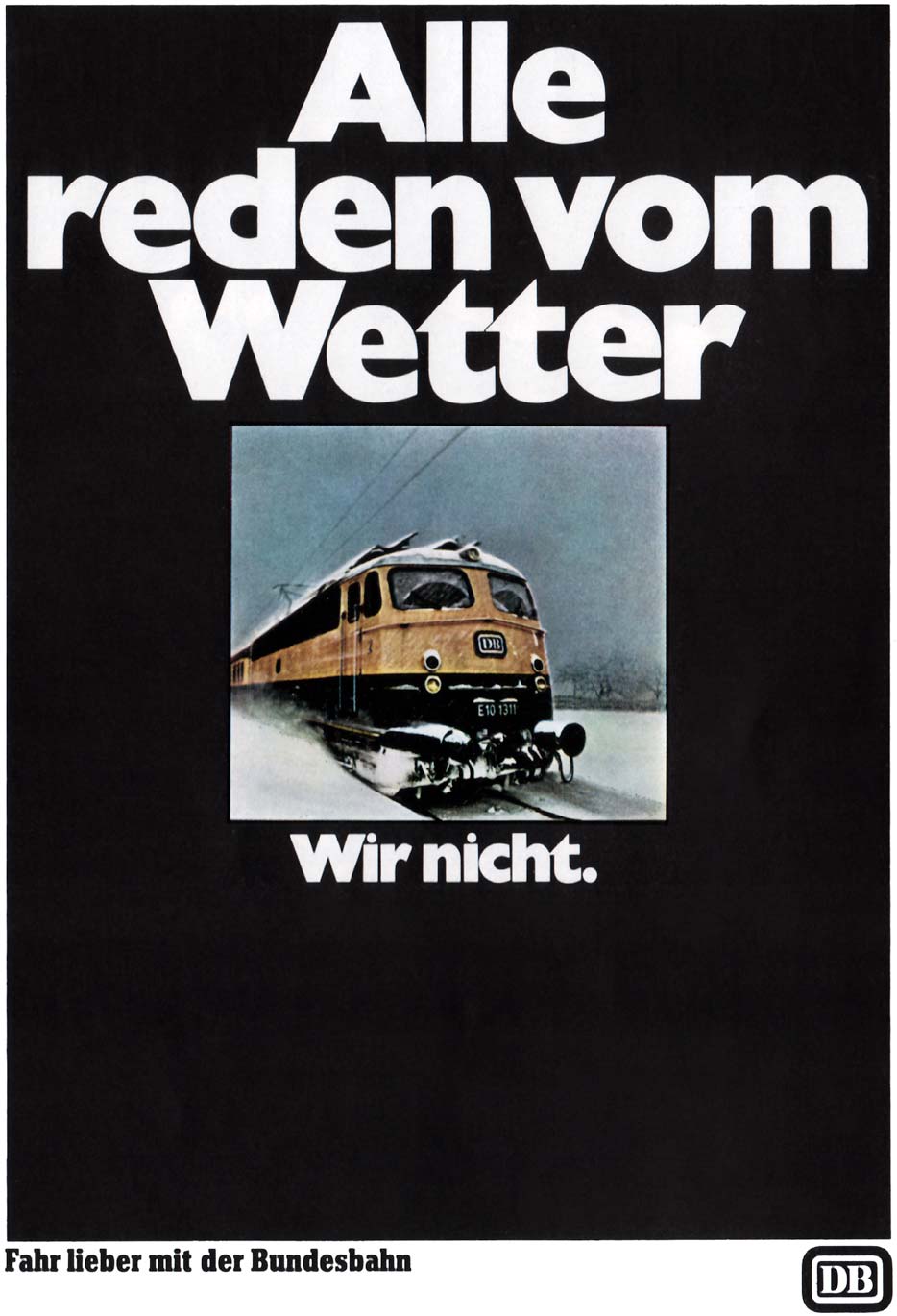
With an unprecedented budget of 2 million D-marks it launched a campaign using a black plane with bold white letters (Gill Sans ExtraBold) and a simple photo. As if it were an episode of Mad Men, the slogan Alle reden vom Wetter. Wir nicht (Everybody's talking about the weather. We're not) was conceived by the 23-year-old secretary Margot Müller, who became a successful copywriter.
The catchphrase, derived from our old slogan 'Wir fahren immer', has literally gone around the globe. It broke away from the poster, so to speak. You can find it in an adapted form in television commercials and foreign advertisements. At the same time, the black-and-white contrast and typography gained popularity. It has become a style trend. The poster leans heavily on the slogan and typography. The same is true for subsequent posters, which were created in collaboration with the same agency.
France (SNCF)
Since the formation of the French National Railways (SNCF) in 1938 a circular monogram designed by Maximilien Vox served as a logo. The entanglement of the letters SNCF symbolized the merger of the five former railway companies.
The extra large C formed a surrounding circle. In 1947, during a period of post-war reconstruction and optimistic nationalism, a new logo was created for use on paper: a coat of arms with a simplified map of France and diagonal initials.
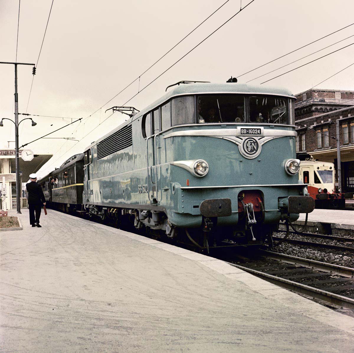
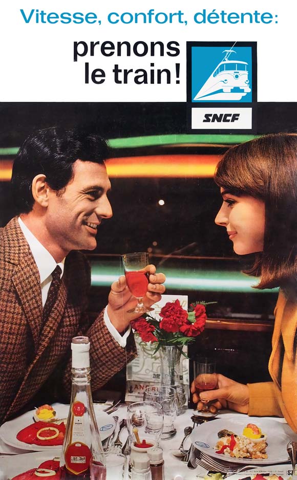
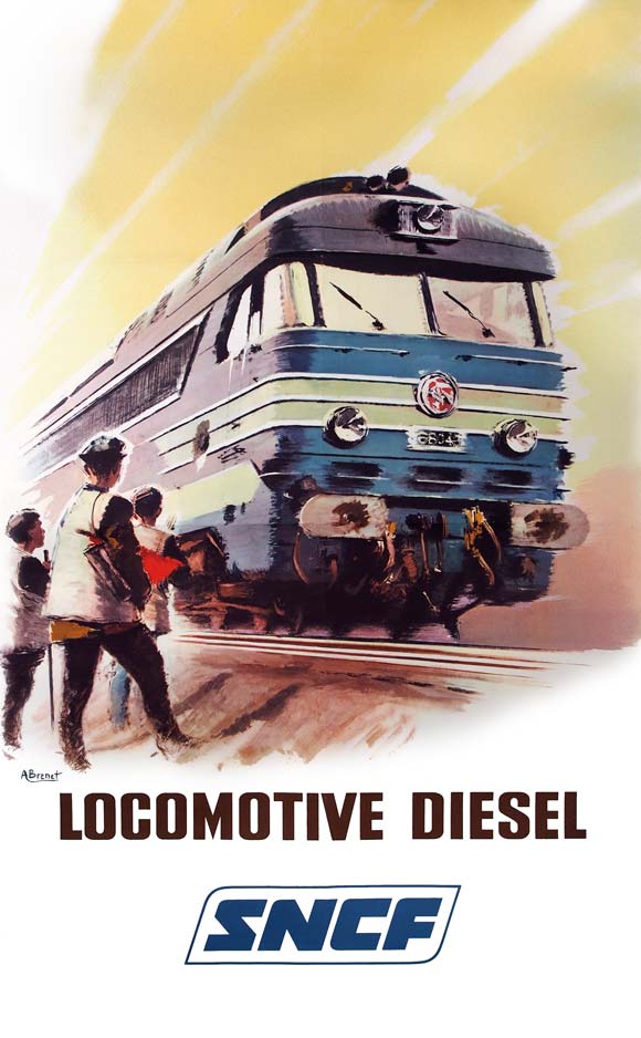
In 1966 the SNCF was ready for a modern logo. Initially it consisted of the stylized silhouette of a BB 16000 electric locomotive, separated by a thick line from the SNCF initials. The letters were bold and italic, which stood for strength and speed. Soon — as two 1966 posters show — the locomotive was omitted.
The SNCF letters were surrounded by a thin frame with two sharp and two rounded corners. On locomotives the old round monogram remained in use. There still was no integral corporate identity.
As a visual symbol and true signature of the company, allowing for its immediate identification, the logo has important cultural and economic weight. It is not a small thing to change it! When the SNCF recently decided to implement its 'nouvelle image visuelle', it was the starting point of a far-reaching change of culture. That is why design, in this case, is far more than just a drawing!
United Kingdom (BR)
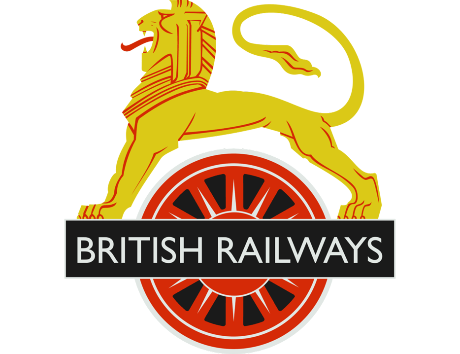
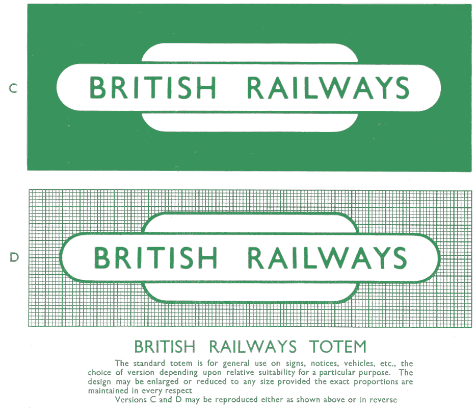
Upon the formation of British Railways in 1948 a 'Cycling Lion', as it soon was nicknamed, served as a logo. It was used on locomotives, while the cigar-shaped British Railways totem was better suited for station signs and use on paper. This logo was nicknamed the Flying Sausage or hot dog.
In Sign standards the Railway Executive prescribed the correct use of the totem and other signage, as well as the Gill Sans font. Different colors stood for the regions (the former railway companies). This first house style was inspired by the former LNER and London Transport. The 'Cycling Lion' logo was replaced in 1956 by the equally quaint 'Ferret & Dartboard'.
In the early 1960s the obsolete emblems were used less and less; in most cases plain words were applied on printed matter. With the elimination of the old regions British Railways was ready for further standardization. In order to develop a modern corporate identity the Design Research Unit (DRU) was commissioned in 1964. It was one of the first British design studios that combined architecture with graphic and industrial design.
A new logo constituted the starting point of the house style. DRU created some 50 design variants, from which the British Railways Board's Design Panel finally picked two: one incorporating two circles and an arrow, and one consisting of parallel lines and double arrows. After the first design had leaked out prematurely, the second one was selected. This 'two-way track symbol', soon known as the double arrow, was designed by DRU's 25-year-old Gerry Barney. Along with the new logo the name was shortened to British Rail.
I was a lettering artist, I wasn't a designer. The designers at DRU were given the brief and, to my knowledge, it didn’t satisfy Milner Gray [the studio's co-founder]. So he threw it open to the rest of the studio, six or seven people. I just happened to think of this symbol. I first sketched the idea on the back of an envelope while taking the Tube to work. When I got to the office I drew it up. It was exactly how I drew it the first time, with straighter lines. I just had to formalise it.
It worked because it was obvious. When you think of railways, you think of parallel lines — up this way, down that way. There was a certain amount of logic I could use to explain the way it looked, then it was a question of stylisation. I'm proud that it has lasted so long, more than anything. And I've never thought, I wish I could do it again because I'd do it better. I actually wouldn't know what to do.
Design Research Unit also selected a color palette — based on red and greyish blue — and a typeface: Rail Alphabet. This was a variant of Helvetica, adapted by Jock Kinneir and Margaret Calvert for optimal readability at stations.
The house style elements were described in a comprehensive manual and applied to all parts of the railway system, from locomotives and trainsets to stations and offices, uniforms and signage, posters and ads, to cutlery and tableware in the restaurants.
Canadian National (CN)
While British Rail's corporate identity was groundbreaking for Europe, it was inspired by a North American railway company: Canadian National (CN). Its 1960 house style included signal red trains and the interlinked CN initials as a logo. It was designed by Allan Fleming. Just like British Rail(ways) a few years later, Canadian National (Railways) shortened its company name. The Dutch Railways also looked at the Canadian example.
The Netherlands (NS)
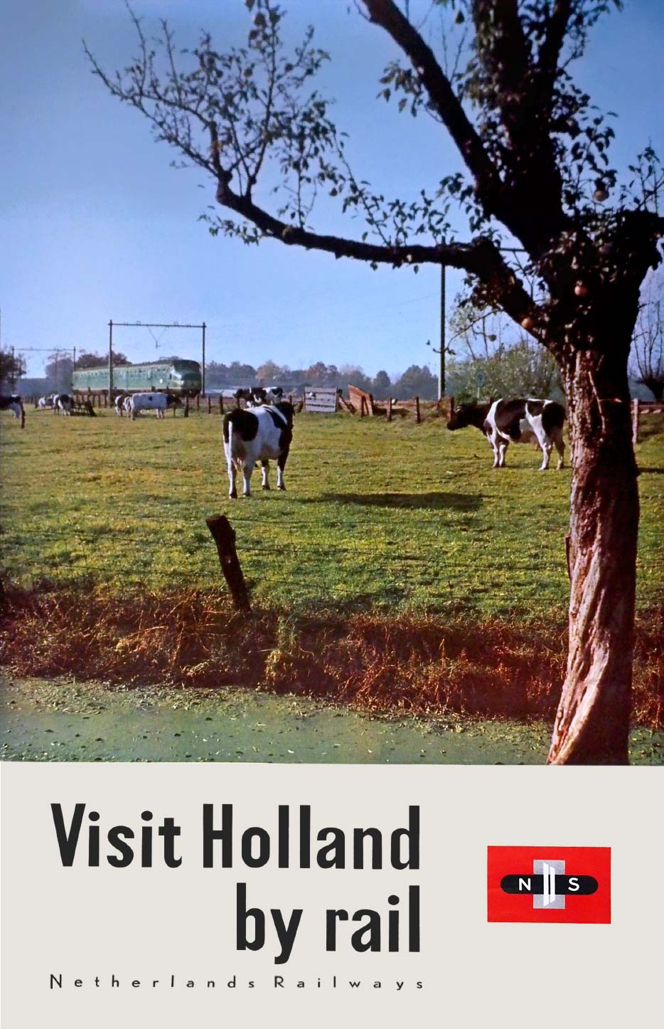
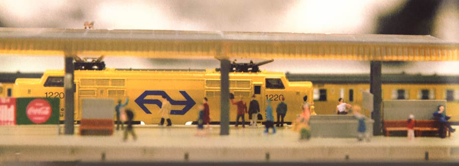
The first railway company on the European mainland to introduce a modern corporate style was the Dutch Railways (NS) in 1968. Main ingredients were a logo, a yellow livery and distinct pictograms at stations. The new house style replaced a multitude of signs and shapes, including a barely recognizable stylized winged wheel with NS initials that served as a logo since 1946.
Inspired by Canadian National and British Rail, an NS Emblem Working Group was established in 1966. One of its members was the young industrial designer Siep Wijsenbeek. Soon it became apparent that a new logo alone would not help the railway company to shake off its old-fashioned, bureaucratic image. Consequently the working group was renamed NS House Style.
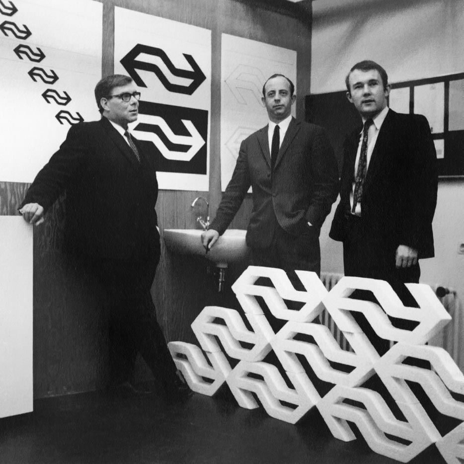
Several designers were approached, including Joop Moesman, who previously created the TEE logo. Eventually two large Dutch studios were in the running: Total Design and Tel Design. The latter, being an industrial design agency, turned out to be the best fit for NS. At the client's request, however, Tel Design also hired a graphic designer: Gert Dumbar (1940), who had studied at the RCA in London, just as Wijsenbeek had. Tel Design worked in an almost scientific manner. First, foreign examples were analyzed extensively.
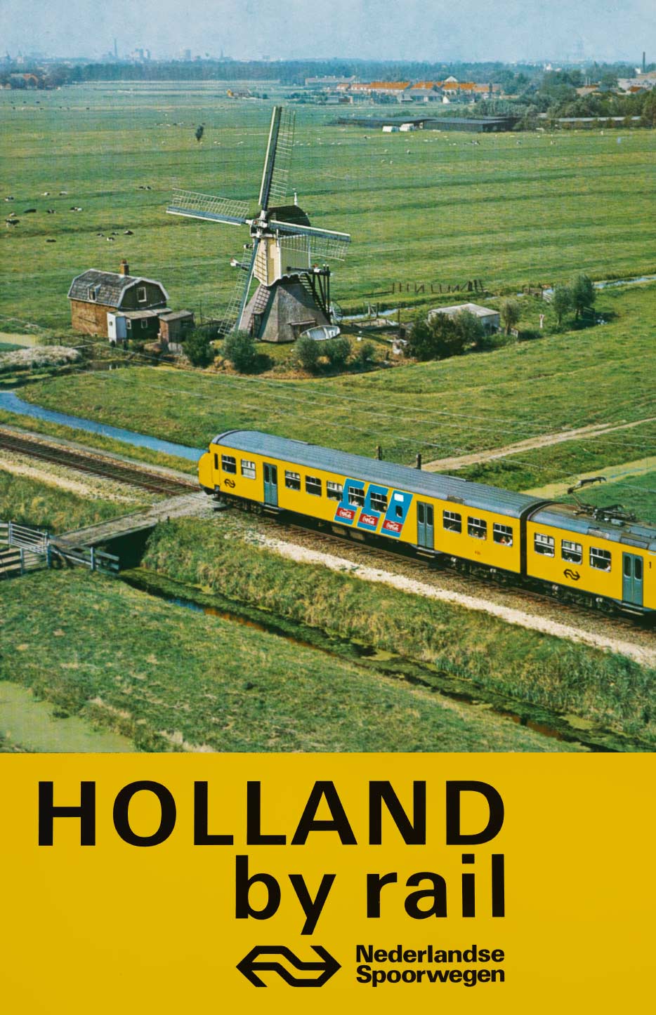
Gert Dumbar created more than 1800 logo sketches. He started with a monogram akin to CN's, but ended up with an arrow symbol like British Rail's (officially: 'transport in two directions in a closed circuit'). Subsequently readability tests were performed and the yellow livery was tested on model trains. Tel Design convinced NS with both technical and emotional arguments. The selected Univers font was, according to Dumbar, not only the most readable, but also gave a 'masculine impression'!
The color yellow works actively on the environment. It has the characteristic to make the image of a gray station fresher and sunnier. Yellow renders the object more visible, making people stand out more against the backdrop of the yellow train; the station image thus becomes an active image. Yellow associates with attention, safe, unofficial, dynamic, modern, powerful, technical and sunny. The color nuance has been selected to avoid its aggressiveness by making it a "warm yellow". Yellow also provides a striking contrast in the landscape. It endorses the statement 'the train may be seen'.
Most innovative was the bright yellow train livery. Previously Dutch trains were dark green, dark red or dark blue. Dumbar wanted to brighten the sombre stations with a fresh color. But use of the conspicuous and safety-enhancing color was no real novelty: British Rail locomotives had yellow fronts, and in some cities trams were yellow. The NS management was still in doubt, but when the existence of a yellow-painted test trainset was leaked to the press, a fait accompli arose. New trainsets were delivered in yellow, but the repainting of existing ones took until 1975. Originally locomotives were also envisioned entirely yellow, but they were given a dark gray central section for practical reasons.

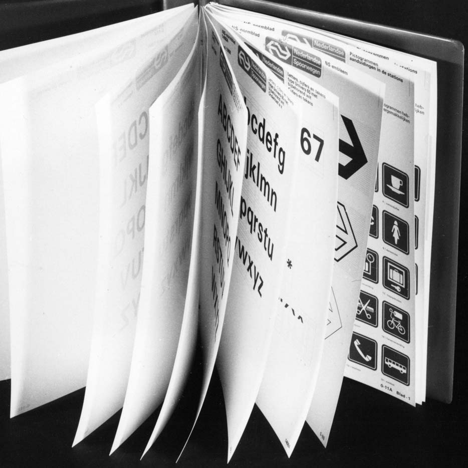
The corporate identity also included signage at stations. Station name signs were typefaced in Univers in white on blue, while pictograms provided practical directions. Pictograms were strongly emerging in the late 1960s because of their international recognizability and uniform size. A basic set of pictograms by the International Union of Railways (UIC) was improved by Gert Dumbar and supplemented with typical Dutch symbols such as a bicycle parking. As a follow-up to the house style, Tel Design's Gertjan Leuvelink designed clear and minimalist new timetable books and yellow departure signs in 1970.
Intercity
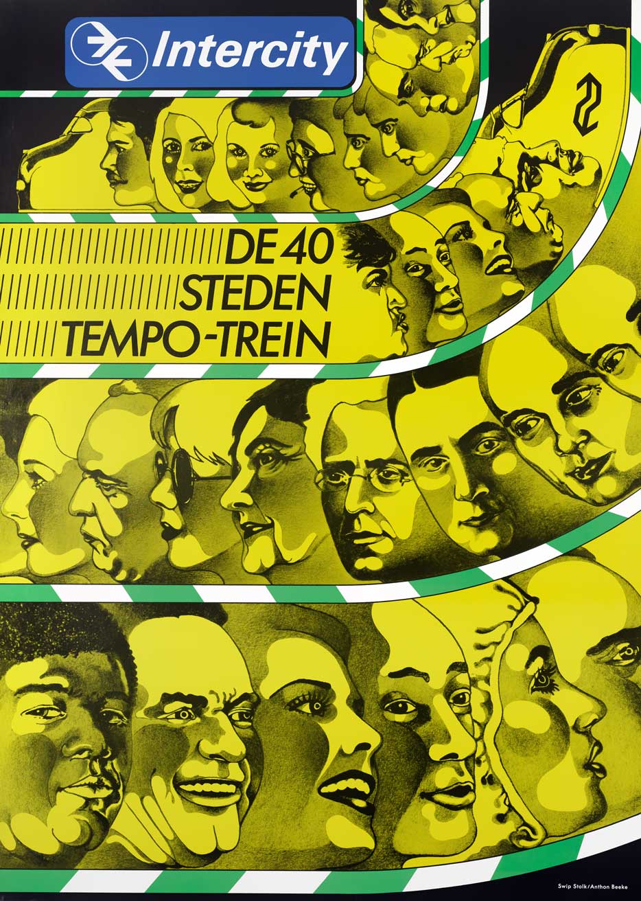
As part of NS's modernization efforts, Intercity trains between 40 Dutch cities and towns were introduced in 1970. The Intercity was given its own logo, consisting of two arrows in circulation, also created by Tel Design. A striking poster for the 'The 40 cities tempo train' by young designers Anthon Beeke (1940) and Swip Stolk (1944) depicted a 'train' of people's heads. The aim was to give the railways a human face.
Denmark (DSB)
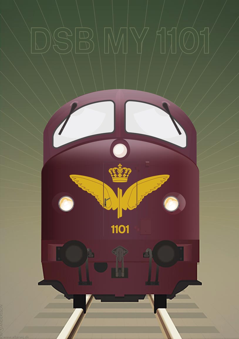
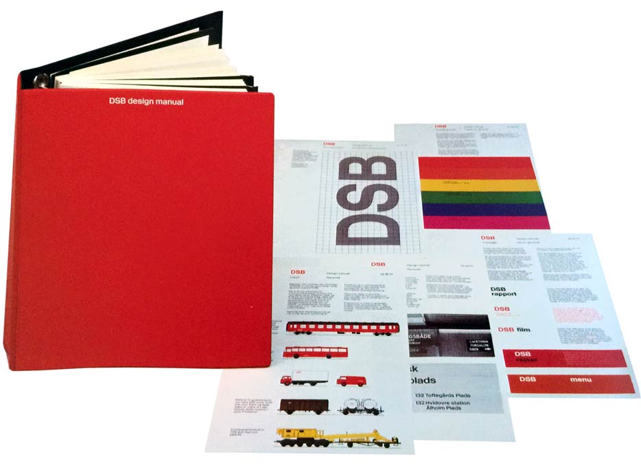
Until 1973 the Danish State Railways (DSB) were using a winged wheel with a crown as a logo, and the trains had a Burgundy red color. This look was classic and reliable, but was now to be made modern and rational. Inspired by British Rail and led by architect and design director Jens Nielsen, DSB underwent a thorough facelift.
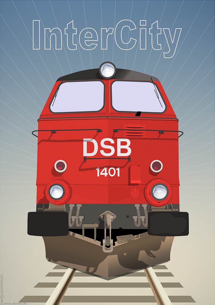
Together with the best Danish designers Nielsen developed a house style consisting of a minimalist logo, an intense red-black color scheme, standardized signage and the Rail Alphabet, adopted from British Rail. In contrast to the Dutch and British railways, DSB did not opt for an arrow symbol but for simple initials in red or white. Graphic artist Ole Søndergaard transformed the three Rail Alphabet letters into a single sign.
The corporate style was consistently applied to all public elements of the DSB: trains, stations, ferries, uniforms, correspondence and advertising. In a few years' time the old railway company was transformed into a figurehead of modernism that attracted international attention.
The corporate identity went hand in hand with the modernization of the timetable and the introduction of Intercity trains, also co-designed by Nielsen.
The times had changed. DSB was not a state-owned company anymore, but was expected to be run like a business. New people were recruited and a new design manager was appointed. I must confess that I was a candidate for the job. I was young and eager and obviously wrote a good application. I arrived at the interview, ready to make a plea for sticking to Nielsen's visual identity. If it ain't broke don't fix it…
I still remember that while I was giving my speech to the recruitment committee it felt like talking to deaf ears. The gentlemen did not listen to me, but just looked at the ceiling, and at the end of the interview they asked: So you don’t think we need a new logo…? No, no, three times no, I patiently explained again. You have Denmark's strongest identity, why do you want to destroy it? The conversation ended there. I did not get the job.
Switzerland (SBB)
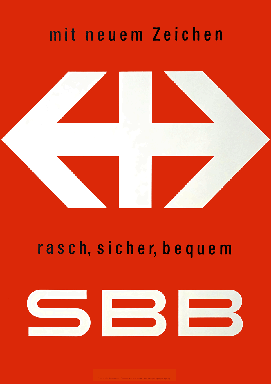
In the middle of the 20th century the trains of the Swiss Federal Railways (SBB) carried a red shield with a white Swiss cross, while an abstracted winged wheel was used on paper. In the 1960s the SBB usually limited itself to simple initials in round letters. Hans Hartmann, who previously created posters for the SBB, designed a new logo in 1972.
The logo consisted of double arrows after British and Dutch examples. A winged wheel could still be recognized with some effort. More important was the Swiss cross in the center to show the national importance of the railways. Hartmann wanted to create the SBB's image as a 'reliable, solid and dynamic public service'. In the first years the logo was used in combination with the 'old' round letters.
By 'corporate image' we mean the visual appearance of the SBB in public space. While the 'performance image' — the first priority — describes our products (passenger and freight transport), the corporate image concerns the 'packaging'. However, it is more than a wrapping, the 'packaging' is also an important information carrier. The SBB deserves a uniform, recognizable appearance that transcends volatile fashion trends; modern does not mean trendy and design is not styling. Everywhere the 'SBB packaging' should appear so that the public reacts with: 'Ah, SBB!'
In some other countries railway companies have developed a 'house style', the British, Dutch, Danes and Canadians being the most successful. In the private sector department stores and oil companies, for example, have developed a clear corporate image. They all have one thing in common: the aim to design fonts, printed matter, uniforms, vehicles and interiors according to uniform guidelines. In most cases the foundation for the house style was laid by selecting a new logo.
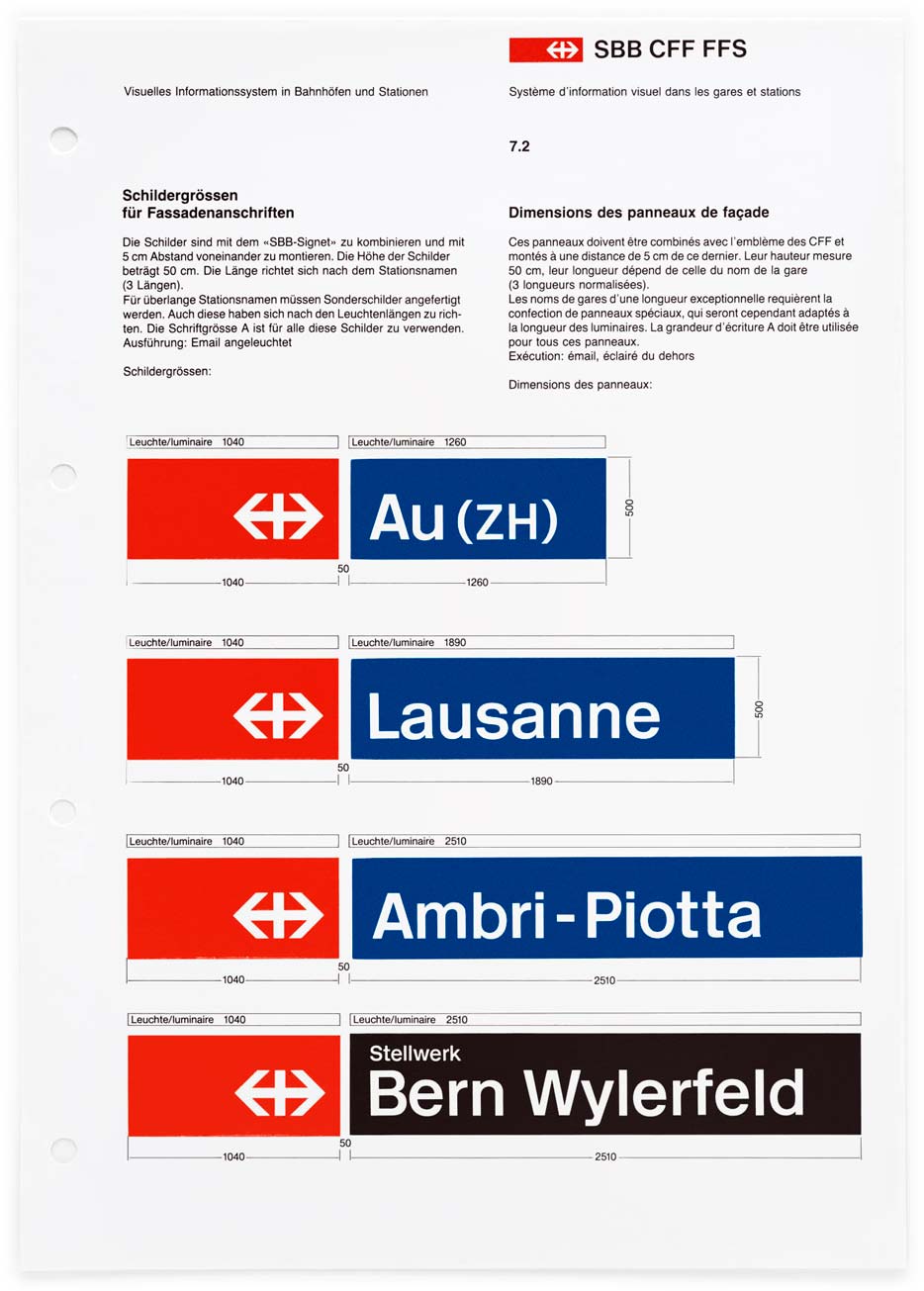
In 1978 SBB lead architect Uli Huber commissioned Josef Müller-Brockmann to develop a corporate style around the logo. The result was introduced in 1982, along with a uniform national timetable. Important elements were the Helvetica font and a red-blue-white color palette. From now on the logo was only used in white on red. It was combined with white lettering on navy blue station signs, and with the SBB CFF FFS abbreviations elsewhere, always giving an oblong result.
Müller-Brockmann's house style manual also included comprehensive guidelines for pictograms, signage, departure signs and timetables. All SBB locomotives were painted red, but only new series were given a large logo in a less solid striped version. The SBB corporate style, with a limited revision in 1992, is still in use and is now an important part of the Swiss identity.

.svg)


.svg)
