Along straight lines
Schematic railway maps in advertising
 Nederlandse versie
Every map is an abstraction, but some maps willingly distort reality. The best-known example is the London Underground Map: distances are unrealistic, geographical features absent, lines are straight and angles either right or diagonal. Such imaginary maps help travelers to find their way easier, in contrast to the spaghetti-like mash that is hidden behind.
Using simplification to provide insight into the network was just as important for (inter)national rail connections as it was in metropolitan areas. Schematic railway maps, as designed during the course of the twentieth century, sometimes resembled metro maps, but could take other shapes as well. They always had the same goal though: making complicated journeys look easy.
Iconic examples
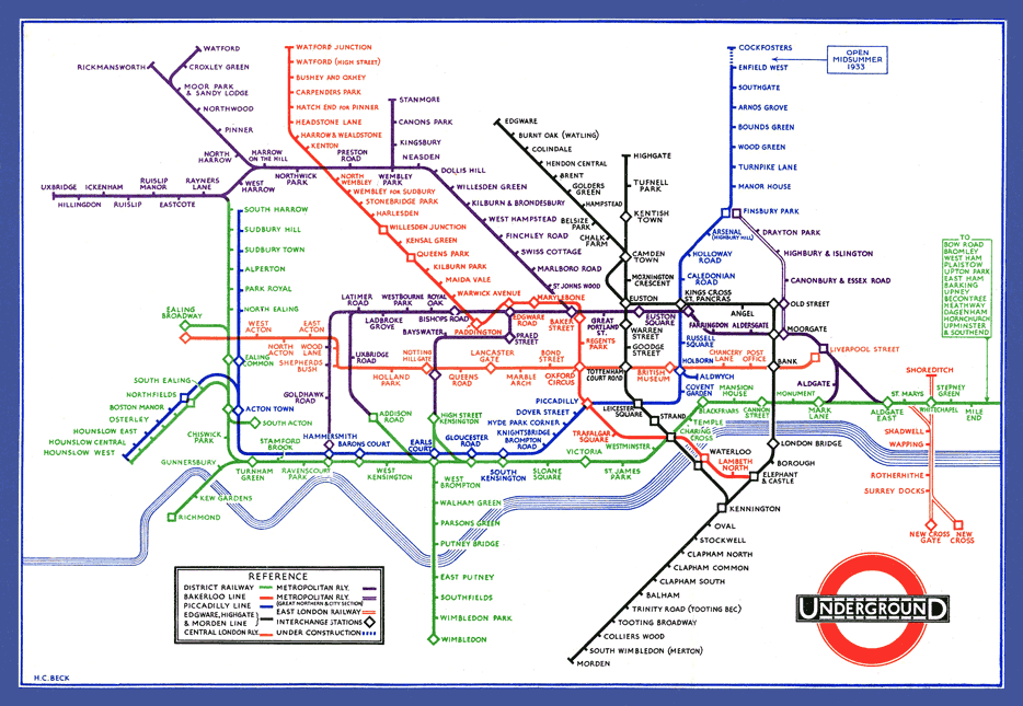
In 1931 Henry ('Harry') Beck, draughtsman at the London Underground Signals Office, sketched a minimalist map of the London Underground. Until then stations were depicted at proportional distances from each other, resulting in a congested city center and a cluttered overall image. Beck limited himself to what travelers really needed and created a topological rather than geographical map. Initially the publicity department found his solution too radical, but in 1933 Beck's map was embraced in full. It became a huge success and is still largely used today.
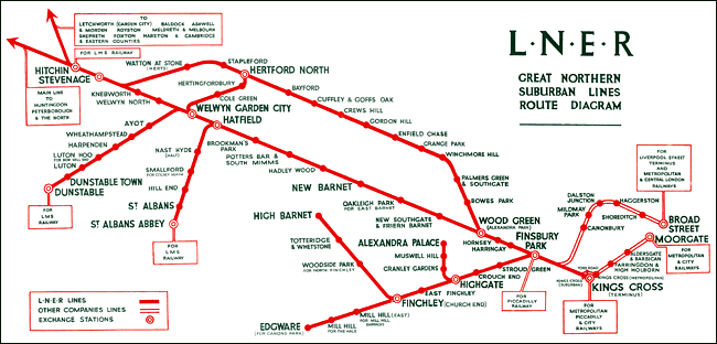
Beck's idea did not come out of the blue. Perhaps on the commuter trains to his work he was inspired by the so-called Dowagrams which George Dow created for local services of the LNER and LMS railway companies. They were combinations of existing carriage diagrams (a straight line with all stations) and traditional route maps.
Looking at the old map of the Underground railways, it occurred to me that it might be possible to tidy it up by straightening the lines, experimenting with diagonals and evening out the distance between stations. The more I thought about it the more convinced I became that the idea was worth trying.
Selecting the Central London Railway as my horizontal base line, I made a rough sketch. I tried to imagine that I was using a convex lens or mirror, so as to present the central area on a larger scale. This, I thought, would give a needed clarity to interchange information.
Henry Beck and George Dow — both draftsmen by origin, not designers — may have conceived the most iconic examples, but they were not the only ones working on schematic railway maps, and not the first ones either.
Nineteenth century
A detail of a large railway map of Austria-Hungary, created by Josef Beer in 1884, shows two things: such maps were cluttered and overcrowded in the 19th century, but experiments with abstraction were already going on. Beer used different colors for different railway companies and brackets to indicate stations. He also omitted geographic features from the background, except for rivers and lakes.
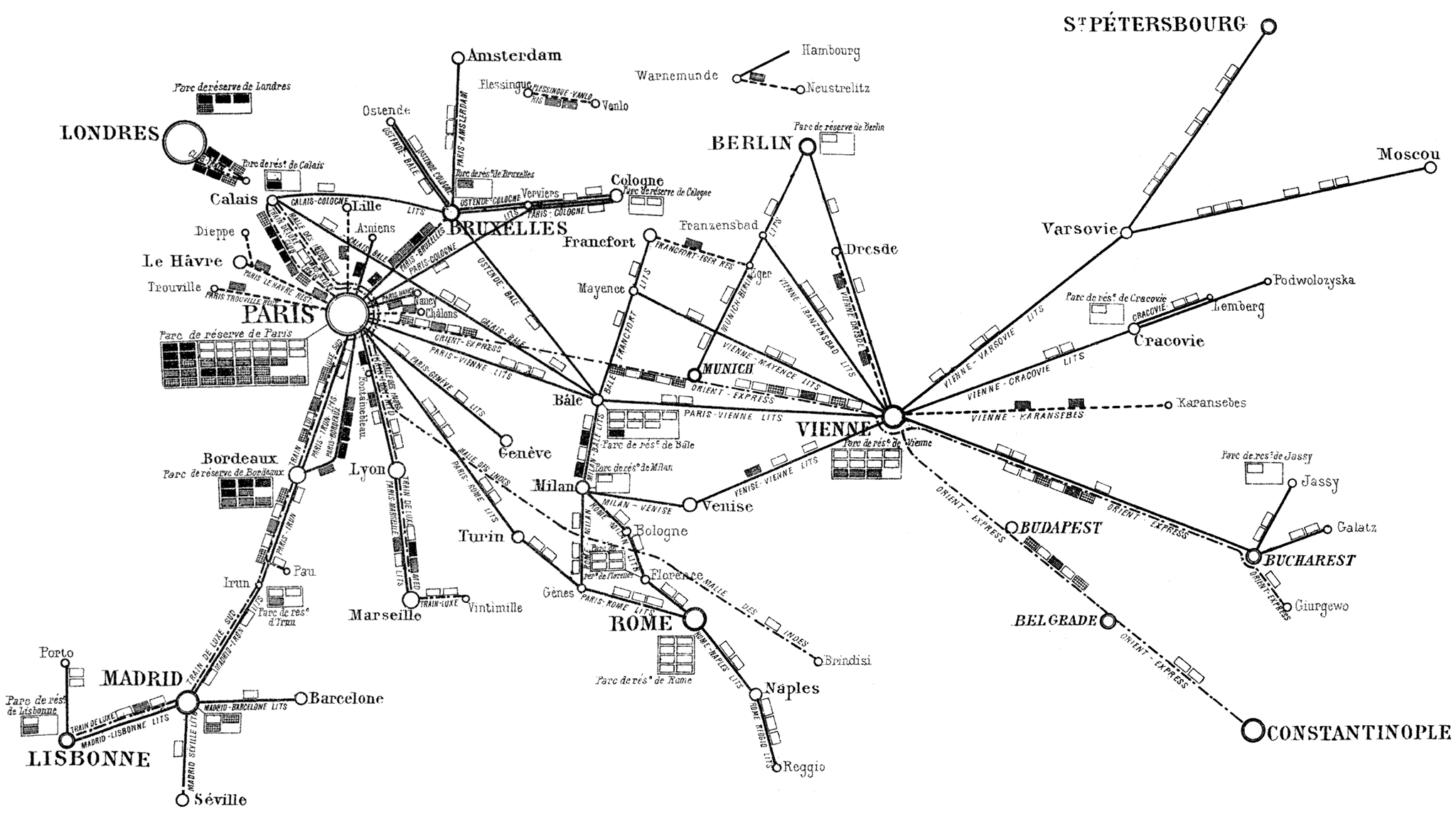
In this period maps could already be very diagrammatic, as shown in the Revue Générale des Chemins de Fer railway magazine of 1890. In an ingenious scheme European cities are positioned proportionally, but all other geography is left out. Direct, straight lines between the cities indicate the train services of operator Wagons-Lits — such as the Orient Express — including the exact number of sleeping, dining and parlor cars.
Early posters
Some of the earliest incarnations of railway posters included maps, such as an announcement of the first Franco-German train service in 1859. It was still full of fine timetable print, while the first Orient Express poster of 1888 already featured an attractive image of the exotic final destination, Constantinople, combined with a route-shaped cut-out of a map of Europe.
Small maps on posters
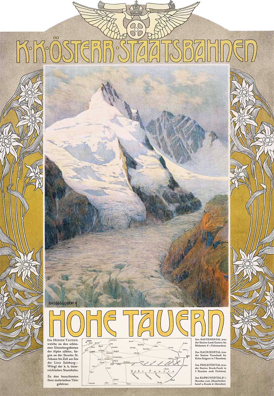
From the turn of the century railway companies, especially in Austria and Switzerland, started including small route maps on their posters, in a box at the bottom. Because of the limited space they were often squeezed and strongly abstracted: railways as straight lines and no geographical background at all. However, on the little map on a 1907 Hohe Tauern poster, the mountain tops were still indicated. This was done in style, though: placed in a straight line next to each other, like stations on a railway line.
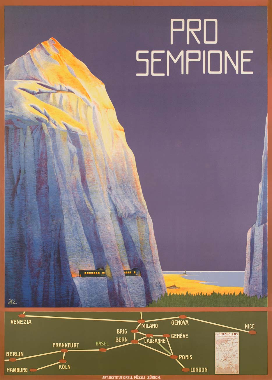
These maps could not only be highly distorted and stripped of geographical features, the usual orientation to the north was also abandoned sometimes. The map on a beautiful 1913 poster by Hans Heggimann for the Simplon railway is facing south, and the north-south axis is highly compressed. As a result it was not easy to understand, despite its simplicity. An even smaller geographically correct map was apparently added later to solve this problem!
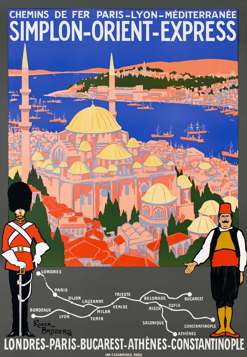
Over time route maps broke out of their little boxes to become an integral part of the main image, albeit still modest in size. On a 1921 poster by Roger Broders for the new Simplon Orient Express, the map is incorporated in the grey border area, which also includes a British and an Ottoman guard.
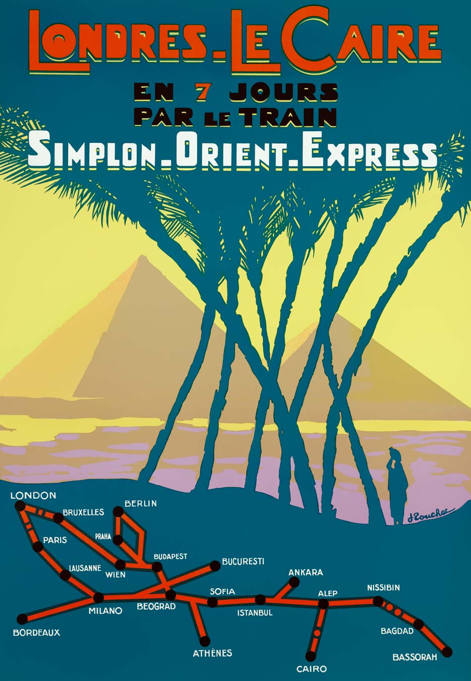
Ten years later the map had a natural place in the scene on a poster for the same luxury train — now with connections to the Middle East. A simplified map can be deceptive: the red line appears to run from London to Cairo almost uninterrupted; in reality, five trains, three ships and a bus were involved.
Cartography is nothing if not a series of editorial decisions about how to represent content. What is included or omitted is a compromise between the mapmaker's skill, the constraints of organization, and, occasionally, political agendas...
Incorporating maps on posters blurs the distinction between being simply informative — helping riders locate their destinations — or purely decorative. The most effective are those that combine the two, managing to function as attractive but useful publicity vehicles.
Posters with maps
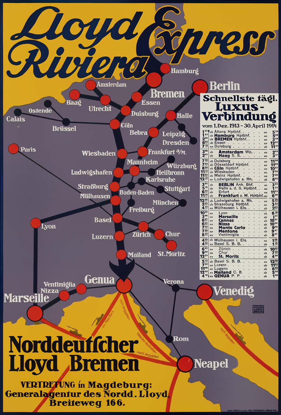
The earliest poster with an abstracted map as its main motif dates from 1913 and looks very modern. The minimalist Plakatstil reveals its German origin. It showed the route of the combined Lloyd and Riviera Express to Genoa, where steamships of the Norddeutscher Lloyd departed for intercontinental destinations.
From the late 1920s onwards many railway posters prominently featured a large simplified route map, usually combined with an aesthetic image of a train or landscape in the background.
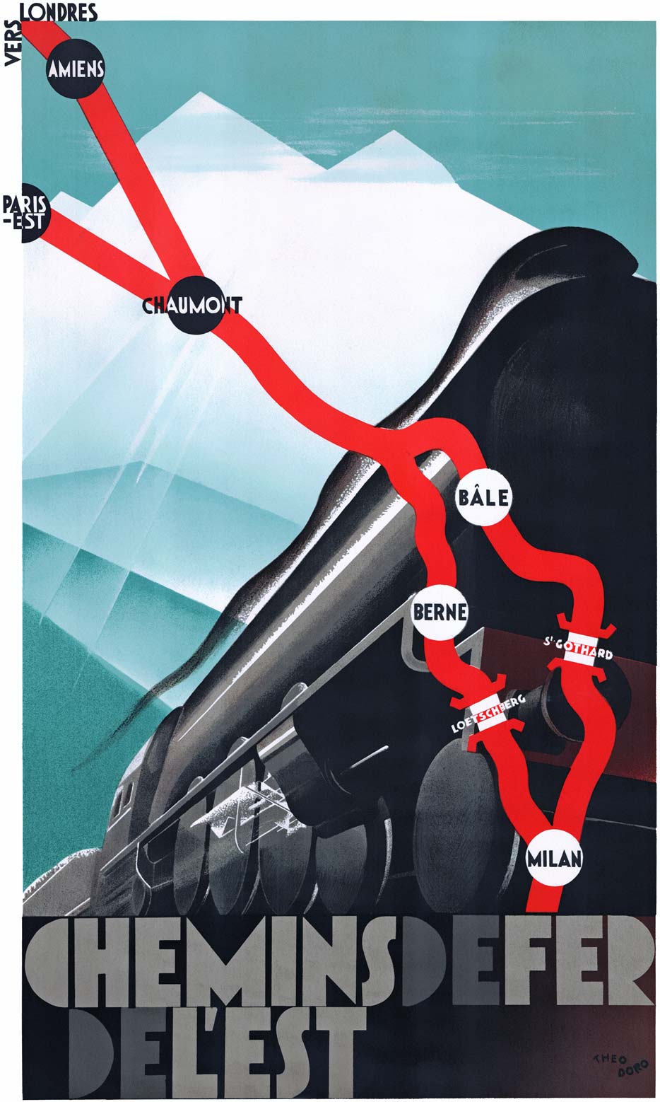
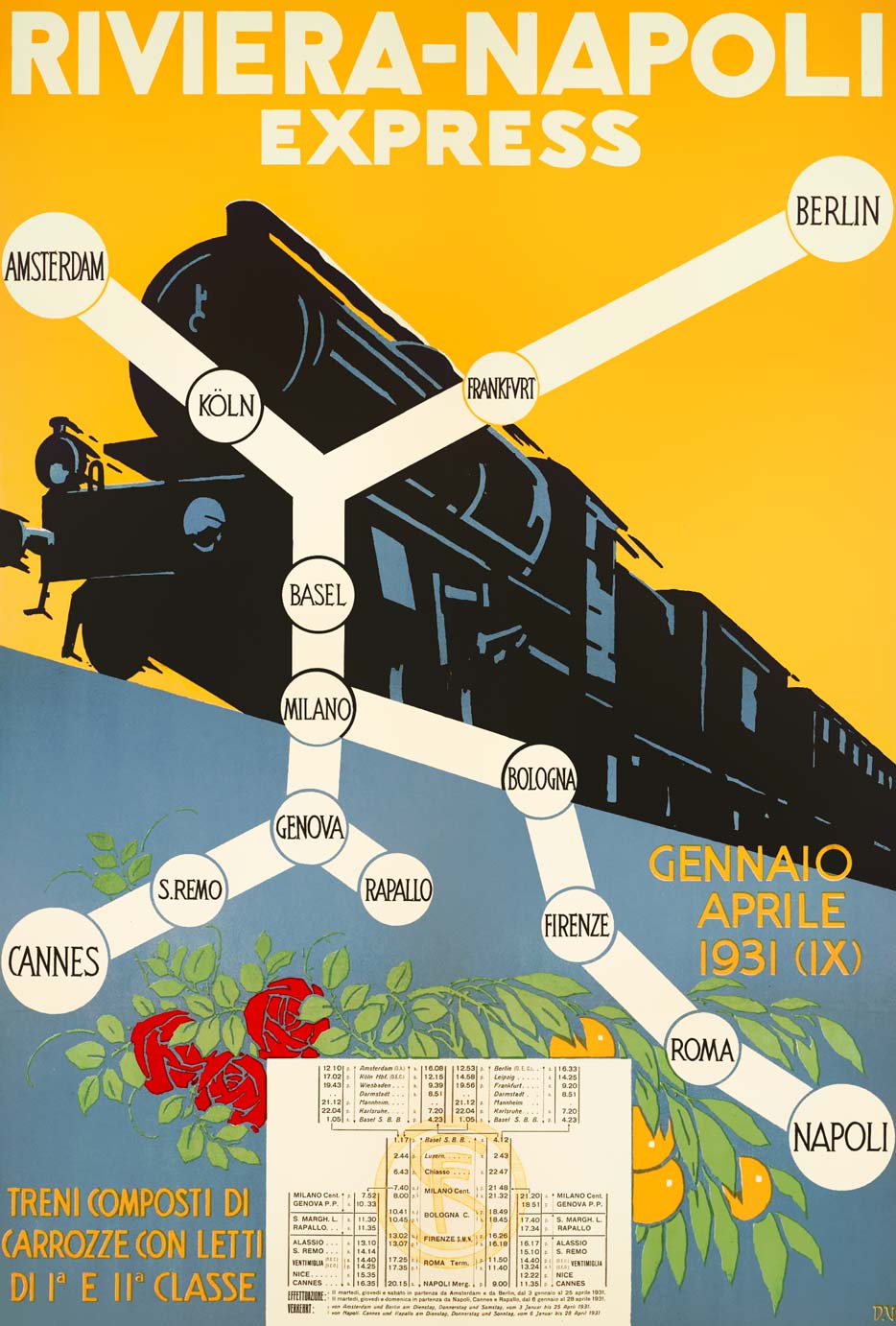
On the French Est railway company's poster by Theo Doro (1896-1973) the smooth, organic lines stand out, while abstracted maps usually were rectilinear. The color scheme and diagonal perspective seem indebted to Cassandre. The indications of the Lötschberg and Gotthard tunnels are elegantly designed, as is the top left reference to London. The straight lines and plump circles on an Italian poster for the Riviera Napoli Express look less subtle, although the colors absolutely breathe a Mediterranean atmosphere.
Folders and brochures

In addition to posters route maps were used in travel folders. The more complicated the journey, the more simplification was needed for travelers to get a grip. That certainly applied to the many variants of the Orient Express, and the connecting Taurus Express to the Middle East that started in 1931. Despite several transfers, crossings, and car or bus transport in parts of Syria and Lebanon, the journey looked like a continuous line on the leaflets of train operator Wagons-Lits.
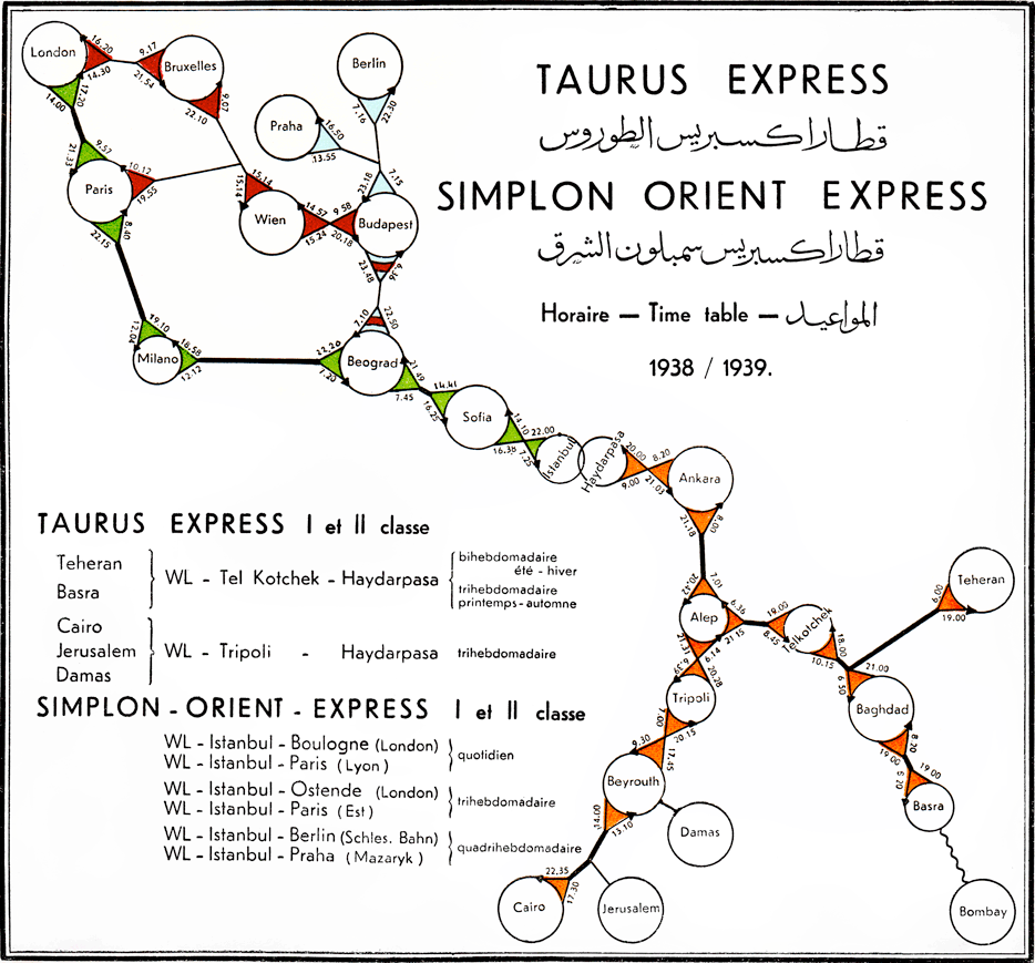
A time table from 1938 not only shows the route and destinations, but also departure times. Circles with small arrows around cities — from London to Bombay! — allowed to indicate both directions. Inventive as this scheme may be, it is not very easy to read.
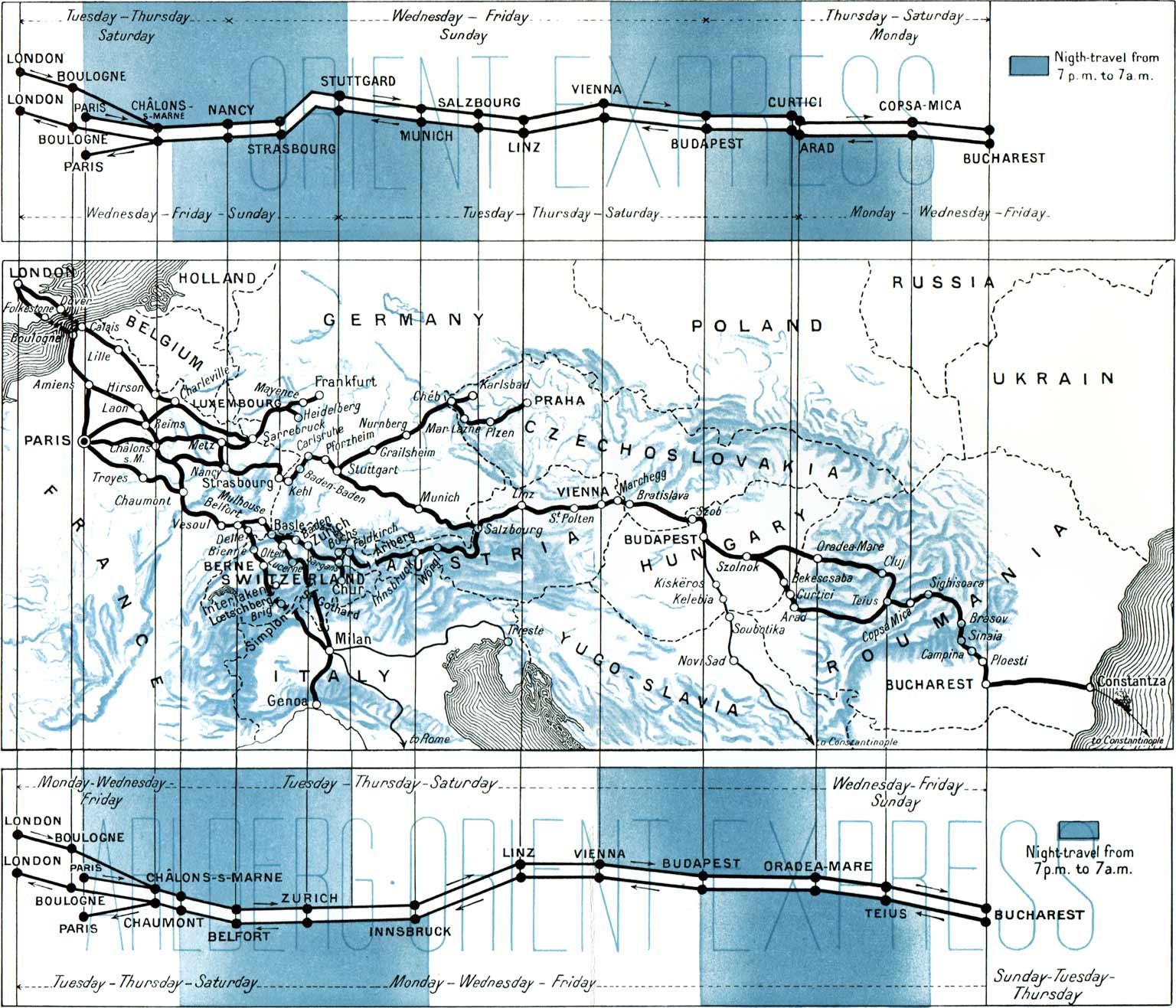
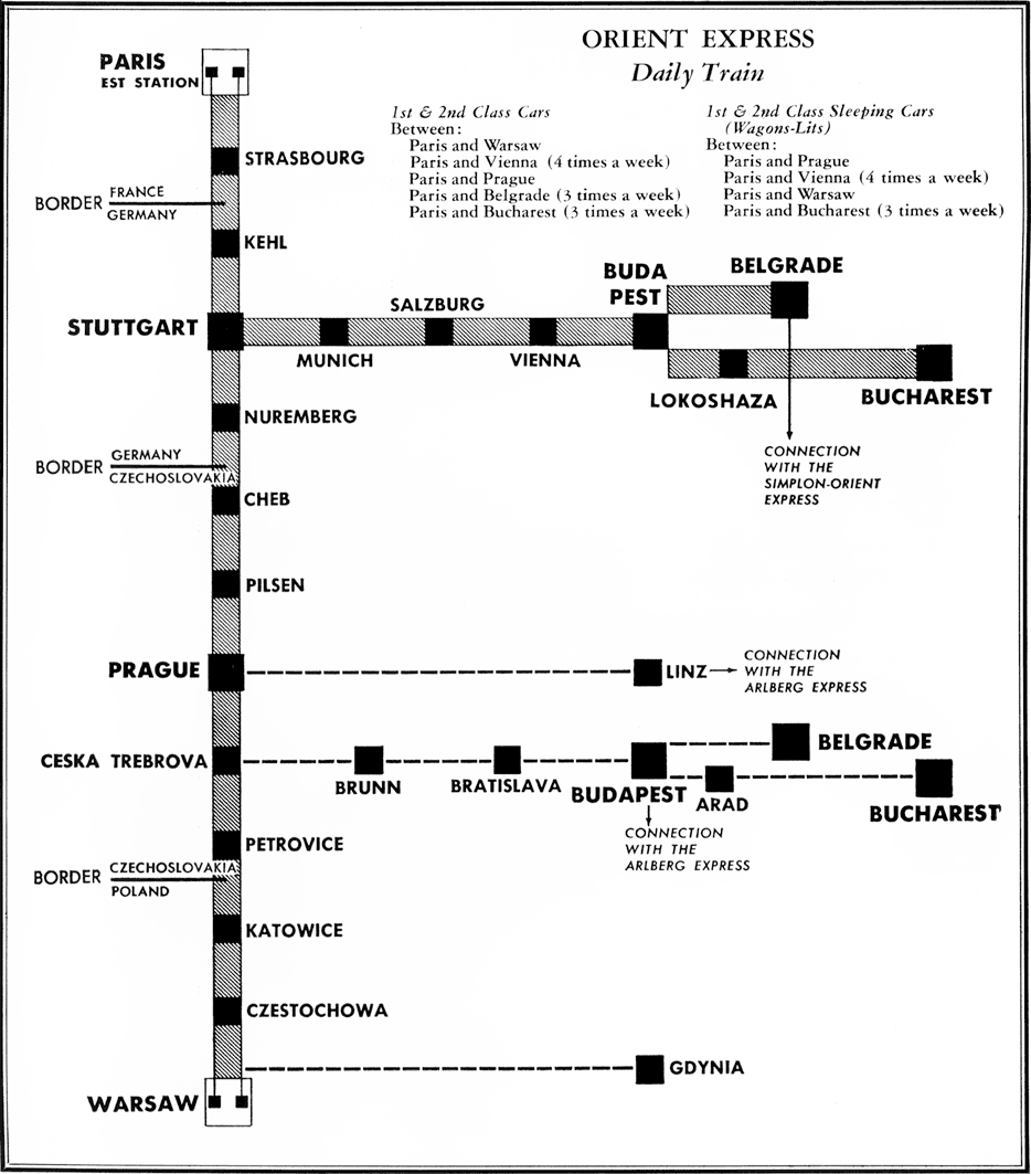
The 'classic' Orient Express did not run to Istanbul anymore after the introduction of the Simplon Orient Express, but still connected Paris to Bucharest. This also applied to the Arlberg Orient Express, running on a slightly different route. A 1931 folder for this train pair features an interesting combination of a traditional route map and schematic versions. The same cities in the different views are connected by explanatory lines.
Shortly after the war a brochure titled Through all Europe from Paris by the French Railways further increased abstraction. It represents the route of the Orient Express in such a minimalist way that it is more a diagram than a map. Such simplification was indeed necessary to make the many branches and connections comprehensible.
Metro-like maps
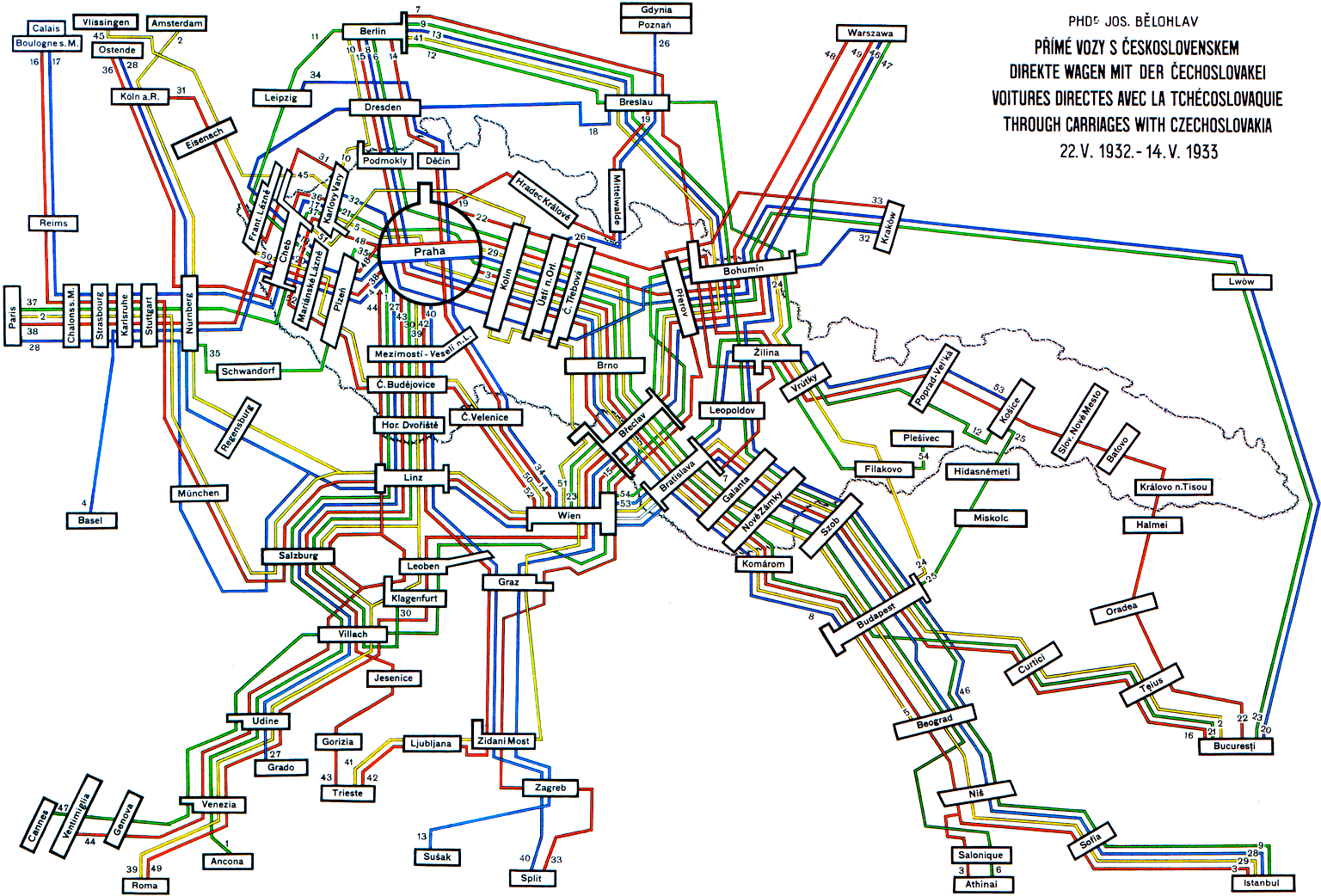
Almost simultaneously with Beck's London Underground Map, as if the time was ripe, similar railway maps of international connections were developed. Especially striking was the use of parallel lines to indicate distinct connections on the same route, and the application of different line colors. An early example is the Through carriages with Czechoslovakia scheme in the lavishly printed International services of the Czechoslovakian Railways from 1932. A 'magnifying glass' emphasizes the capital of Prague.
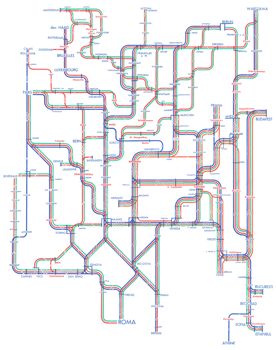
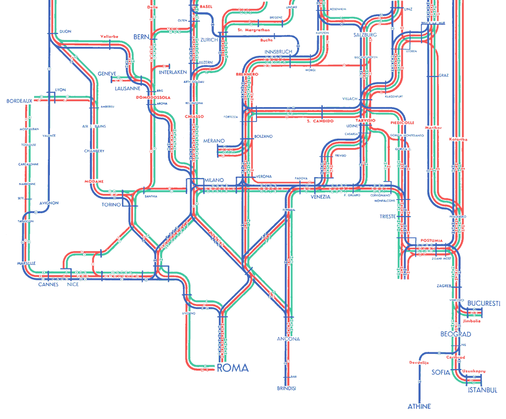
In 1938 the Italian State Railways published a graphic index of international connections. The curves of the 90 degree-angles make this map look very beautiful. The colors indicate carriage passenger classes, with blue referencing sleeping cars. Perhaps the designers went too far in omitting geography: just as Beck had included the river Thames, the coastline of Europe could have been a useful reference.
Maps as posters
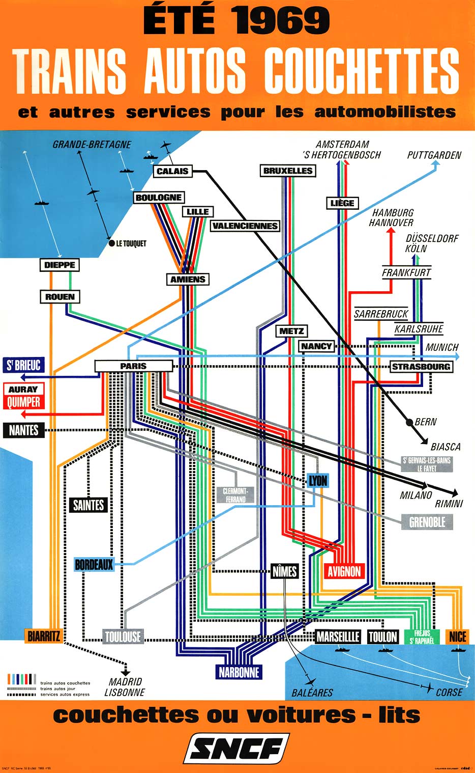
After 1960 railway posters became more minimalist under the influence of the modernist International Style. On many posters typography was central, while figurative images were applied less. Diagrammatic route maps were a good alternative. The maps now served as the main motif, whereas before they used to be combined with a picture of a train or landscape. Abstract maps demonstrated the modernity of the railways and fitted well with the new, highly stylized logos of the British, Swiss and Dutch Railways from the late 1960s.
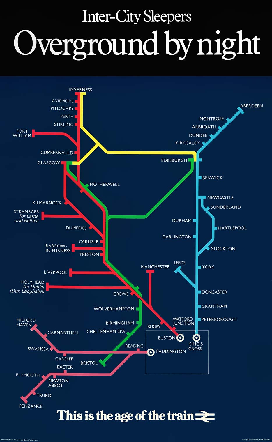
A poster by the French Railways of 1969 showed the network of trains auto-couchettes or car sleeper expresses within and departing from France. Despite its sleeper theme the colorful composition of lines does not convey a nightly atmosphere, in contrast to another example. In 1976 British Rail issued a poster for domestic sleeper trains, the Inter-City Sleepers. The routes were indicated in neon colors against a dark blue backdrop, like constellations in the sky. Similar posters for regular Inter-City services had maps on a white background.
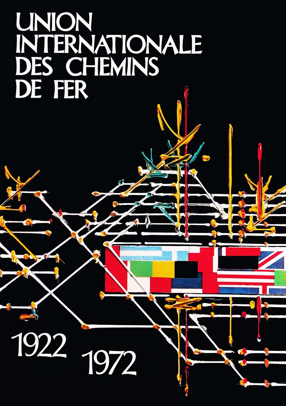
The aesthetics of abstracted maps, used as decorative elements rather than sources of information, were partly based on technical diagrams common to the railways. This becomes evident, for example, from a 1972 anniversary poster of the UIC International Railway Union. It shows a track diagram as used for switchboards in signal boxes. Artist Georges Mathieu painted it with thick brushstrokes, giving the sober diagram an unexpected picturesque appearance. This foreshadowed David Booth's famous poster The Tate Gallery by Tube of 1987.
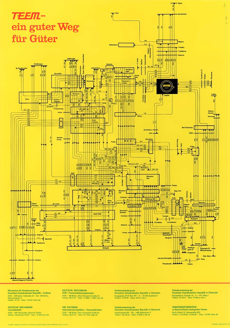
An interesting poster image can also be achieved by using an existing technical or organizational diagram as it is. An example is a 1975 German poster for the TEEM, the Trans Europ Express Marchandises (goods transportation). Although probably incomprehensible to outsiders, and certainly not readable in a few seconds while passing by, such a chart demonstrated that the railways ran like a high-tech and well-oiled machine.
