Plain elegance
Railway posters by Leo Marfurt and Tom Purvis
 Nederlandse versie
Shortly before 1930, railway posters with attractive travel and leisure scenes, composed of simple shapes and solid colors, appeared in both the United Kingdom and Belgium. There were many similarities between the posters of Tom Purvis and Leo Marfurt. The designers knew each other's work, but it is unknown whether they influenced each other knowingly.
Perhaps the spirit of the times, the late Art Deco period, sent both designers in the same direction. Marfurt mainly pictured passengers on platforms, while Purvis showed leisure activities at their holiday destinations, such as the British East Coast. Both managed to catch the clothing and hair fashion of the late 1920s in two-dimensional planes.
Leo Marfurt
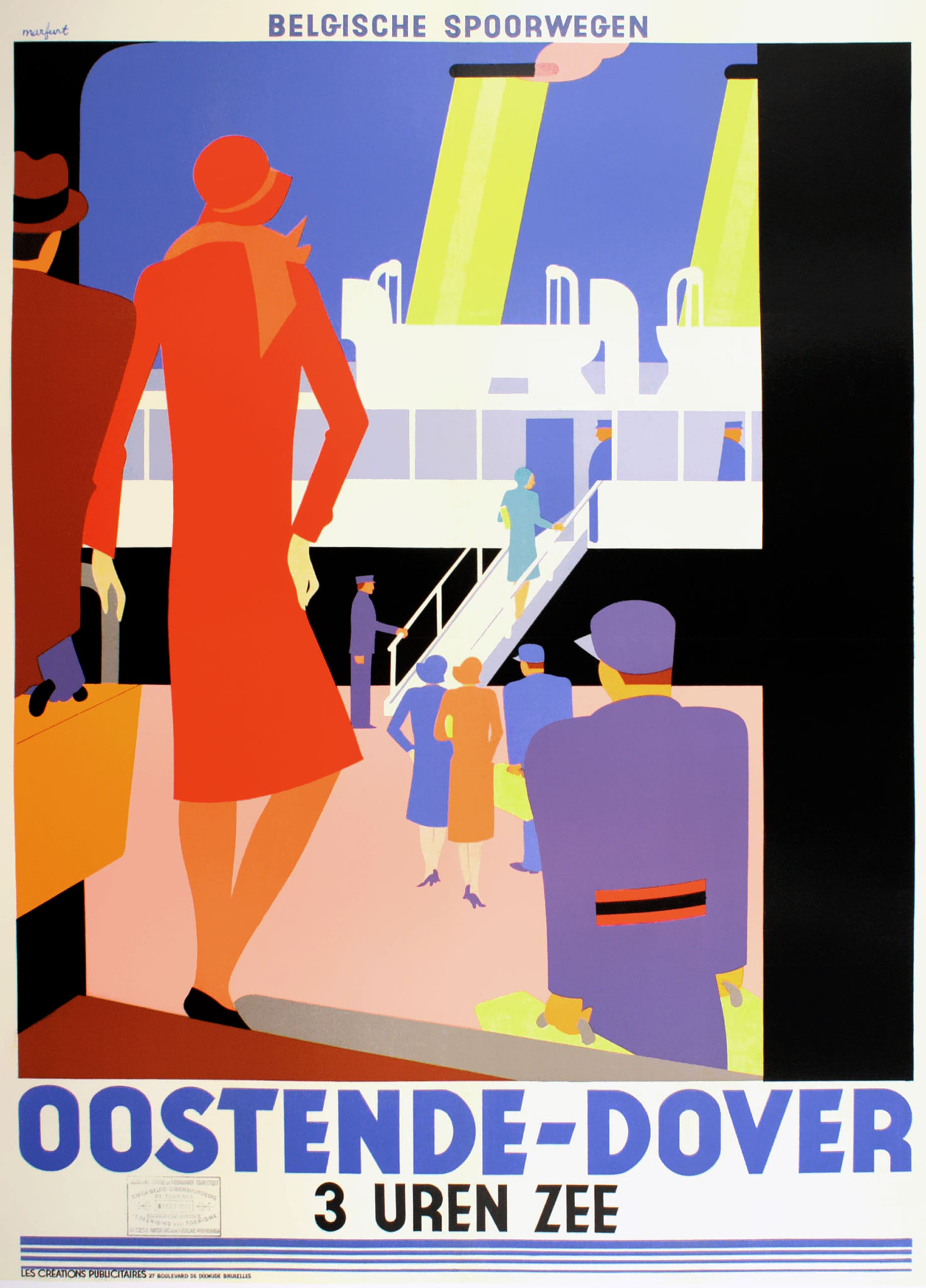
In 1928 two strikingly colorful posters were displayed in Belgian stations. One of them was advertising the Ostend-Dover ferry link, a 3-hour sea passage by turbine ship. At the Ostend Maritime station passengers could easily transfer to and from trains reaching all of Europe.
The seemingly simple image consists of highly stylized shapes without any depth. The colors are bright and fresh with no gradients. The fashionable passengers, seen from the back, are shown as silhouettes. The transport transfer is presented as very streamlined; subservient staff is abundant. The black contours of the train's door blend seamlessly with the ship's bow.
The poster was designed by Leo Marfurt, a Swiss who had been working in Belgium for several years and broke through as an innovator of the Belgian poster, as Cassandre was in France. Both aimed to achieve maximum impact with minimal means.
In 1927 Marfurt also created the poster Les Grandes Communications (The Great Connections) for the Belgian railways. It visualized the many international railway connections in Belgium, especially starting from Ostend.
The upper half shows the bustle before the departure of a train from Ostend to Stamboul (Istanbul), depicted in flat silhouettes with bold colors. Despite the simple shapes some nice details are visible: a magazine trolley, a luggage porter and elegantly dressed passengers waiting for each other or saying goodbye, their scarves waving in the Ostend sea breeze. Facial details such as eyes and mouth are omitted.
The schematic map with lines in different colors is reminiscent of public transport maps like the London tube map. Along the lines, names of international trains such as the Ostende-Wien-Orient-Express of the Wagons-Lits company, are indicated. During summer, the Belgian railways also offered their own carriages to Istanbul, which were linked at Cologne to a regular train to Vienna and beyond. Perhaps one of these was displayed on the poster.
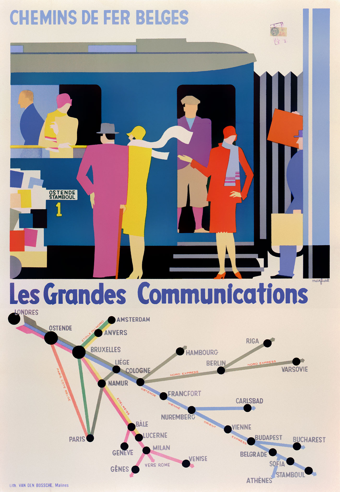
In many stations of our country a modern poster is on display, showing a 1st class carriage with the inscription Ostend-Stamboul. Travelers are boarding; their attire and posture clearly show us they are very modern. With this description, our readers who have not yet seen the poster, are only half aware of the whole significance of this famous placard issued by the Belgian railways.
At the bottom of the poster, explained above, a map is depicted. We can see Paris, Amsterdam, London, Geneva, Bucharest, Riga, Warsaw, Constantinople, etc. etc. Regarding the Belgian cities (as the poster is from a Belgian company) all we can find are… Brussels, Antwerp, Liege, Namur and Ostend. There is no trace of the fourth largest city of Belgium, its second port.
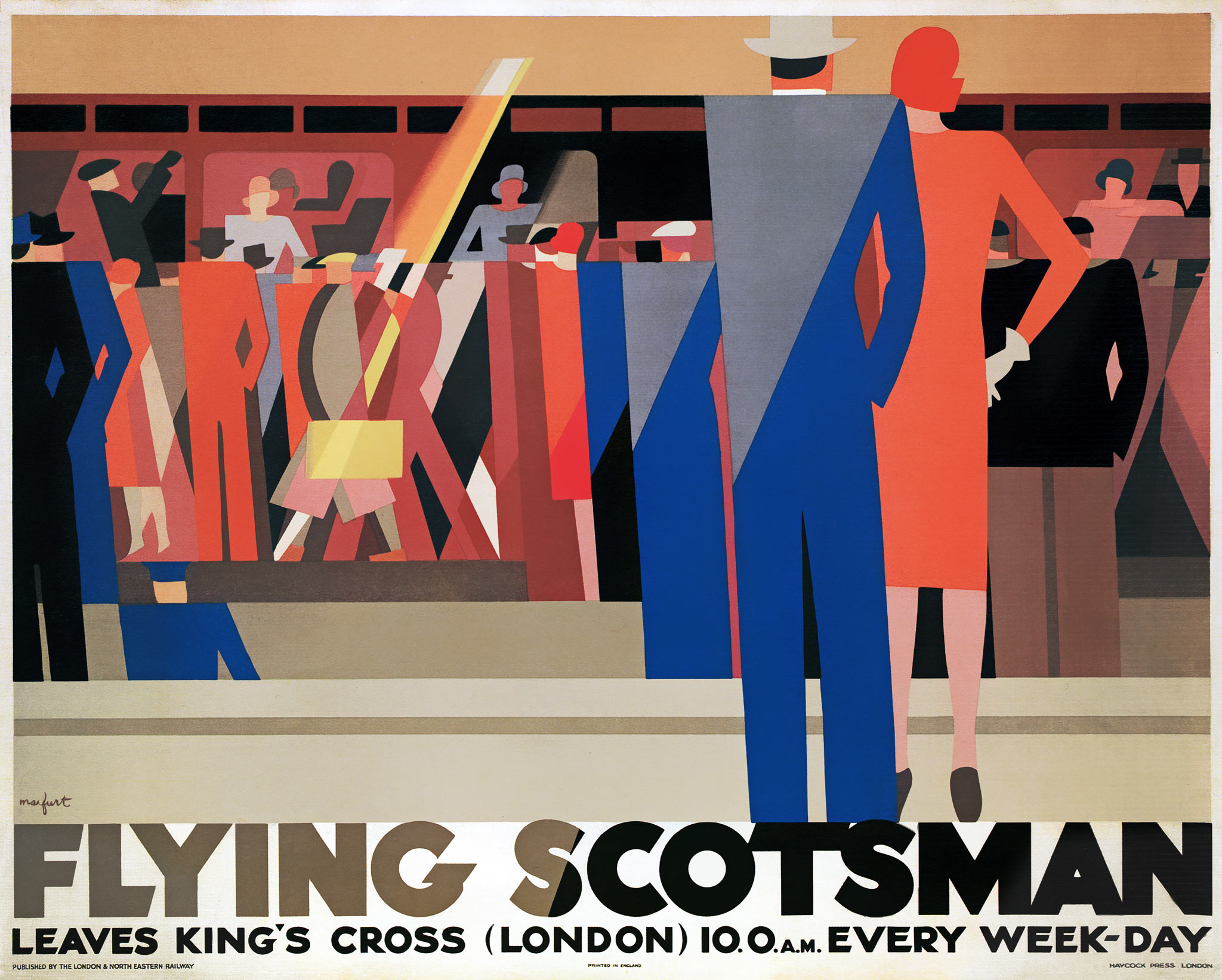
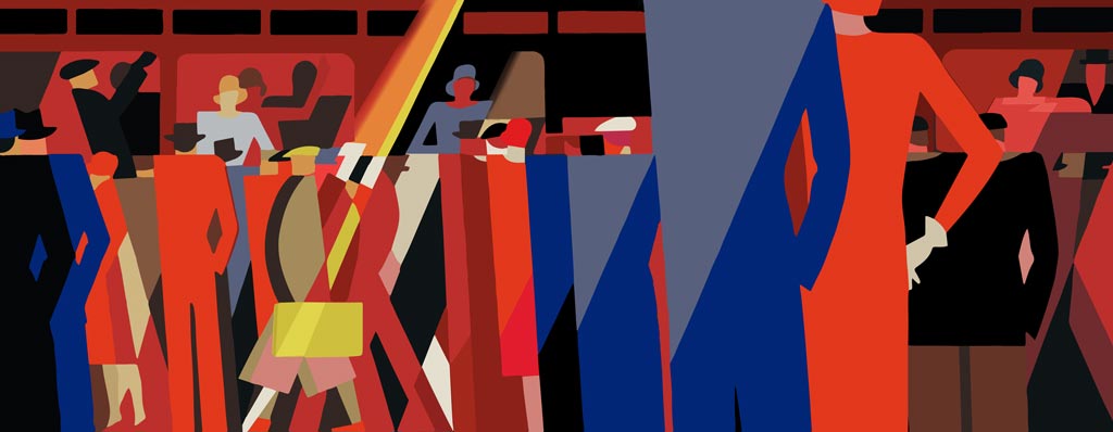
After winning the design contest for the poster of the 1930 Antwerp World Expo — and perhaps also because of the English version of the Ostend-Dover poster — Marfurt attracted attention in Britain. The LNER railway company commissioned him for a poster of their flagship: the Flying Scotsman. This fast London to Edinburgh train with onboard restaurant, bar and hairdressing salon aimed at a well-heeled audience. Marfurt created a unique poster, probably his best design ever.
The motif was similar to the earlier Ostend platform scene: the excited crowds just before departure. Though also composed of flat shapes, the execution was very different. Inspired by Cubism and Futurism — art movements Marfurt had studied during his training and travels — he dissected the figures to geometric shapes.
Marfurt also combined front and side views in one single image, just as Picasso had done. Parallel diagonal lines — including a light beam — added rhythm to the composition.
The dynamic poster was very well received. In 1929 it was displayed at an exhibition of 100(!) new LNER posters in the London New Burlington Galleries. Reviewers from Britain and abroad, including the influential magazine Commercial Art, called Marfurt's Flying Scotsman one of the highlights. The famous British poster artist Tom Purvis, who also worked for the LNER, included Marfurt's poster in his Review of poster advertising in 1929.
Tom Purvis

The London and North Eastern Railway (LNER) was formed in 1923 by the merger of several railway companies along the British East Coast. It was one of the first companies with a deliberate corporate identity. The in-house art director William Teasdale developed the special 'LNER Look'. It included a logo, the custom Gill Sans font and fixed formulas for slogans and text-image ratio.
In 1927 the LNER signed exclusive contracts with 5 poster designers. They were given regular assignments and generous benefits, but were not allowed to work for other railway companies. As a result the LNER look was secured. There was some labor division: Fred Taylor, for example, specialized in historic towns and Tom Purvis in holiday resorts. Taylor was most appreciated by the public, Purvis by colleagues and critics.
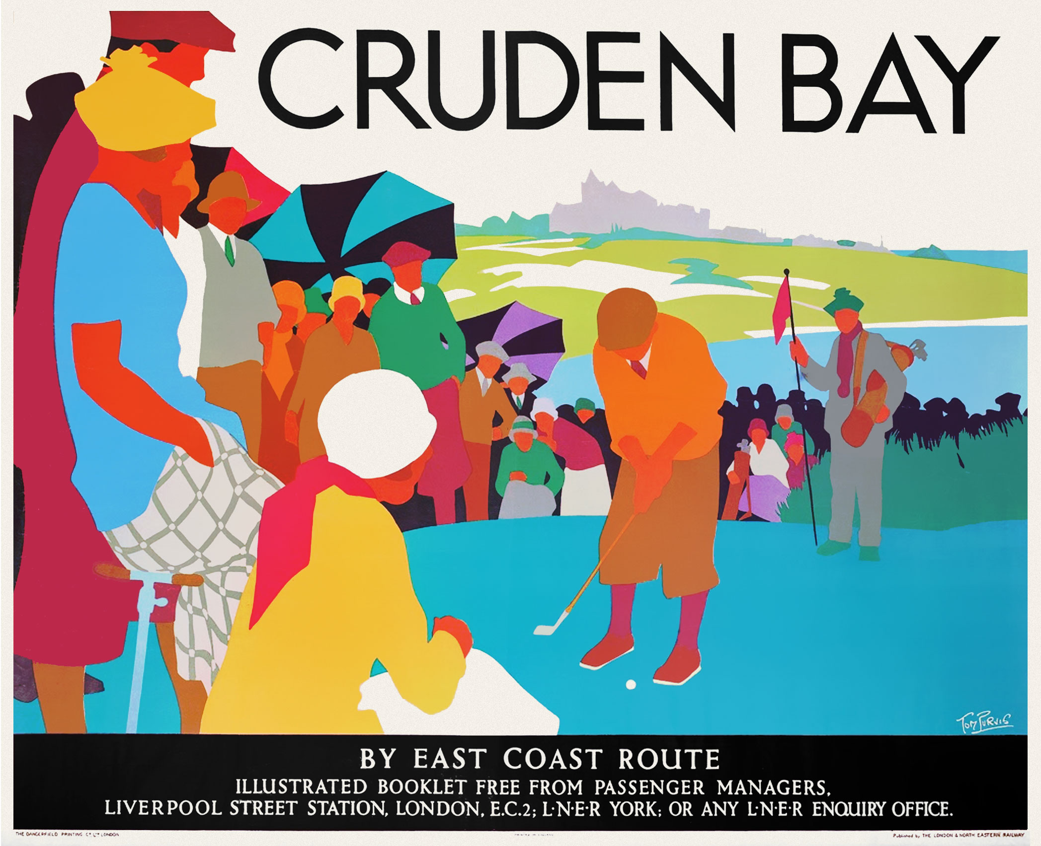
The LNER advertised destinations, not journeys. Purvis pictured no trains but resorts and leisure activities. Sports were central on posters for the Scottish golf resort of Cruden Bay and the Yorkshire spa town of Harrogate, where young people — cut-away figures on the white paper — played tennis in the park. Purvis also aptly captured the clothing; besides the LNER he also worked for the Austin Reed fashion brand.
Purvis specialized in eliminating detail. By reducing everything to simple silhouettes in intense colors he created vivid mosaics. His bold style was ideally suited for posters: they were visible from far and easy to read. But behind the simplicity of his designs, Purvis brought to bear impressive graphic skills and a refined sense of proportion.
It is the work of the professional poster artist that is of more importance than occasional excursions by famous painters into the realm of decorative illustration. And of living poster designers none are better qualified than the specialists enrolled by the LNER: Tom Purvis, Austin Cooper, Fred Taylor, Frank Mason, and Frank Newbould — the "Big Five" of the poster world.
Tom Purvis is probably the boldest and most original of the group, and for this reason the ideal poster artist. He understands the value of elimination and of reducing every subject to its simplest forms, and bare essentials. His effective flat patterns explain themselves in a flash.
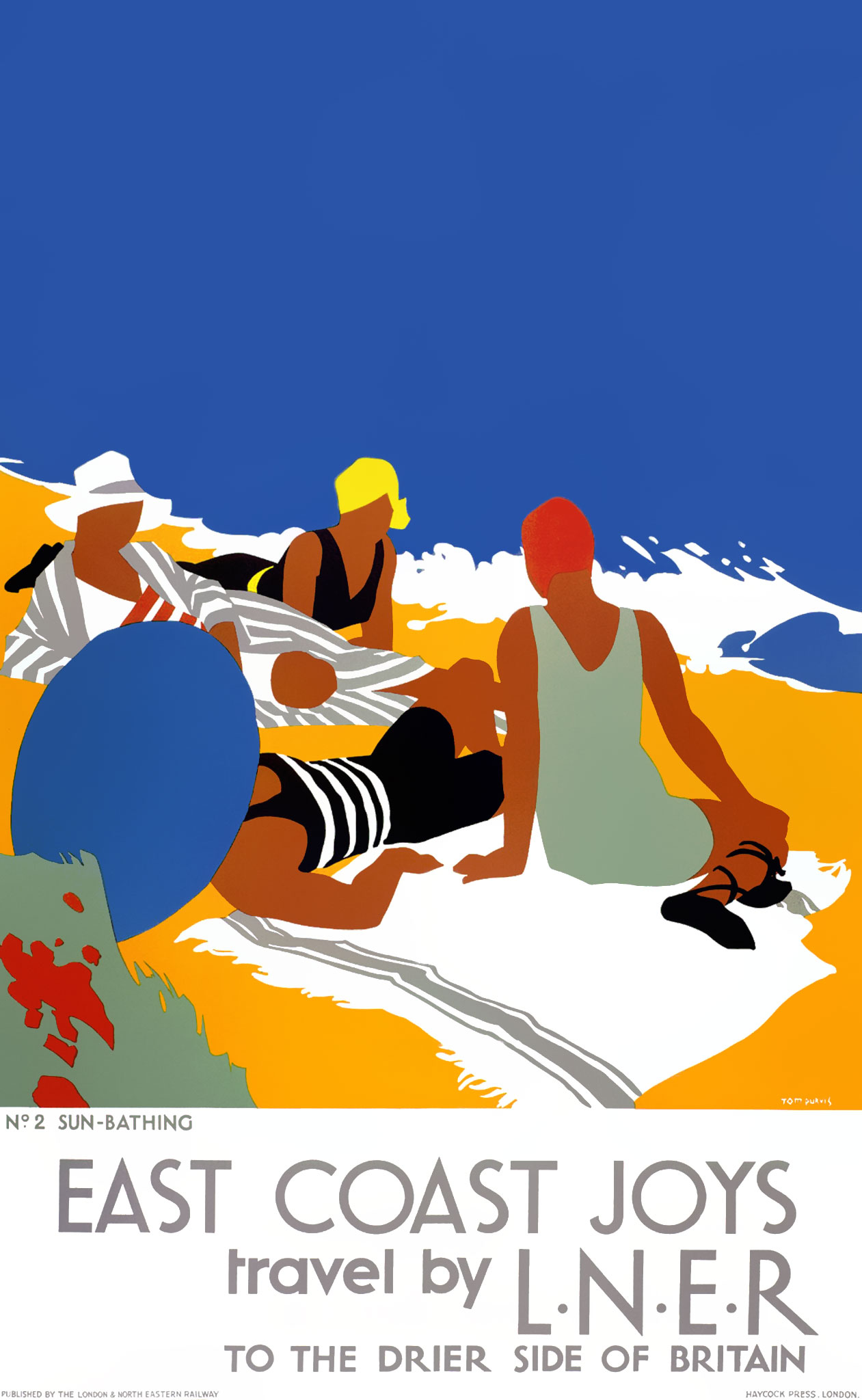
Through its advertising the LNER partly invented tourism on the British East Coast. With the slogan The drier side of Britain and posters in Mediterranean colors the fact was hidden that the beaches of Essex, Suffolk, Lincolnshire, Yorkshire and Northumberland were not only the driest but also the coldest.
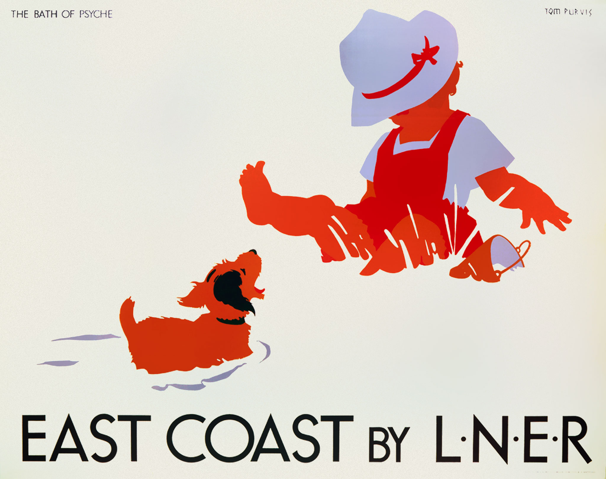
Tom Purvis helped to define the popular image of the East Coast. He designed several posters, including one of a child and a dog on the beach that he named The Bath of Psyche after the painting by Frederic Leighton. This was an indication that he valued advertising design as highly as art.
He also created a unique set of six posters that could be used both separately and side by side, forming a single continuous landscape. The LNER had displayed posters by the same designer next to each other at stations before, but Purvis brought this concept to a higher level. Separate or combined, the East Coast Joys series (1931) showed what to do along the coast in a relaxed style: walking tours, sun bathing, building sand castles ('safe sands'), sea bathing, fishing and boating ('sea sports').

Continuation
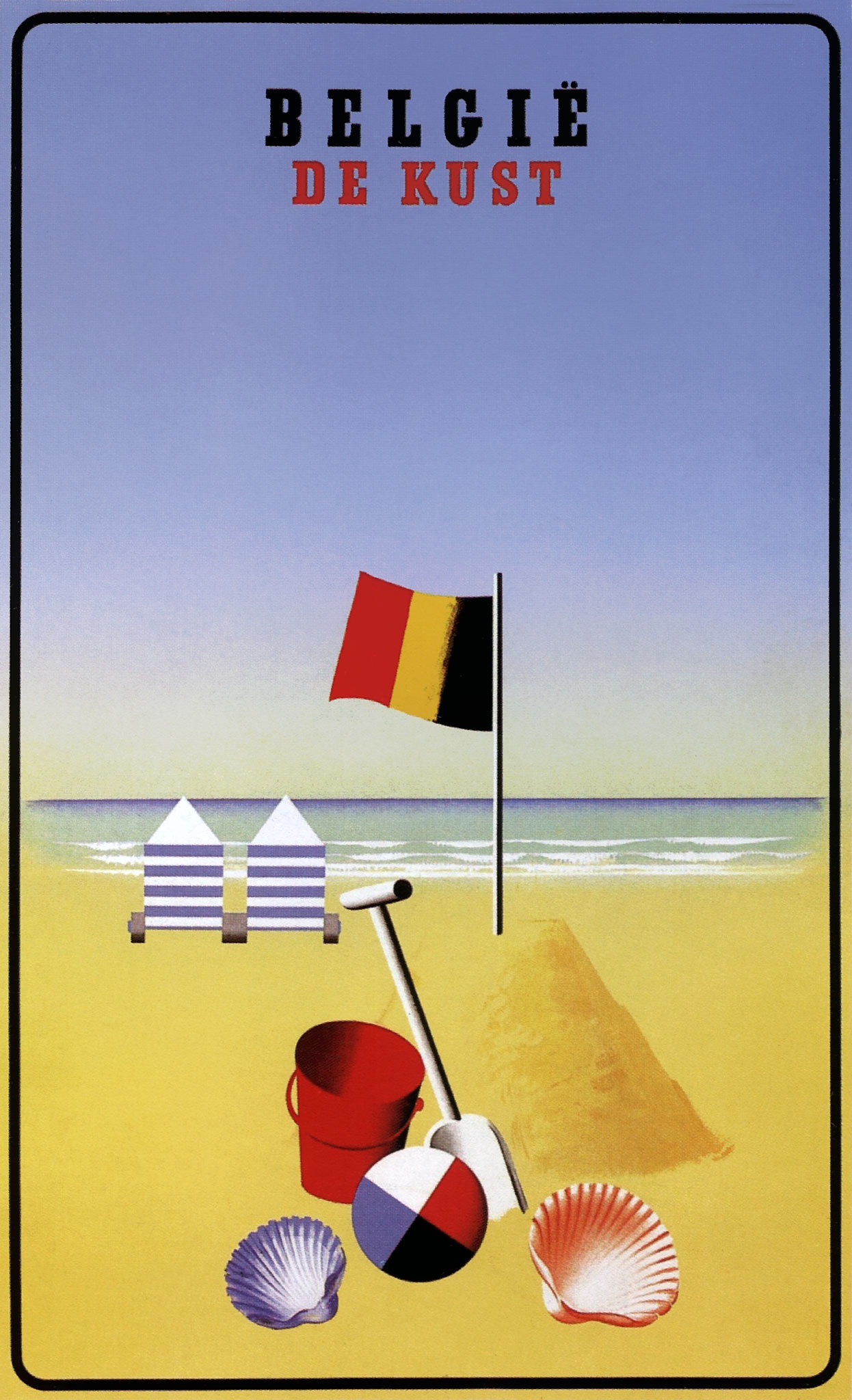
To both Tom Purvis and Leo Marfurt, the use of two-dimensional color surfaces without detail was a passing phase, probably under the influence of design fashions. For Marfurt the 3 railway posters were the only ones with a strictly flat style, but simple shapes and bold colors always remained important to him. After several designs with dark backgrounds and thin white lines he created colorful posters again, now with shading and subtle color gradients, as in the 1938 poster for the Belgian coast.
Purvis applied the 'flat style' until 1935, but not in all his posters. Slowly more and more details appeared in his designs, such as faces and shadows — still mostly as flat color areas, but suggesting depth nevertheless. On the nice 1937 Coronation poster the perspective is even a main characteristic. He continued to use bold shapes and bright colors.
