Die Winterreise
Snowy railway posters
 Nederlandse versie
Trains are the ideal transport mode in winter: mostly unaffected by slippery conditions and strong enough to withstand snowstorms. Railway companies advertised these characteristics on their winter posters, but even more often they promoted winter sports destinations. Especially when cars were still less reliable and flights too expensive, the train was the preferred means of transport to ski resorts.
Snowy railway posters from the beginning of the 20th century onwards from all over Europe not only show that ski fashion changed and trains became electric. The design styles also evolved, with the photo poster eventually prevailing.
[Early winter sports]
The first winter sports posters appeared around the turn of the last century. Alpine skiing, originating from Scandinavia, was introduced in the Alps to attract tourists in winter as well. The Swiss town of St. Moritz had its first skiing season as early as 1865, initiated by the Kulm Hotel. It took some time before it really caught on. Winter sports were the domain of the well-to-do who were having winter holidays anyway, on the French Riviera for example. By 1913 hotels in Swiss ski resorts boasted around 200,000 beds.
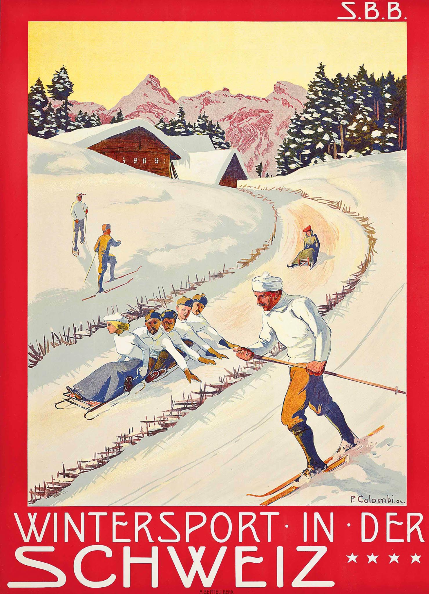
Posters were issued by hotels, tourist offices and local authorities, but also by railway companies. In Switzerland, private mountain railways such as the Rigi Bahn promoted specific winter destinations. The national Schweizerische Bundesbahnen (SBB), founded in 1902, issued general winter sports promotions, such as the 1904 poster by painter and graphic artist Plinio Colombi.

The k.k. Staatsbahnen, the Austrian state railways, commissioned Alpine painter and mountain climber Gustav Jahn to create a poster for the Arlberg region in 1907. The Ski-Club Arlberg was established a few years earlier in Sankt Anton at the foot of the Arlberg Pass. The Arlberg Railway offered excellent international connections, as a small map at the bottom of the poster indicated. Remarkable on these early ski posters is the use of only one ski pole. The so-called Arlbergtechnik with two poles, which originated in this region, would only become mainstream from 1920 onwards.
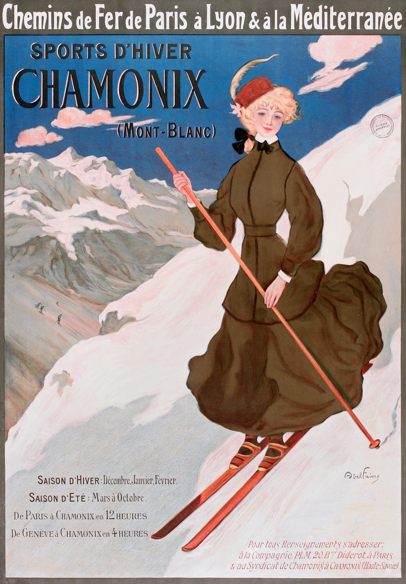
Before World War I, trains were rarely depicted on winter sports posters, but the names of railway companies featured in large letters. In France the Paris-Lyon-Méditerranée (PLM) provided the main connection between Paris and the Alps. The journey from the Gare de Lyon in Paris to Chamonix near the Mont Blanc took 12 hours. The 1905 PLM poster by Abel Faivre shows that wearing a long dress and an elegant hat apparently was no obstacle for skiing.
Bon voyage, bonne neige
After World War I winter sports were revived to unprecendeted heights during the roaring twenties. A major boost was the introduction of the Winter Olympics in 1924, held for the first time in Chamonix-Mont-Blanc and four years later in St. Moritz. A new rich elite from Paris and London headed out to the snow. Equipment and facilities improved, ski clothing became more fashionable. Women could now wear pants and sweaters and have short haircuts.
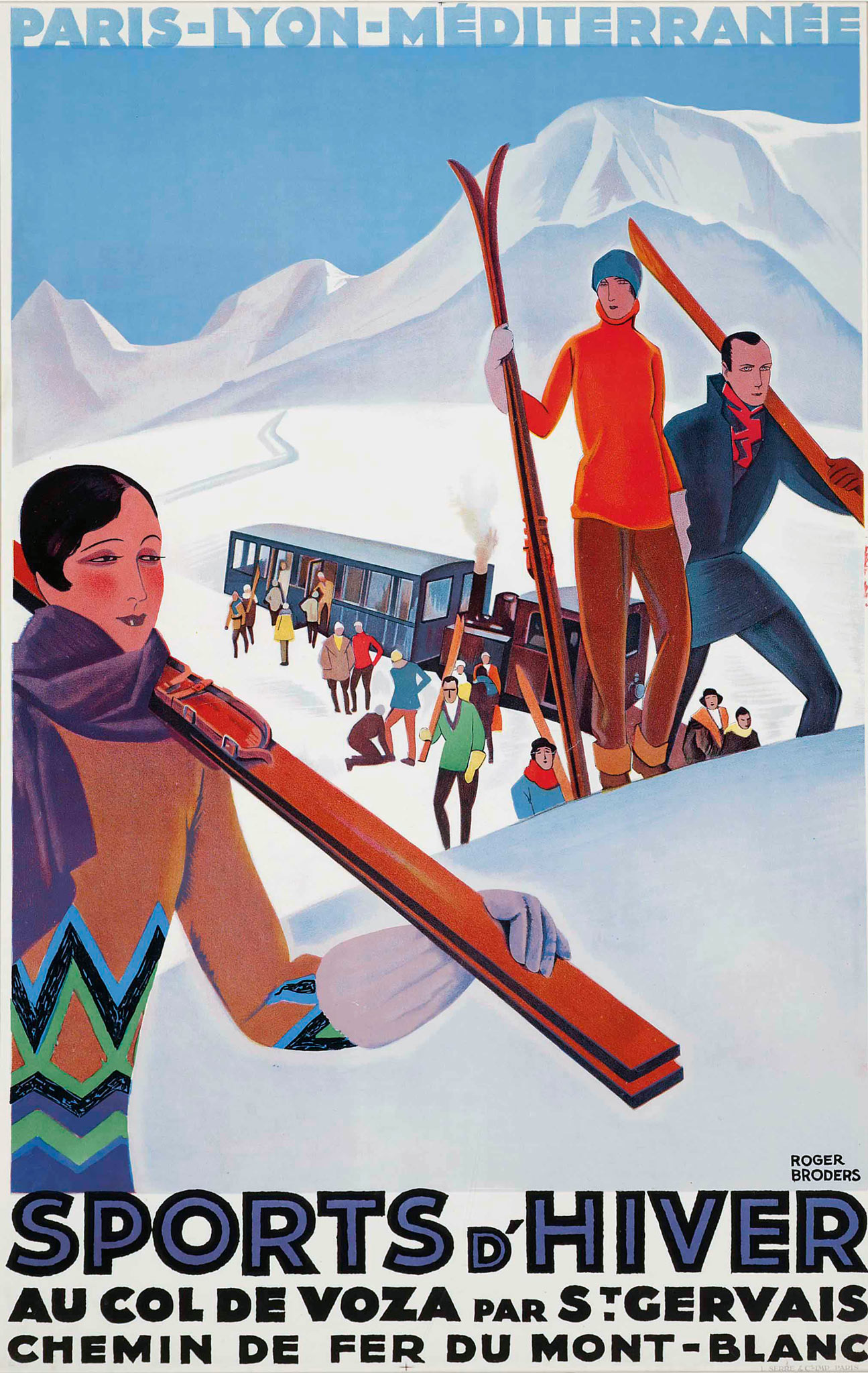
Between 1922 and 1932 poster artist Roger Broders worked almost full-time for PLM, the main French railway carrier to the Alps. This resulted in dozens of colorful Art Deco scenes of beaches on the Côte d'Azur and fashionable winter resorts in the Alps. One of his posters shows skiers at the Col de Voza with the Tramway du Mont-Blanc, which connected to the PLM station at Saint-Gervais.
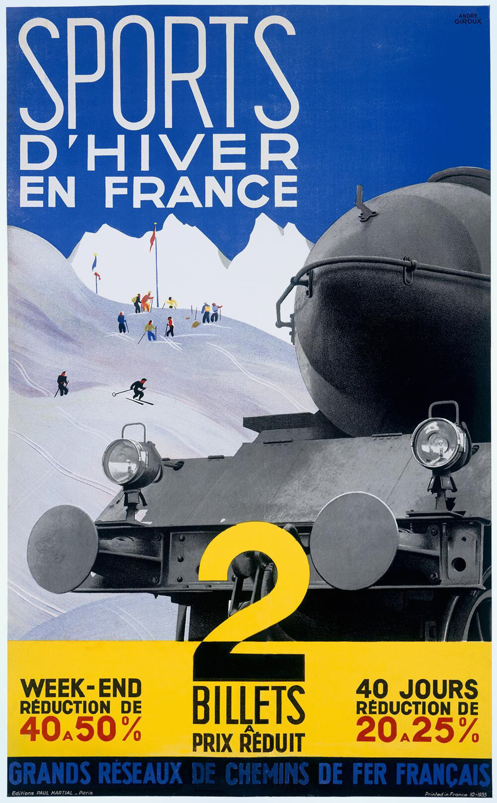
Around 1935 the various French railway companies, including PLM and Est, started to collaborate under the name Grand reseaux de chemins de fer francais. They issued a joint poster for discounts on train tickets to winter sports destinations. It was a photo montage with a painted background by designer André Giroux (1895-1965).
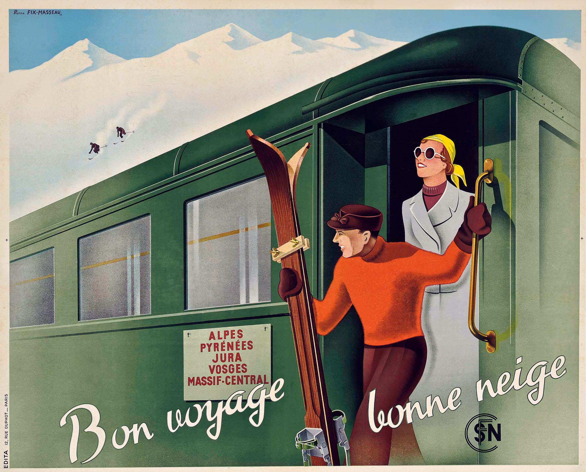
By 1938 the railway companies eventually merged into the national SNCF. In the same year Pierre Fix-Masseau created a large horizontal poster titled Bon voyage, bonne neige (good journey, good snow) for the new company. The itinery sign on the train included all five French winter sports destinations: Alps, Pyrenees, Vosges, Jura and the Massif Central.
Winterreisen mit der Reichsbahn
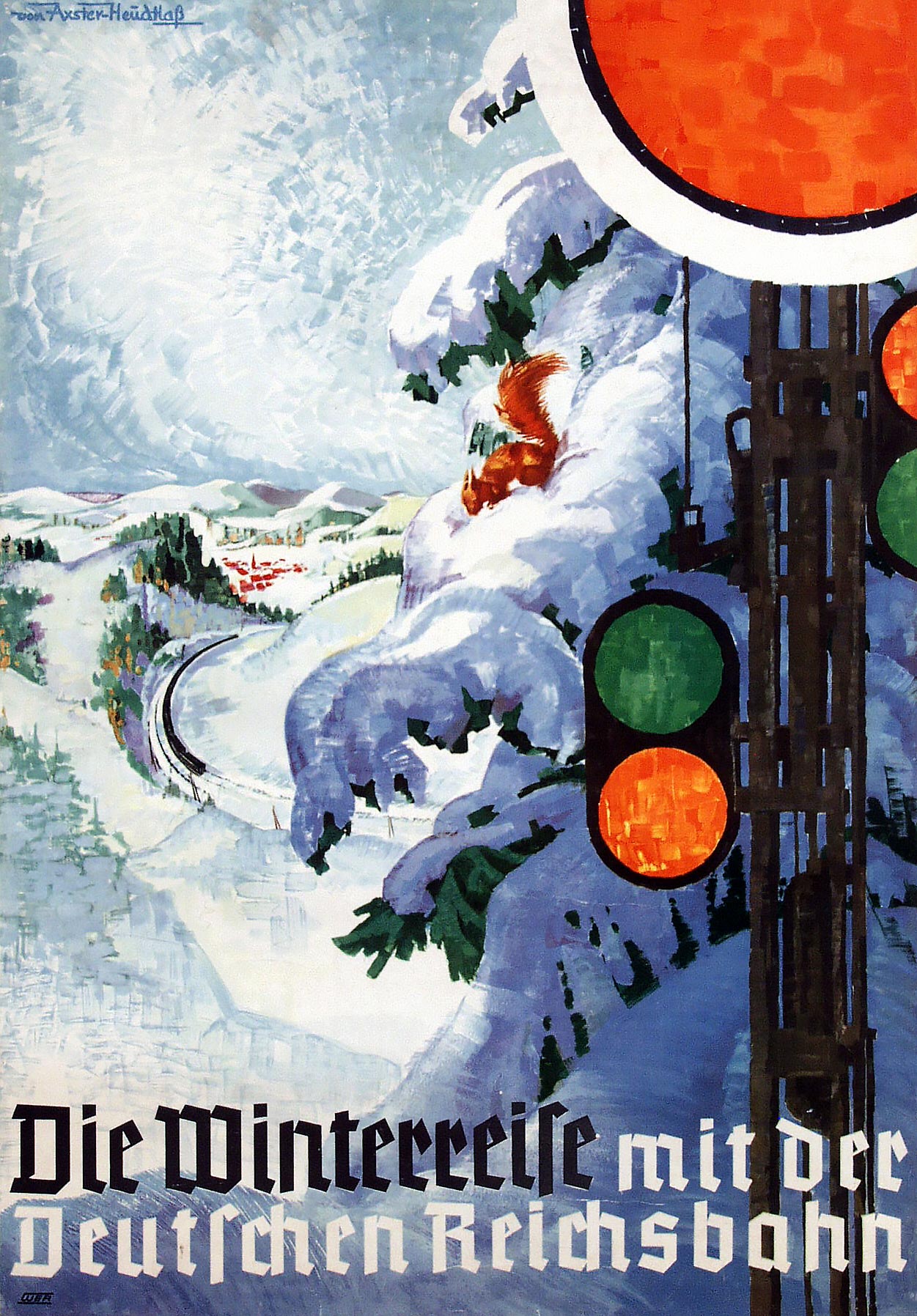
Apart from transportation to winter sports, the train was also a reliable and comfortable option for winter travel in general. In Germany, Werner Heudtlaß (1898-1949) and his wife Maria von Axster (1884-1966) created Die Winterreise mit der Deutschen Reichsbahn around 1936. The colors green and red of the semaphore, although a modern element, went well with the romantic winter scene in the background. The designers selected the pseudo-gothic Tannenberg font by Erich Meyer, which was widely used in Nazi Germany. In fact Atelier von Axster-Heudtlaß designed a lot for the Hitler regime, including the 1939 poster Räder müssen rollen für den Sieg (wheels must roll for victory).
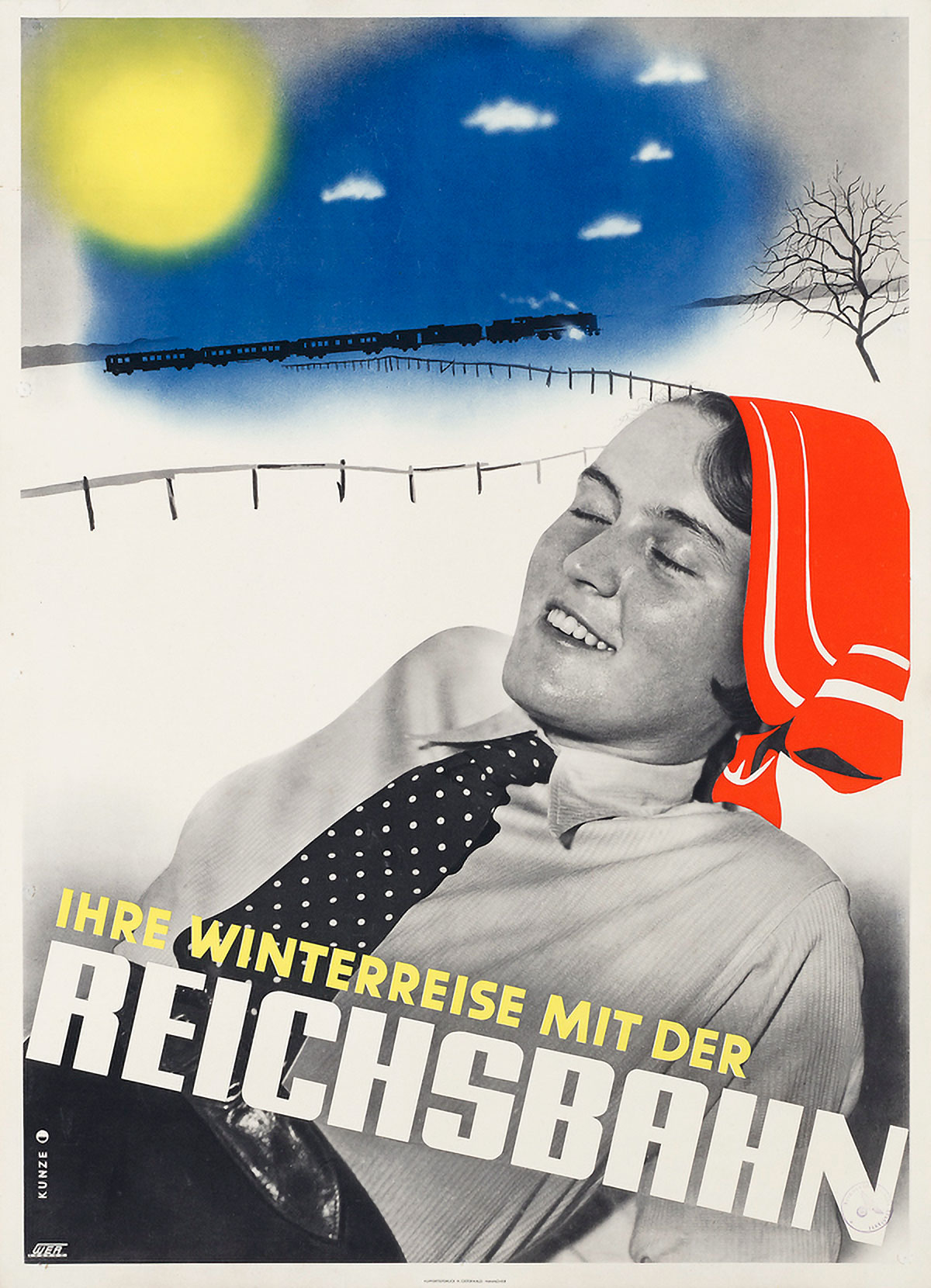
Not compromised by Nazism (as was officially established later) was young designer Willi Kunze (1914-?). He created contemporary designs for the Reichsbahn in 1937. They were intended to radiate speed and reliability, and in the case of his Winterreise also enjoyment and comfort. He combined photo montages with watercolor, airbrush and collage elements, which was an international trend at the time. According to the multilingual magazine Gebrauchsgrafik, Kunze belonged to 'the foremost rank of those young, active, creative, commercial artists'. But later he was largely forgotten.
Ook 's winters per spoor
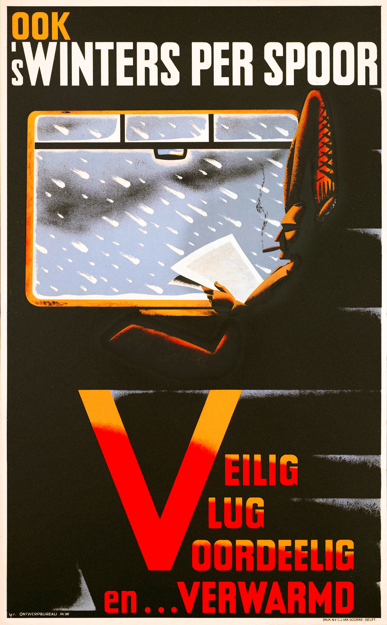
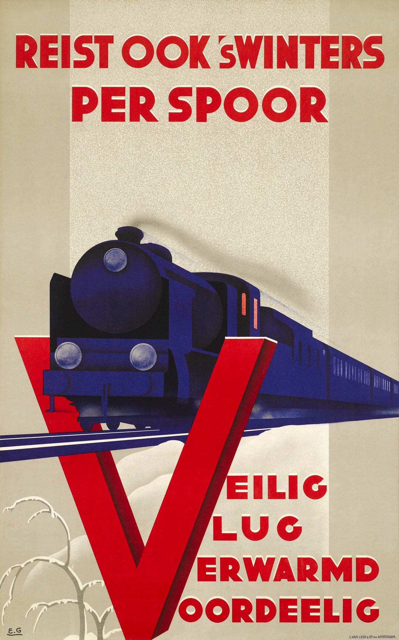
In the Netherlands, which has no winter sports areas, the Dutch Railways (NS) advertised the slogan Ook 's winters per spoor. Veilig, Vlug, Voordeelig, Verwarmd (In winter by rail as well. Safe, fast, inexpensive, heated) from 1936 onwards. The last part was a variation of the three Vs of Veilig, Vlug, Voordeelig, which the Dutch Railways had been using for some years. Advertising designer Machiel Wilmink, who also worked for Van Gend & Loos freight transport and the Rotterdam Lloyd, depicted a cigar-smoking traveler comfortably reading a newspaper while a snowstorm rages behind the train window. The letters of the four Vs radiate a warm glow. Emmanuel Gaillard (1902-?), who worked as a designer at the Van Leer & Co printing company in Amsterdam, also used a large letter V on his poster. He depicted a steam train against a rather bright background, with a tree at the bottom bending its branches under the snow.
South for winter sun
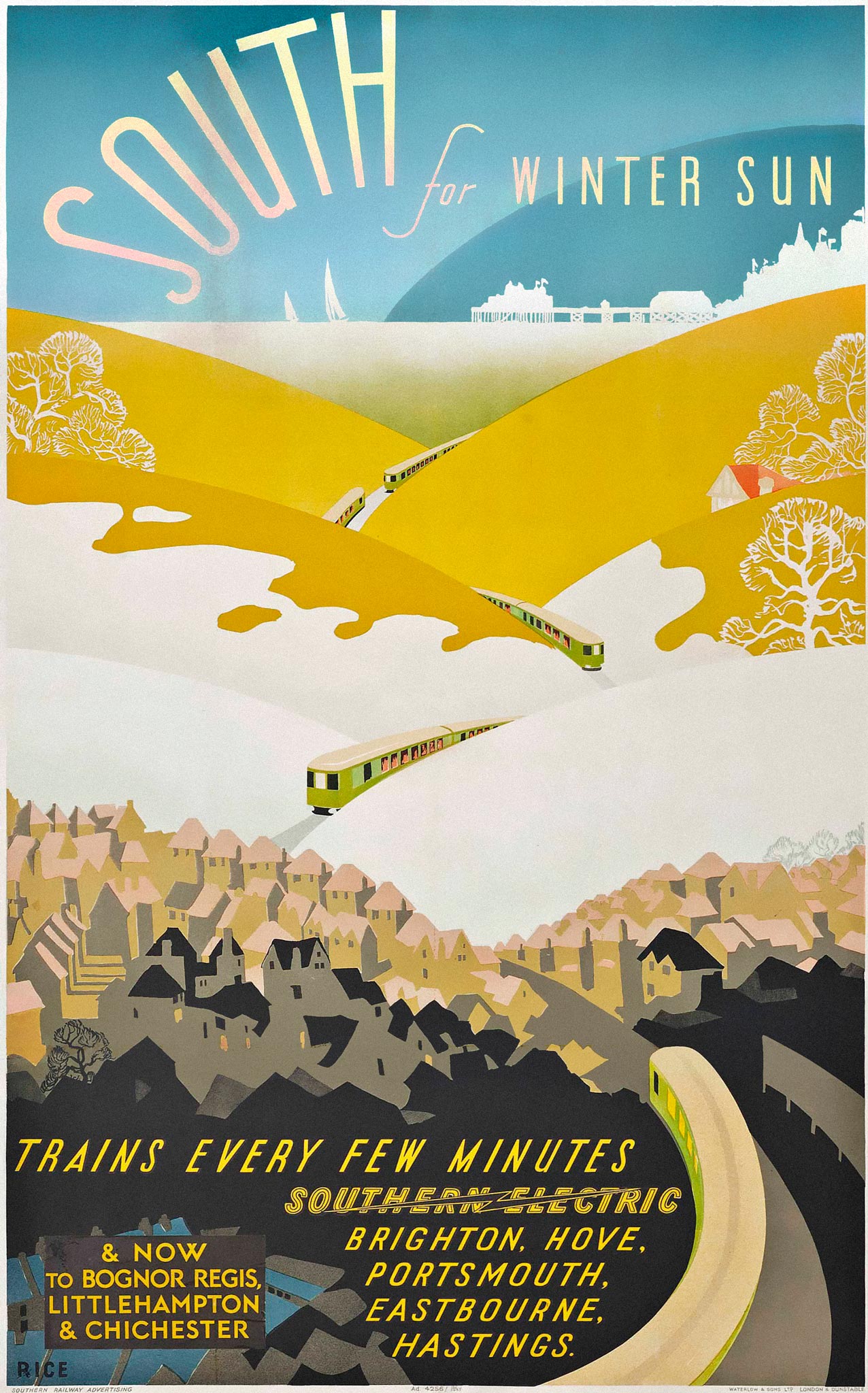
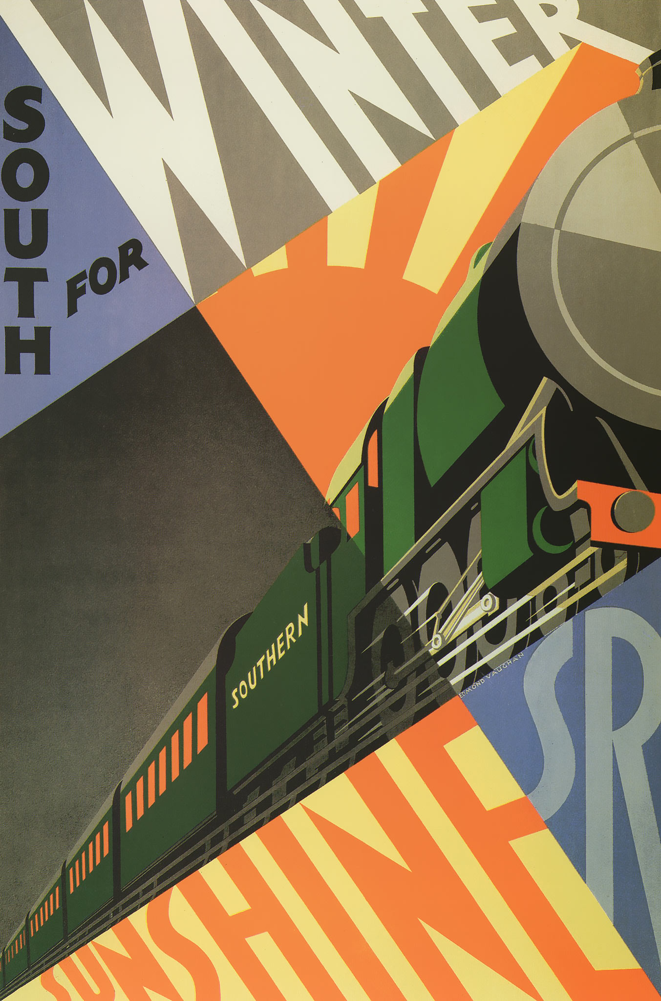
The English Southern Railway used South for winter sunshine as its seasonal slogan. Posters emphasized the difference between drizzly London and the sunny south coast of England, even in winter. This is why the well-known winter sunshine poster from 1929 by Edmond Vaughan (1906-1996) showed no snow but only warm, sunny colors. Nevertheless, on the South for winter sun 1937 poster we see the snow-covered chalk hills of South East England, over which new Southern Electric 2-BIL trains are heading towards Portsmouth and Eastbourne.
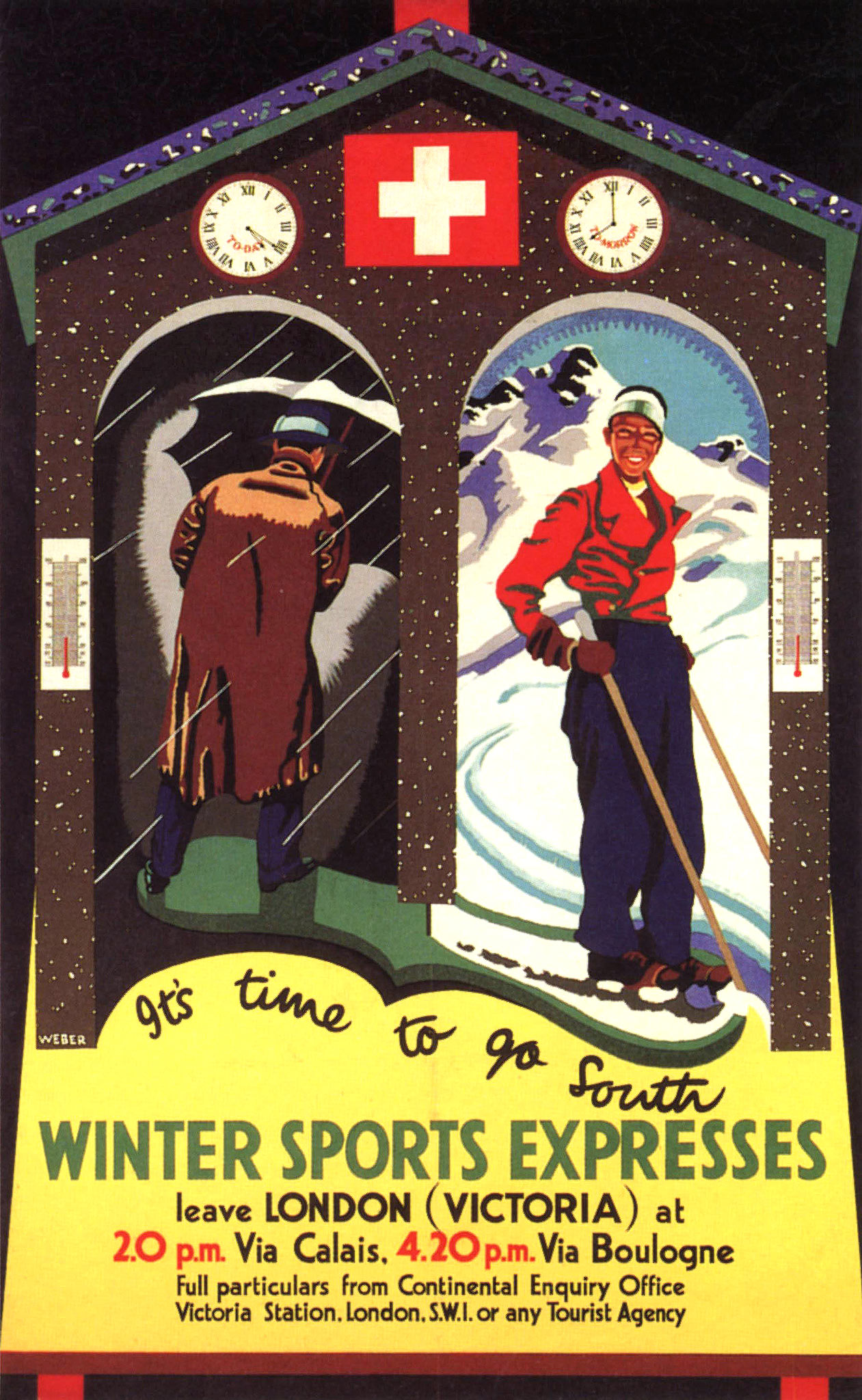
Southern Railway also offered Winter Sports Expresses from London Victoria via Calais and Boulogne to Switzerland. The accompanying 1934 poster shows a weather house with someone stepping in from rainy London and coming out on the other side in ski equipment. The designer was Audrey Weber (1917-1950), who was permanently employed by the railway company. She also created the Conducted Rambles series consisting of four seasons, the winter poster showing a rider in the snow. Southern released a four-part Winter Pastime Series as well, designed by Helen Ray Marshall (1894-1960). It was not about winter sports but featured library and museum visits, concerts and music lessons, hobbies and board games.
Montreux Oberland Bernois

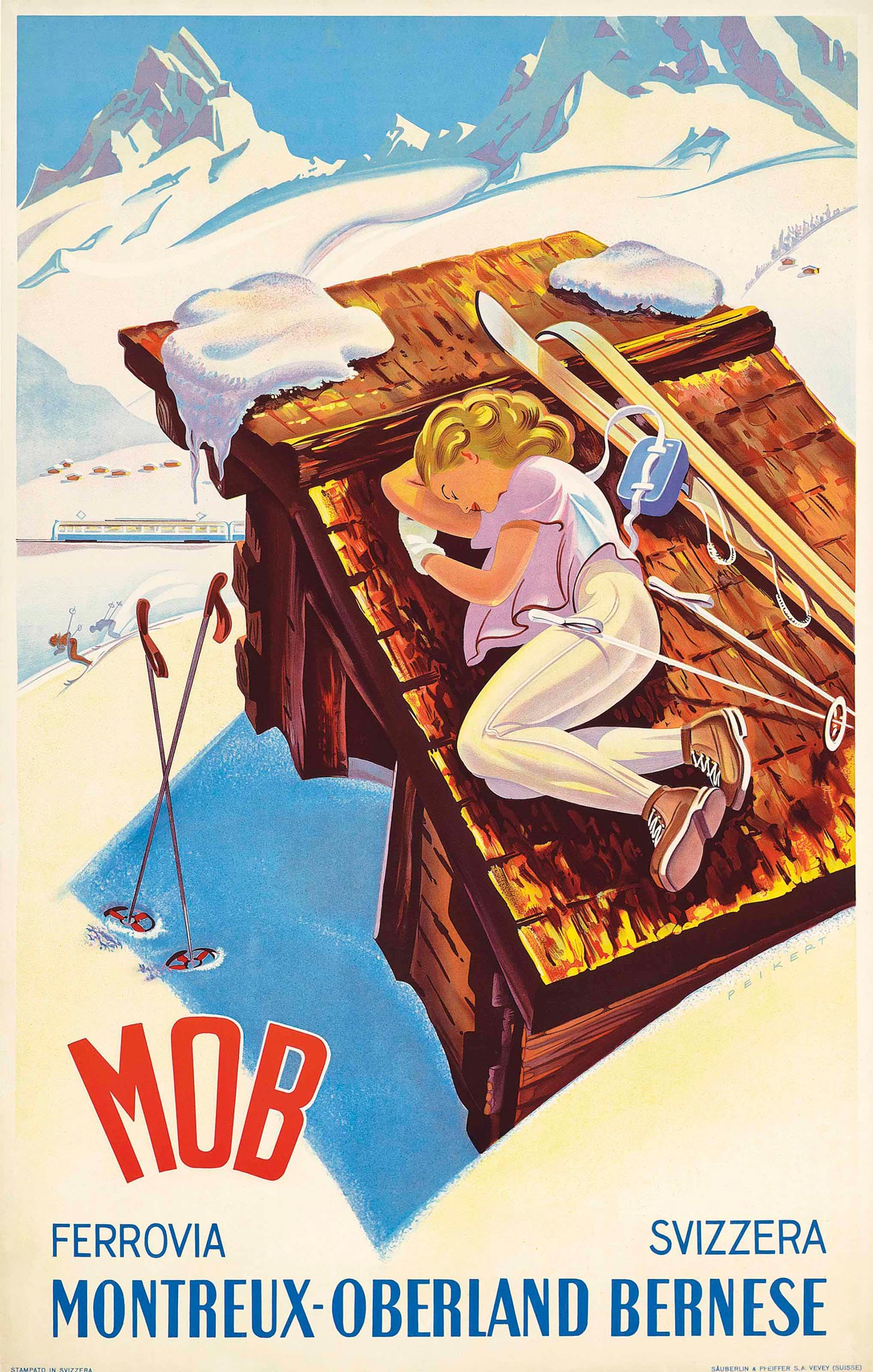
After World War II more and more people could afford to go on winter holiday. One of the many Swiss mountain railway companies (on meter gauge) is the Montreux Oberland Bernois (MOB). It connects Montreux on Lake Geneva over 75 kilometers to Lent in the Bernese Oberland, calling at ski resorts such as Gstaad.
In the 1940s advertising illustrator Martin Peikert created a playful, youthful style for the MOB. He used bright colors and bold designs to attract attention. A skiing woman is central to all of his winter sports posters, which have style and humor. There's always an MOB train somewhere in the picture.
Abfahrt zur Wintersonne
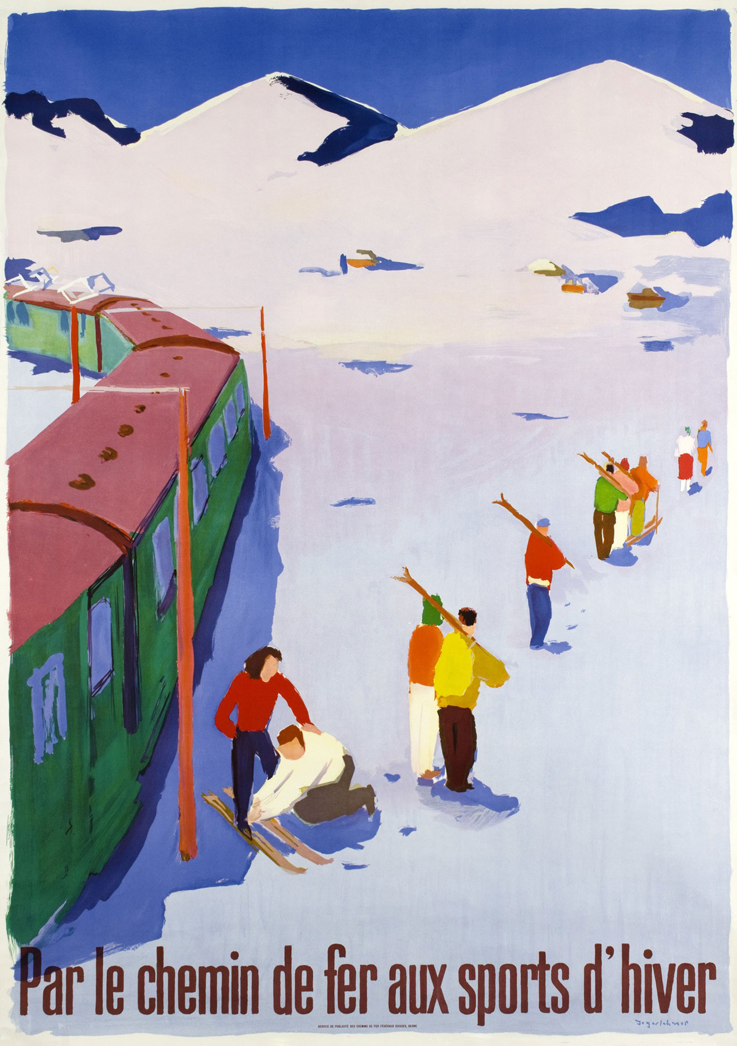
The fact that many trains directly reached the ski slopes was an important asset for the Swiss SBB. In Switzerland the electric railways take you right into the heart of winter sport, was the English text on the 1950 poster by Hans Jegerlehner (1906-1974), who also made paintings and murals. For his SBB tourism posters he used distinct colors and anecdotal scenes. We can see a woman in a red sweater stepping directly onto her skis from the train; others are first walking with skis on their shoulder.
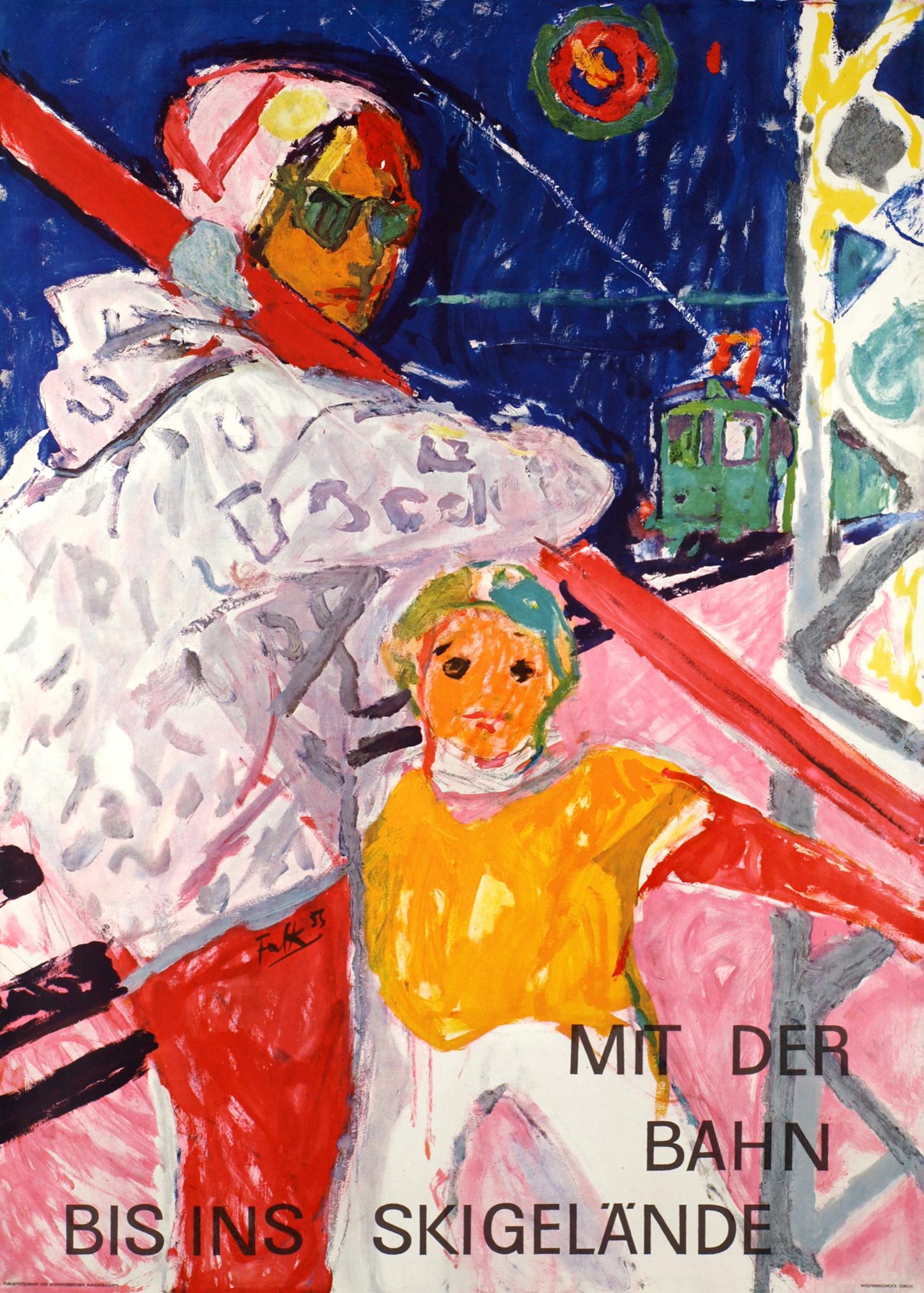
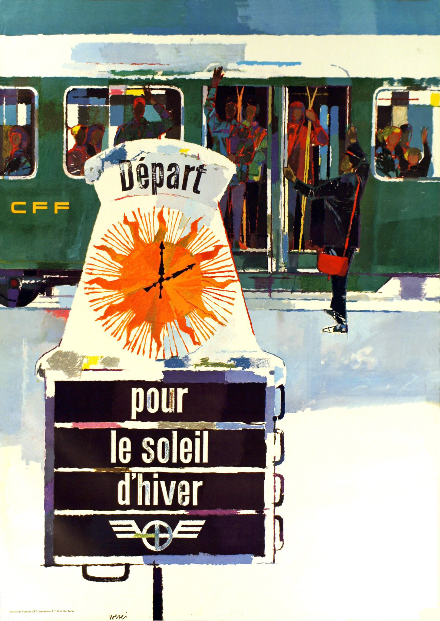
A striking poster from 1955 by Hans Falk, who later became a well-known abstract expressionist painter, has the same theme. Mit der Bahn bis ins skigelände, was written at the bottom. The woman with skis and her child look at the viewer like in a family snapshot. In 1958 another Swiss painter, Hugo Wetli, depicted the dark green SBB train even more emphatically. The German version of the text on the departure board shown is Abfahrt zur Wintersonne. The clock is depicted as a sun with rays.
Neve al Nord
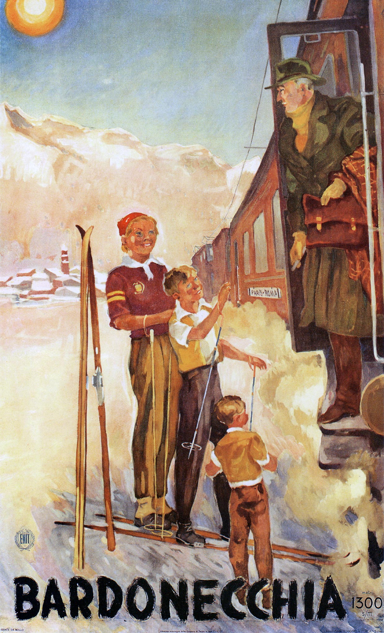
Northern Italy also has winter sports areas. The ski village of Bardonecchia in the province of Turin is located directly on the Modane-Turin international railway line, just after the Fréjus tunnel between France and Italy. Its excellent accessibility was shown on an anonymous poster from 1952 by featuring the Paris-Rome express train. Straight from Paris travelers stepped into the snow at 1300 meter altitude. The poster was issued by the Italian National Tourist Office ENIT.
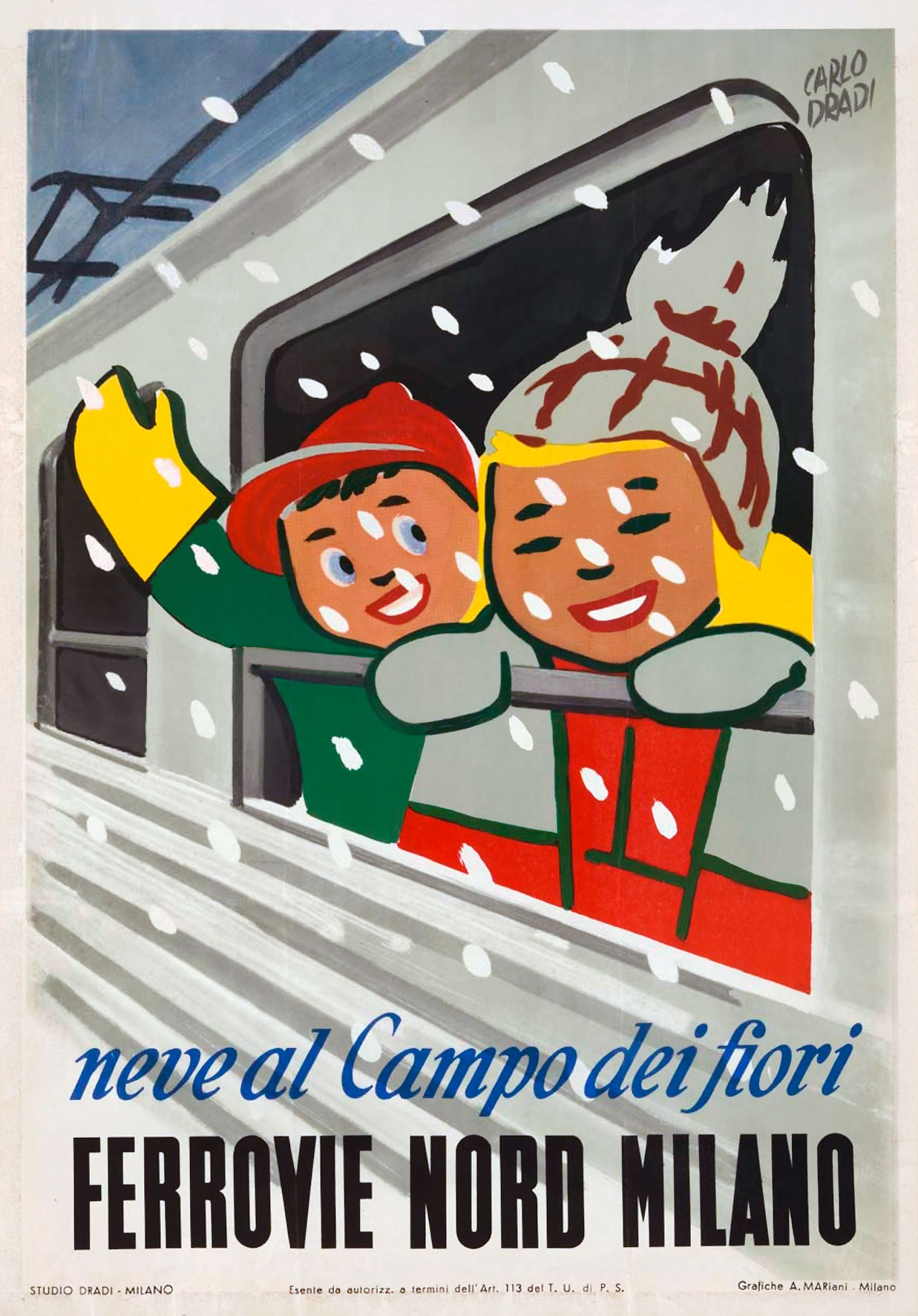
The railway lines in the area north of Milan are not operated by the Italian state railways (FS), but by the regional Ferrovie Nord Milano. In the late 1940s Carlo Dradi created a series of twelve posters for this railway company. One of them shows children in winter outfits leaning out of a train window while it is snowing. Above the railway company’s name is the slogan Neve al… (snow in…) followed by a winter destination. There are versions known with San Primo, San Maurizio and Campo dei Fiori. The electrification of Ferrovie Nord Milano's railway lines, as also visible on the poster, was completed in 1951.
Bequem, warm und schnell
Austria as a winter sports destination was advertised internationally by its national tourism board. The federal railway company ÖBB mainly promoted domestic traffic. Auch im Winter wenn es schneit, steht die Bahn für Sie bereit! (even in winter when it snows, the railway is ready for you) was on the white sheet held up by a skier, which could run messages as required. Many ÖBB posters were created by Walter Harnisch, who in addition to being a designer was also a painter and renowned art teacher.

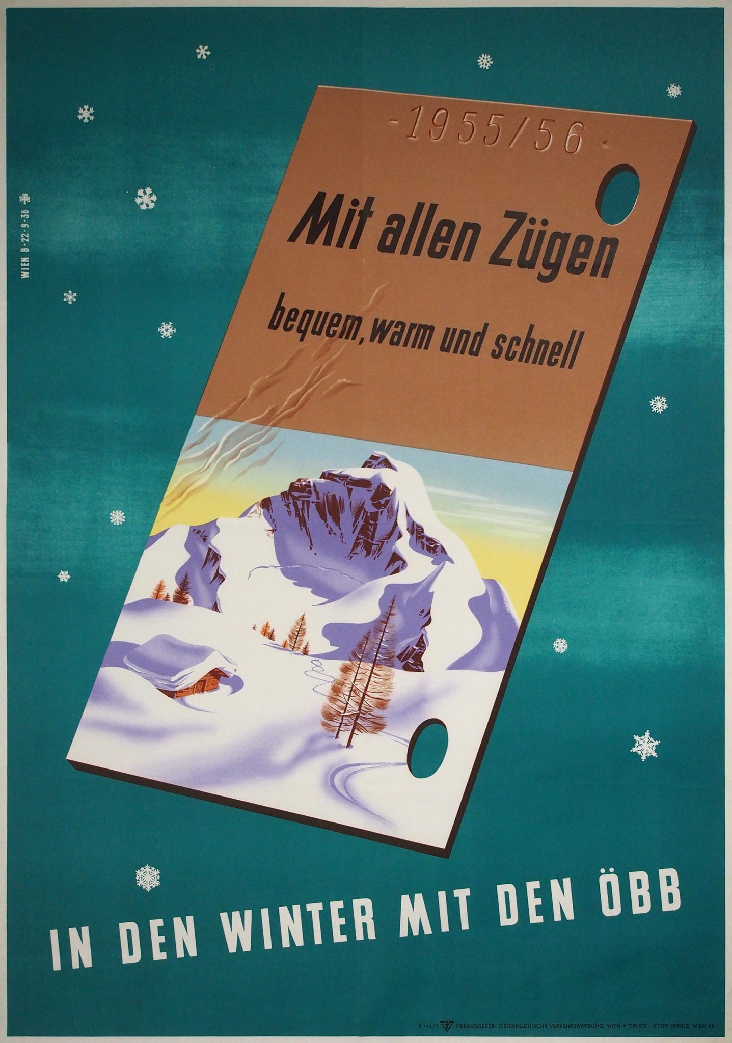
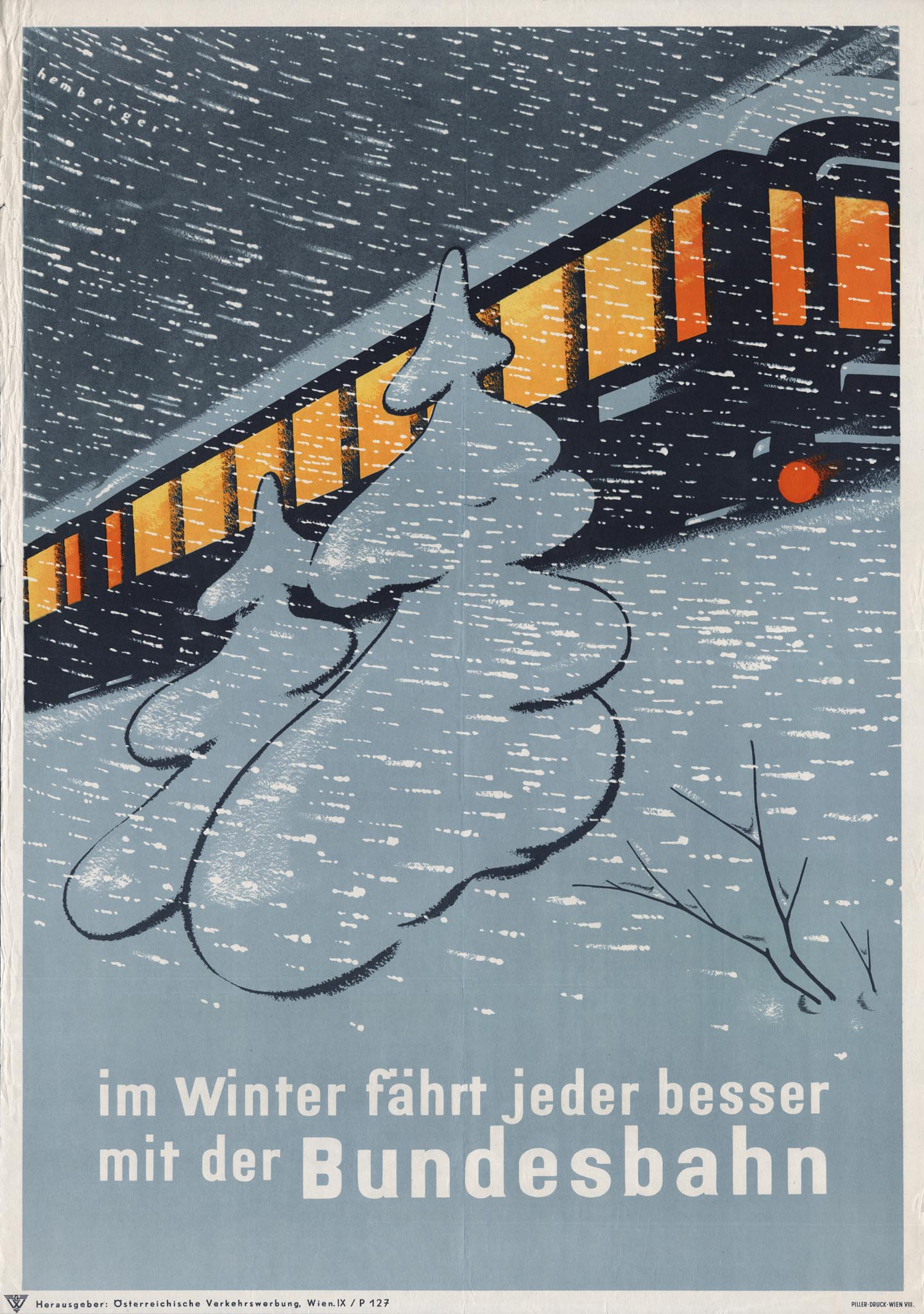
An apparently free-floating train ticket on a 1955 poster not only featured a winter landscape, but also the words bequem, warm und schnell. It seems comfortably warm behind the windows of a train that runs through a snowstorm on an anonymous ÖBB poster a few years later, with the catchy caption In Winter fährt jeder besser mit der Bundesbahn (in winter everyone travels better with the federal railway).
Winterwünsche erfüllt
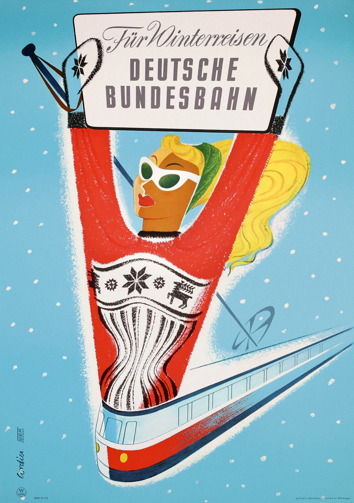
In the 1950s the Deutsche Bundesbahn (DB) used mild humor to promote Germany as a winter sports destination. Artist Eugene Maria Cordier depicted a woman wearing a ski sweater literally as the figurehead of a Fliegenden Kölner, a fast diesel-electric train that was built shortly before the war as a follow-up to the well-known Fliegender Hamburger.
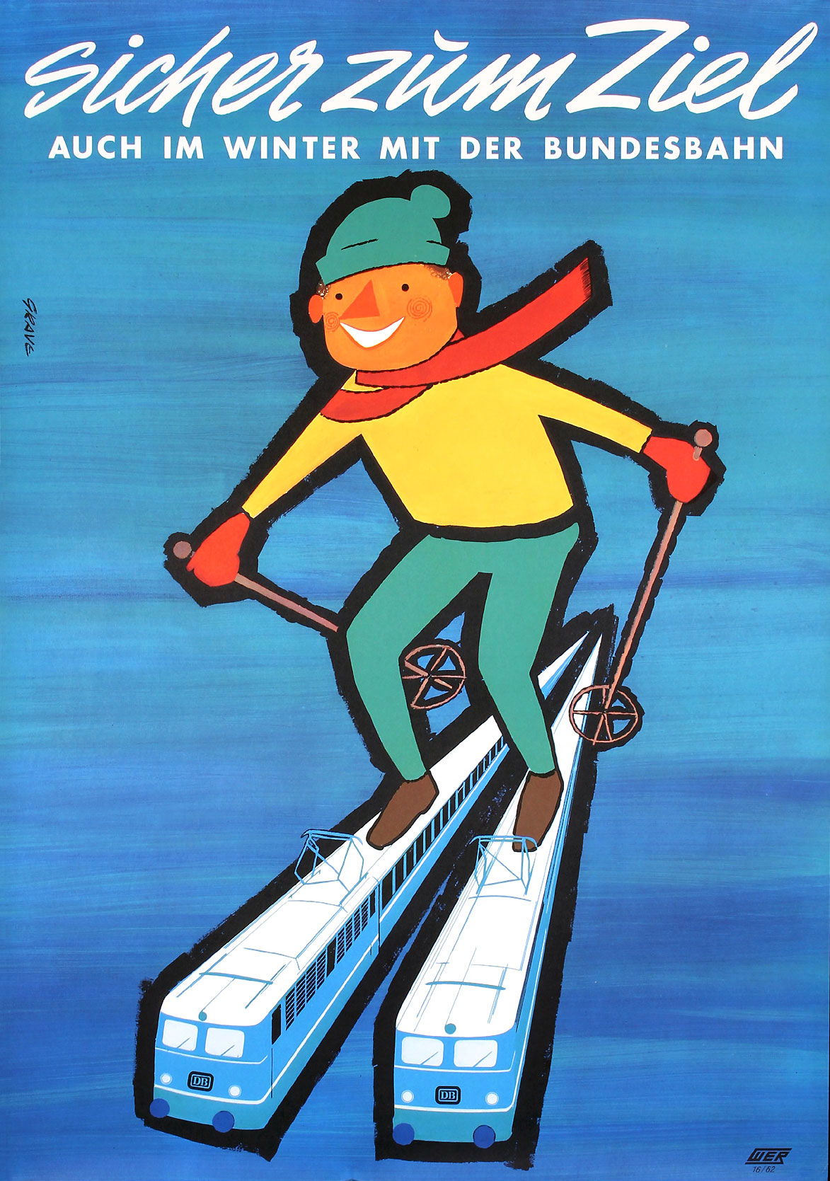
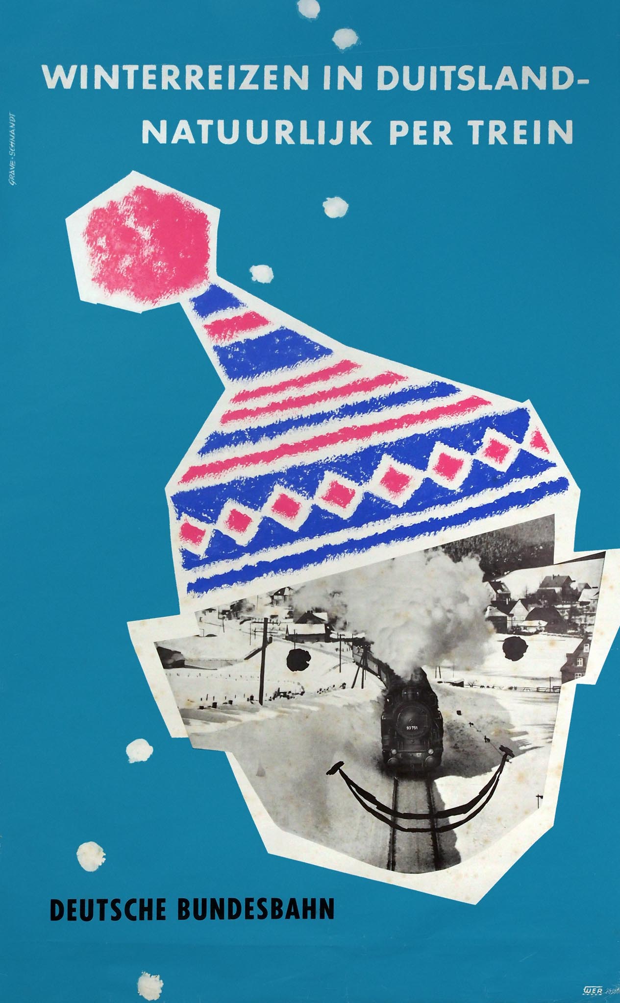
Two other trains double as skis on a playful poster from 1962 by Grave (details unknown). The slogan Sicher zum Ziel (reliable to your destination) was previously used on a DB poster by Hans Schmandt (1920-1993), with whom Grave formed the Atelier Grave-Schmandt in Frankfurt in the 1950s. Among other things, they created a poster of a head with a hood, the face formed by a photo collage of a train in the snow. A few thick snowflakes fall on the blue background.
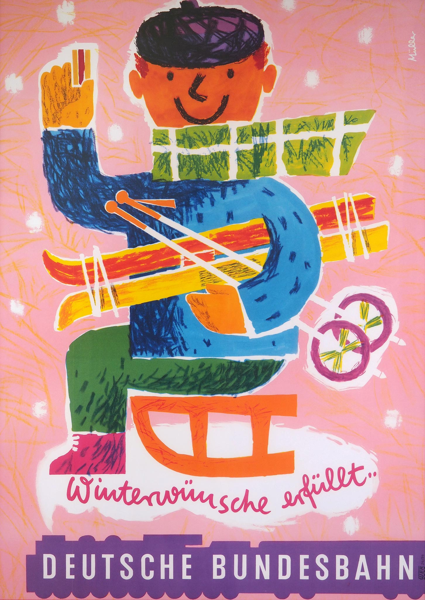
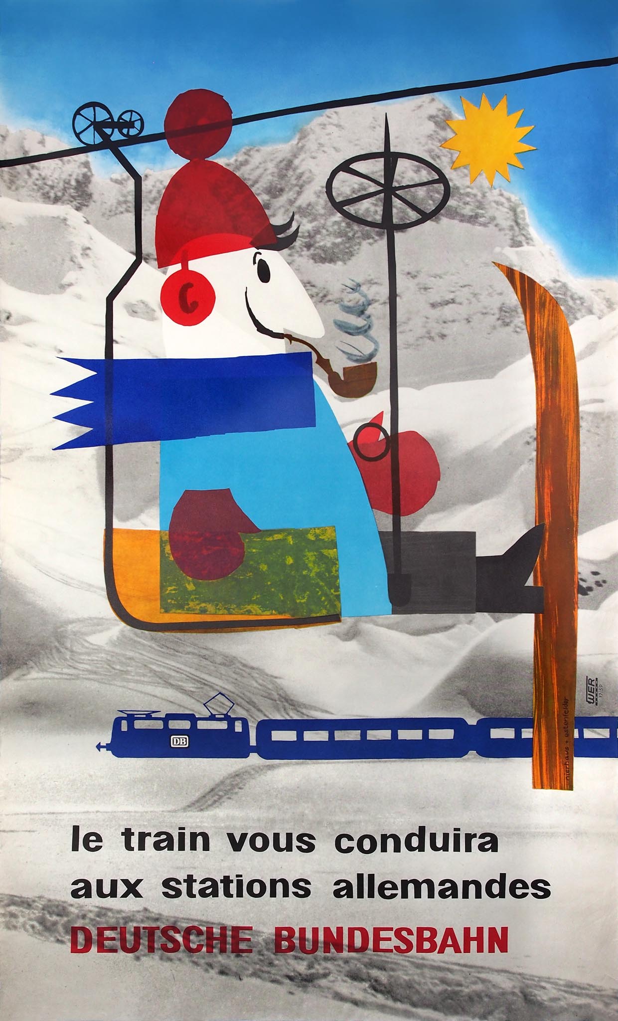
Winterwünsche erfüllt (winter wishes fulfilled) was on another cartoonesque DB poster. The colorful little man on a sled, with skis under his arm, was designed in 1954 by Erika Müller (1930-2010). She later also created a summer railway poster and became a member of the novum society for new graphics. A poster of a gentleman in a chairlift was 'preisgekrönt' (award-winning) in 1959, although the award concerned is unknown. The image was created with collage techniques by Nierhaus + Estenfelder, the design agency of Maria Nierhaus (1936-2005) and Charly Estenfelder (1935-1980) in Frankfurt.
Christmas Greetings
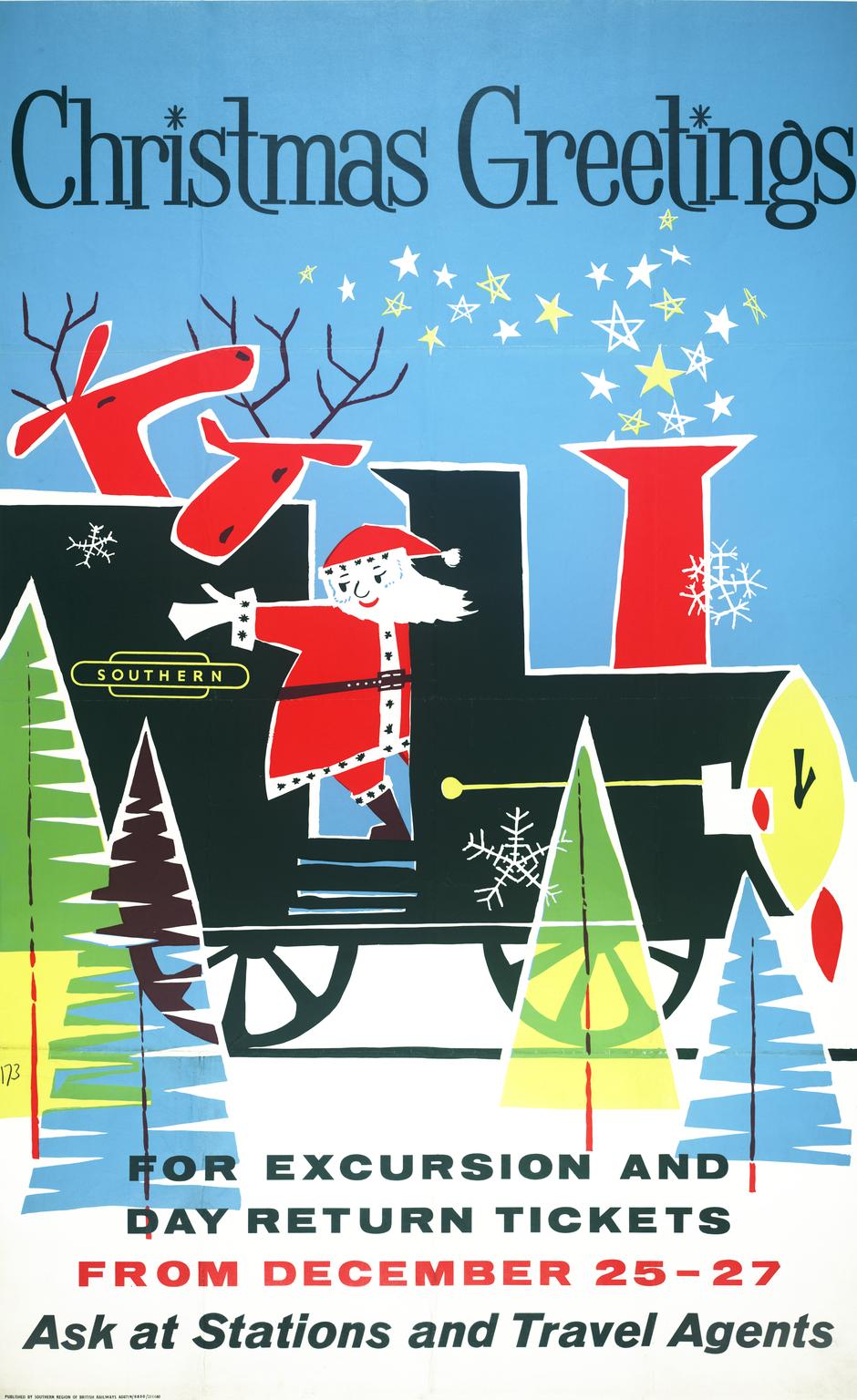
The Southern Railway was merged into British Railways in 1948, but retained some independence as Southern Region. This is also apparent from a poster with Christmas greetings from 1960. It is a cartoon of Santa Claus with two reindeer on a steam locomotive, the chimney spitting out stars. On the locomotive is the Southern totem while British Railways remained unmentioned.
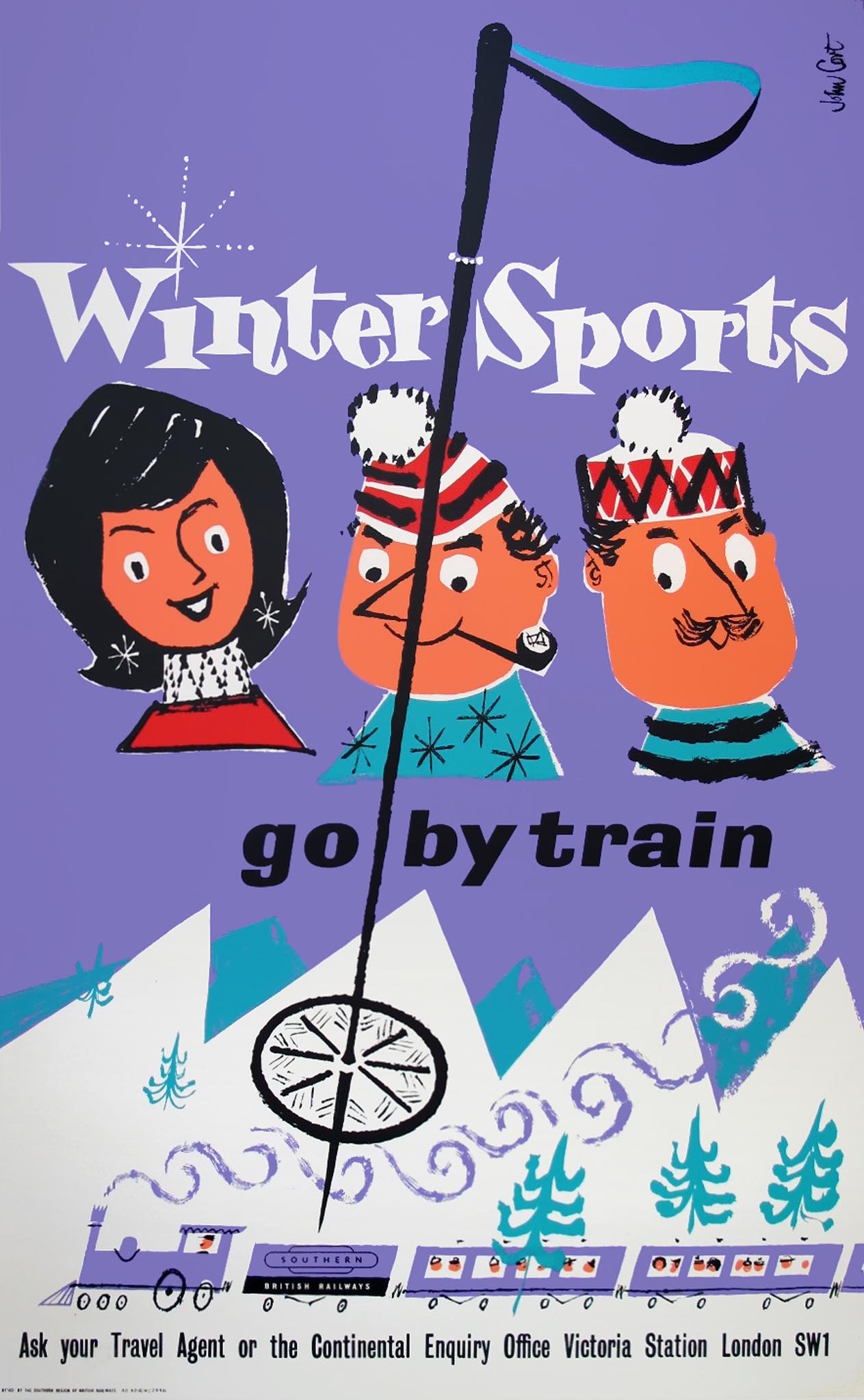
John Cort was probably responsible for the Christmas poster, even though it was not signed. In any case, in the same periode he created a winter sports poster for the Southern Region to promote ski trips to the continent. John Cort was a designer and illustrator. Together with his wife Margareth Cort, who had also worked in advertising, he published the children's picture book Little Oleg in 1965. Their son Ben Cort would later become famous in this genre.
Winter Adventures by German Rail
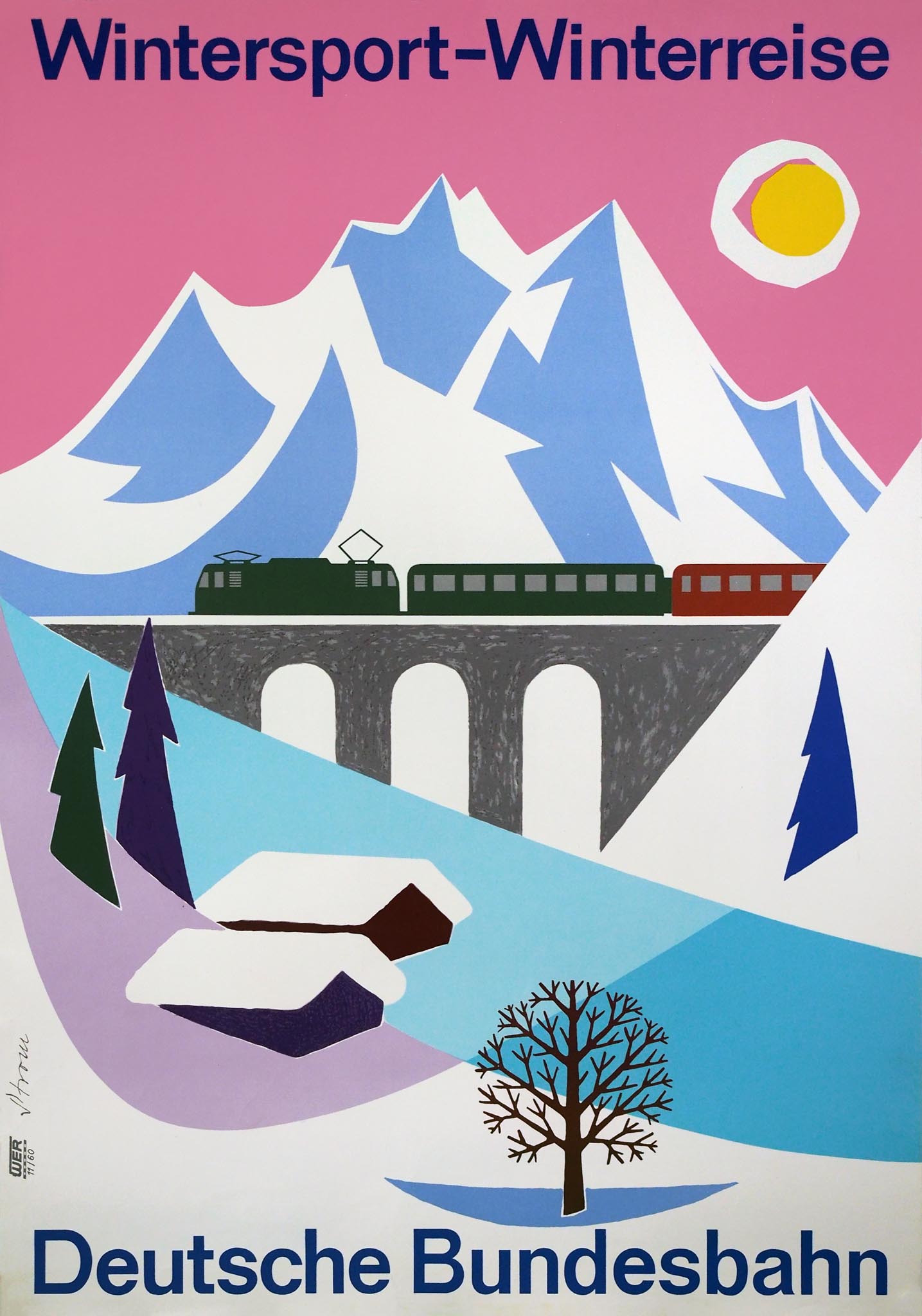
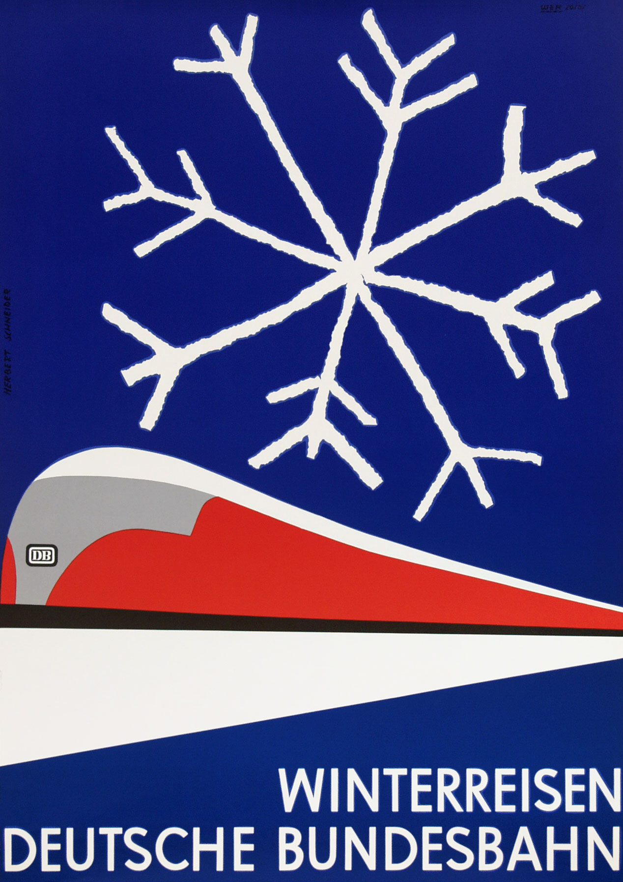
The Deutsche Bundesbahn promoted winter journeys by railway with scenes of snow-covered landscapes and criss-crossing trains. These posters did not refer to winter sports as such but to the romance of the white landscape. Artist and graphic designer Ernst Strom (1929-2019) used minimal shapes and distinct colors, such as a pink sky. In 1957 Herbert Schneider (1924-1983), who shortly before had won the Kunst-Preis der Jugend, only drew a white line and a snow crystal, along with a stylized representation of the striking red VT 08 trainset.
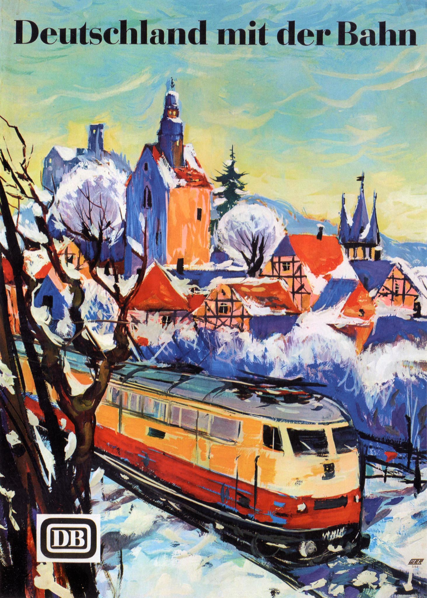
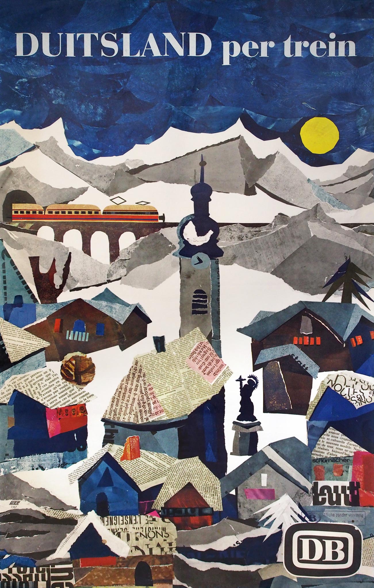
The opposite of minimalist were the painted landscapes by Hans Schmandt in the Deutschland mit der Bahn series. The winter version with an electric E10.12 Rheingold locomotive featured a more exciting text in the English version: Winteradventures by Germanrail [sic]. A similar themed poster followed in 1967, then executed as a paper collage by the young artist Rainer Negrelli. It was displayed at stations throughout Europe via an exchange program with other railway companies.
Alle reden vom Wetter. Wir nicht
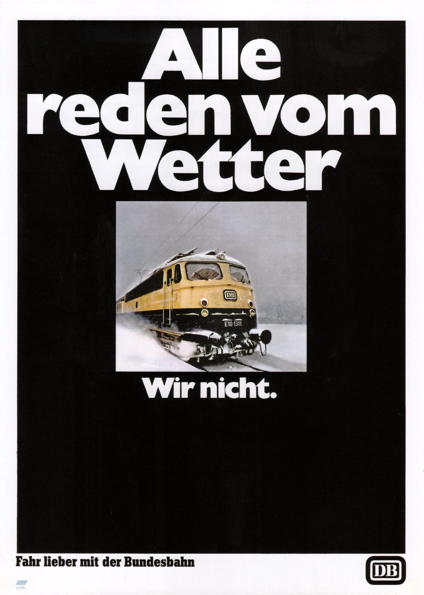
In the late 1960s the car had become an important competitor for the train, even if it was more vulnerable to winter conditions. In 1966 the Deutsche Bundesbahn hired the McCann advertising agency in Frankfurt, a subsidiary of the American McCann Erickson company. With an unprecedented budget of 2 million D-marks it launched a campaign using a black plane with bold white letters. In the middle was a simple photo of a locomotive in the snow. The slogan Alle reden vom Wetter. Wir nicht (Everybody's talking about the weather. We're not) was a huge succes; countless variations and persiflages appeared.
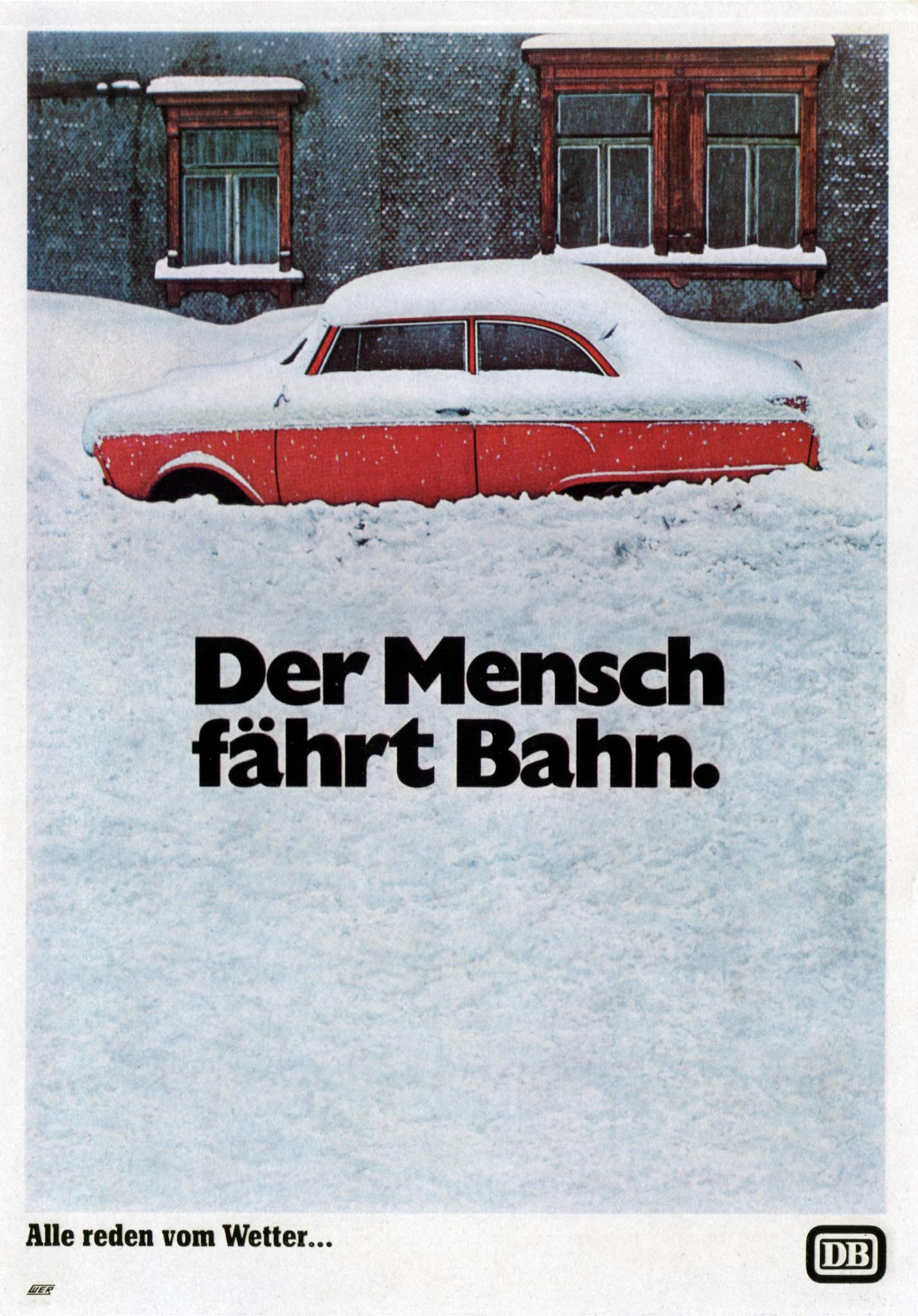
Two years later the first part of the slogan was reused as a caption below a photo of a car covered by a thick layer of snow. Every German could now supplement it with Wir nicht. The poster showed that color photography and printing was taking over the advertising world.
Eis und Schnee SBB
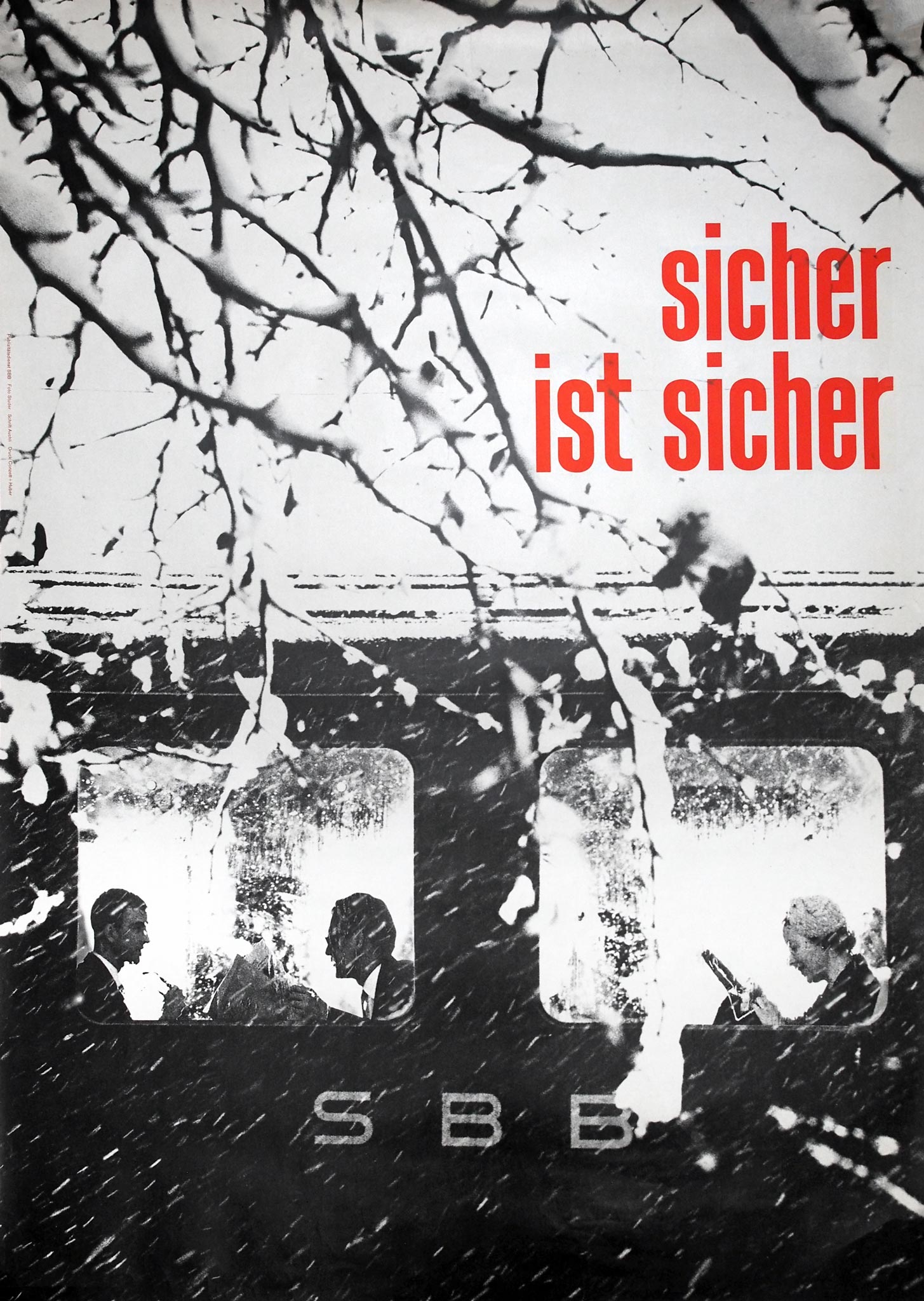
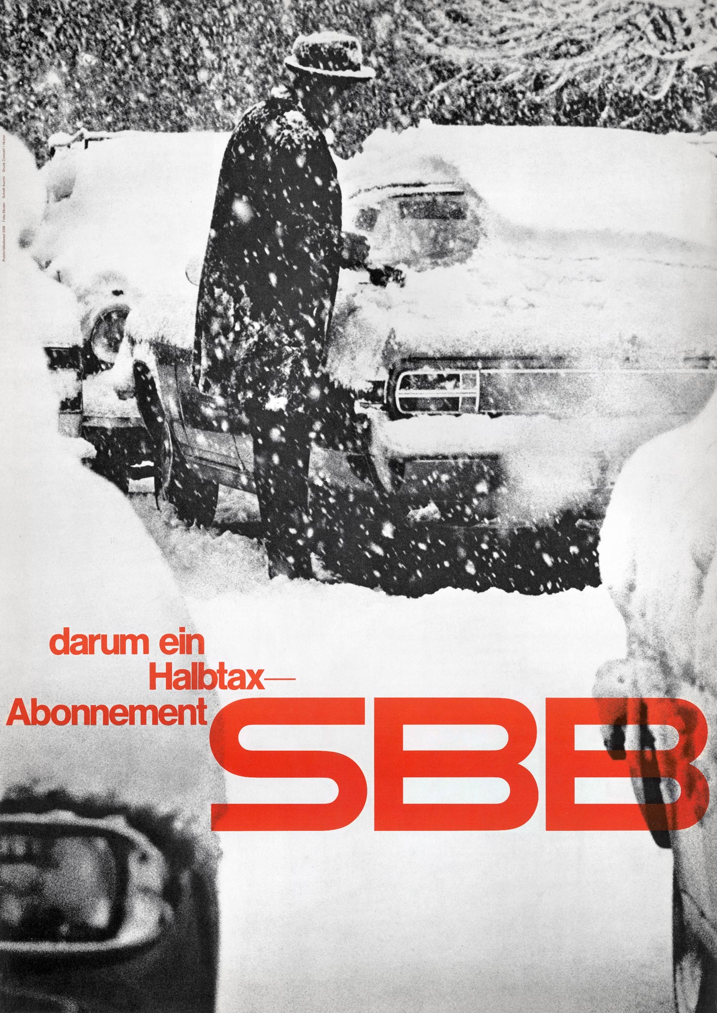
The Swiss railways also competed with the car on photo posters, but opted for high-contrast black and white photography. Under the direction of SBB's head of publicity Werner Belmond (1915-2011), the focus was on reliability (sicher ist sicher). The wintry photos were taken by Walter Studer (1918-1986), the red lettering was the work of designer Herbert Auchli (1921-). Studer had previously worked as a sports and news photographer and won a World Press Photo Award in 1962. Auchli originally created traditional illustrated posters, but switched to photos combined with graphic elements and typography in the 1960s.
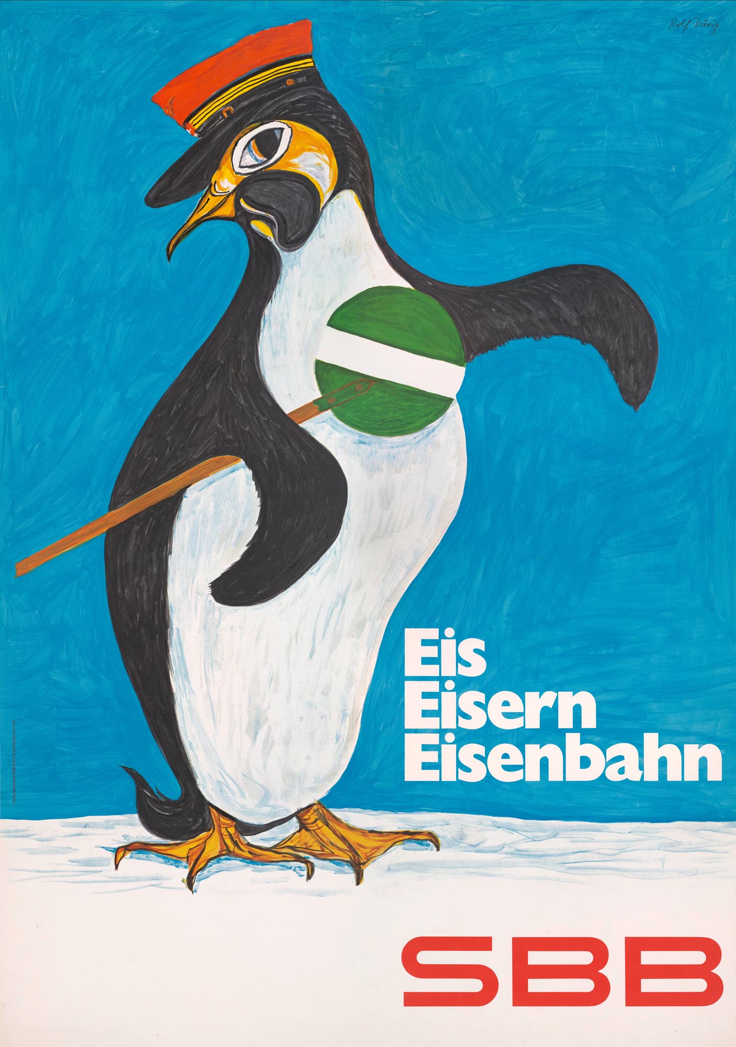
Despite the rise of the photographic poster the SBB continued to commission illustrated designs in a playful style, such as the versatile posters by Donald Brun. He represented a train ticket as a cuckoo clock with a snow-covered roof, for example. A penguin with a conductor's hat was painted by Rolf Dürig (1926–1985). His design was printed along with the alliterating text Eis, Eisern, Eisenbahn (ice, iron, railway).
Ski-France
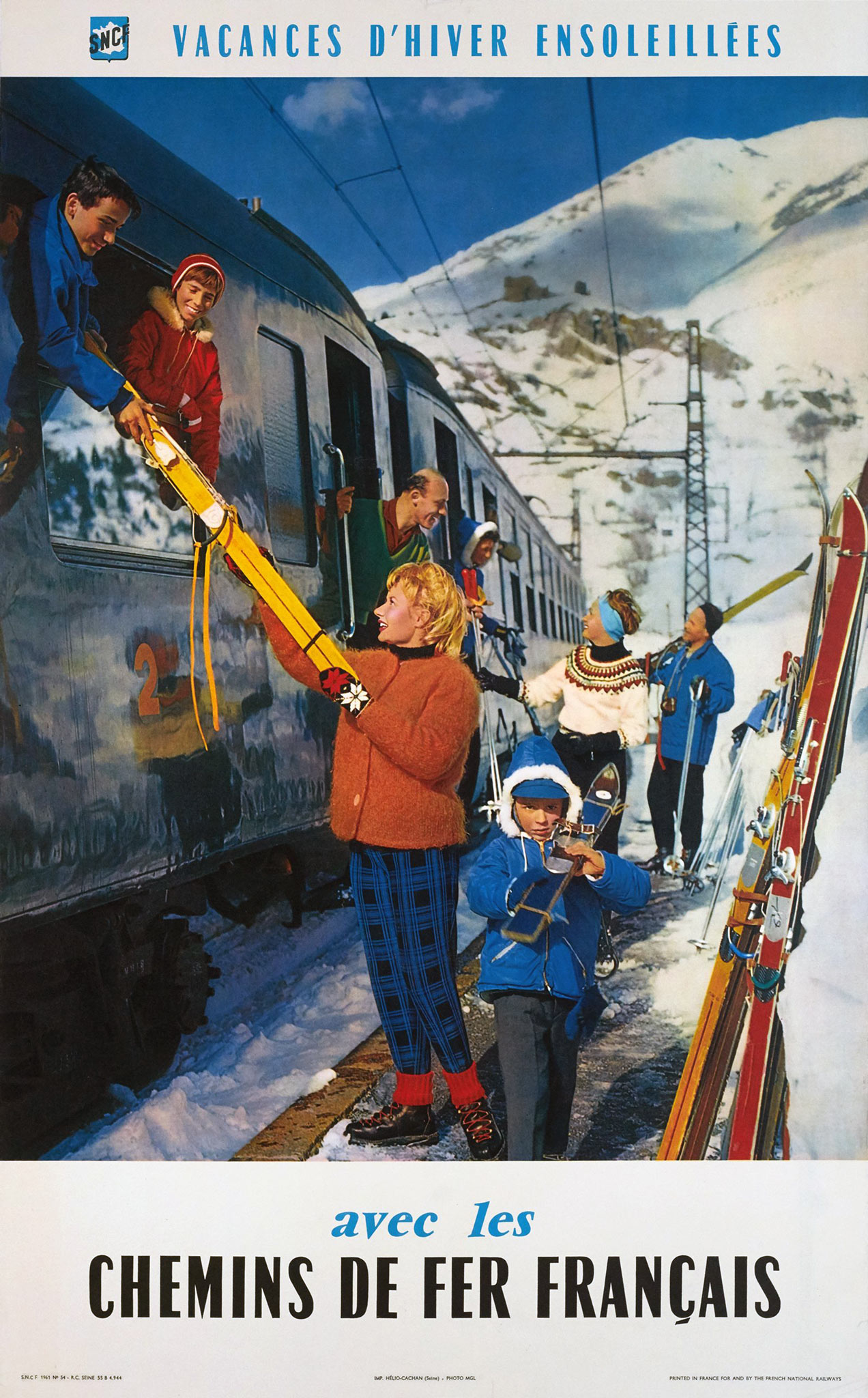
The French SNCF released photographic posters since around 1960. The bold colors were sometimes deliberately exaggerated in the photolithographic process. A poster for sunny winter holidays features skiers of all ages leaving the train while yellow and red skis are handed through the train window. A classic letter font was used on this poster as well as the outdated 1947 SNCF logo, a coat of arms with a simplified map of France.
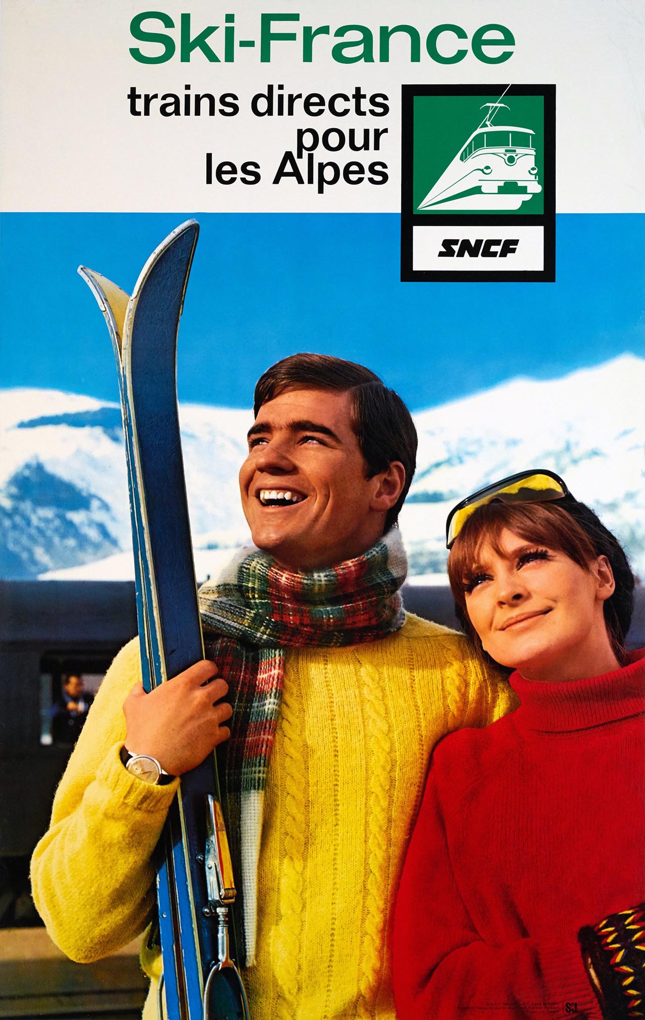
In 1966 the SNCF obtained a modern logo with the stylized silhouette of an electric BB 16000 locomotive. Together with a matching sans serif font it was applied to a poster promoting direct ski trains to the Alps. The photo of a couple in brightly-colored ski jerseys came from French advertising photographer Jean-Claude Dewolf. He became also known for 'the ambience of sea, sex, and sun for Perrier throughout the late 60s and early 70s', for example.