Sybold van Ravesteyn
an exceptional
Dutch railway architect
 Nederlandse versie
Between 1930 and 1960 the idiosyncratic architect Sybold van Ravesteyn shaped the image of railway architecture in the southern half of the Netherlands. He designed clean, functionalist signal boxes as well as baroque stations with curves, ornaments and sculpture colonnades. It has been said that Van Ravesteyn conceived both some of the most beautiful and the ugliest buildings in the Netherlands.
Despite recent revaluation of his more flamboyant works, only a few of his railway buildings have been preserved. His magnum opus for instance, the Rotterdam Central Station, was demolished in 2008. Van Ravesteyn's last station, a small and rather eccentric building, was renovated in 2016.
Feyenoord goods office
Sybold van Ravesteyn (1889-1983) graduated at the Delft academy and started as an engineer at the infrastructure department of the Dutch State Railways in 1912. During his first years he assisted in large projects, such as the so-called Inkpot building, designed by his superior George van Heukelom. In 1921 he started working on his own designs, mainly utility buildings to begin with. Meanwhile he designed furniture inspired by the De Stijl movement for his own use and for his friends.
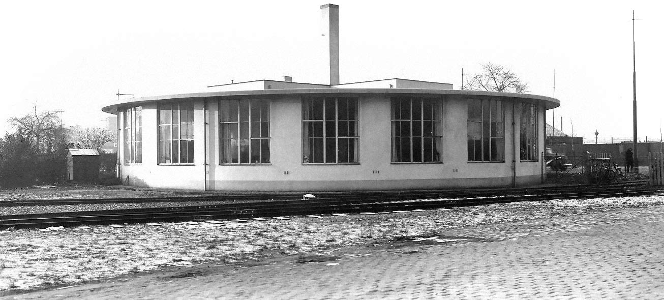
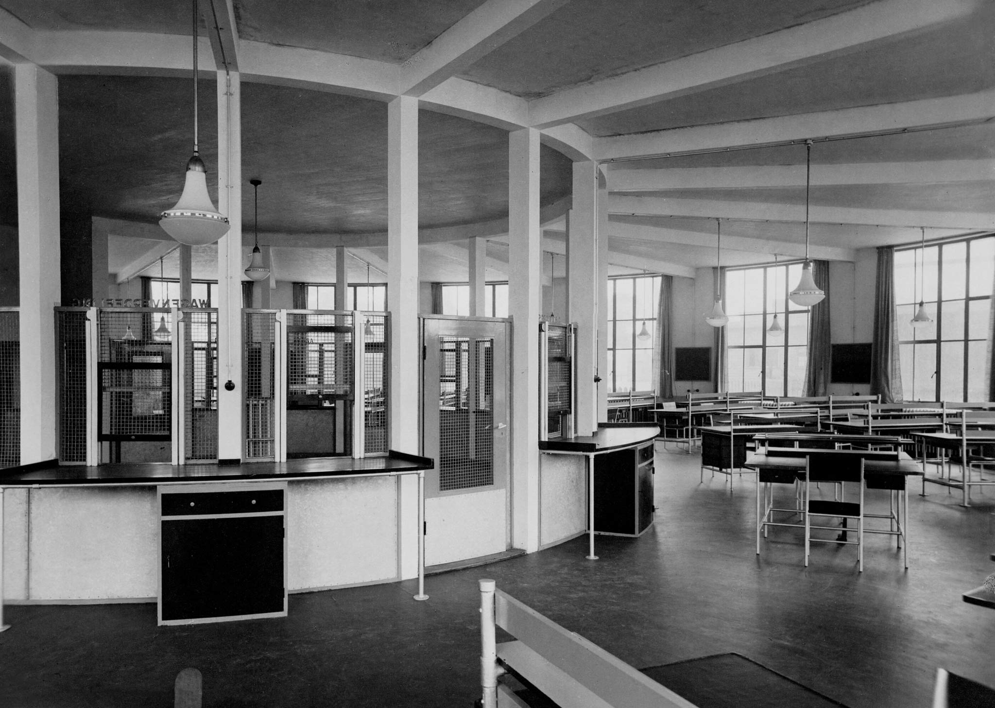
One of Van Ravesteyn's first major constructions was the Feyenoord goods office at Rotterdam (1927), nicknamed the snail-shell. It was a three-quarter circular building with a rectangular higher section topped with three chimneys. The round part seemed wedged between the concrete slabs that formed its foundation and roof. In the center was a circular ticket hall, surrounded by fanned-out open office spaces. The ultra-modern furniture was fashioned from gas pipes by the architect himself.
Development
Van Ravesteyn initially identified with the De Stijl group and the modernist Nieuwe Bouwen movement. He was acquainted with Gerrit Rietveld and J.J.P. Oud and became a member of the De 8 en Opbouw group of architects. In the 1930s he would develop a distinctive, decorative neo-baroque style. After Van Heukelom's retirement a separation emerged between the railway architecture in the southern half of the Netherlands, characterized by Van Ravesteyn's curved lines, and the north of the country which showed the functionalist style of his colleague H.J. Schelling.
Maastricht signal box
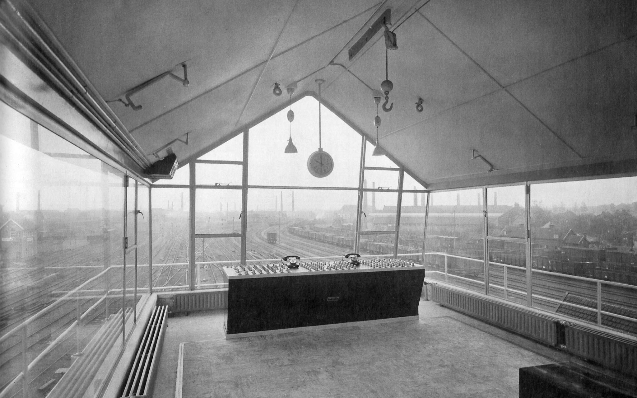
Instead of the traditional brick cabins, Sybold van Ravesteyn designed glass signal boxes on slim concrete columns. They were the ideal objects to apply the functionalist principles of New Objectivity. For their basic shape he was inspired by the Wolkenbügel — horizontal skyscrapers — of Russian architect El Lissitzky, with whom he was in contact. Van Ravesteyn strived for the smallest possible footprint and a maximum field of view. He conceived 18 signal boxes in total.
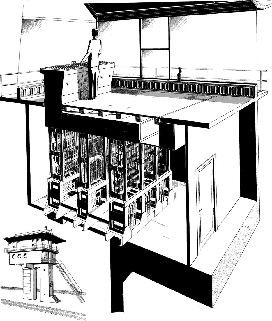
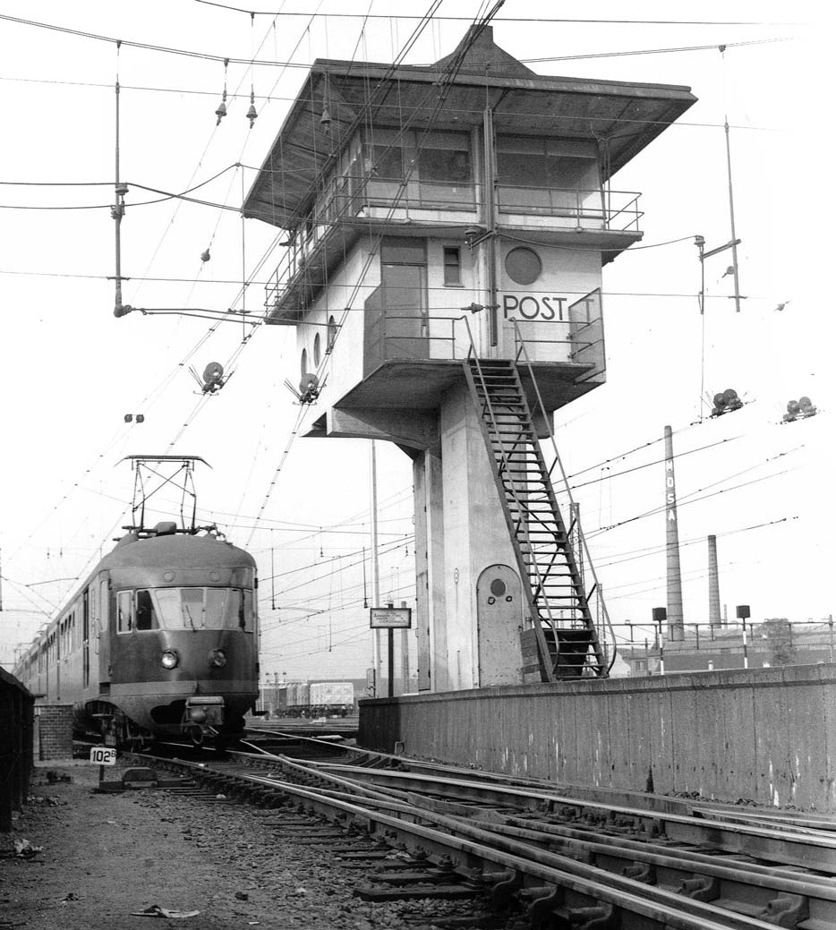
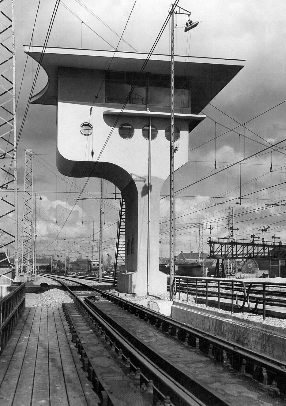
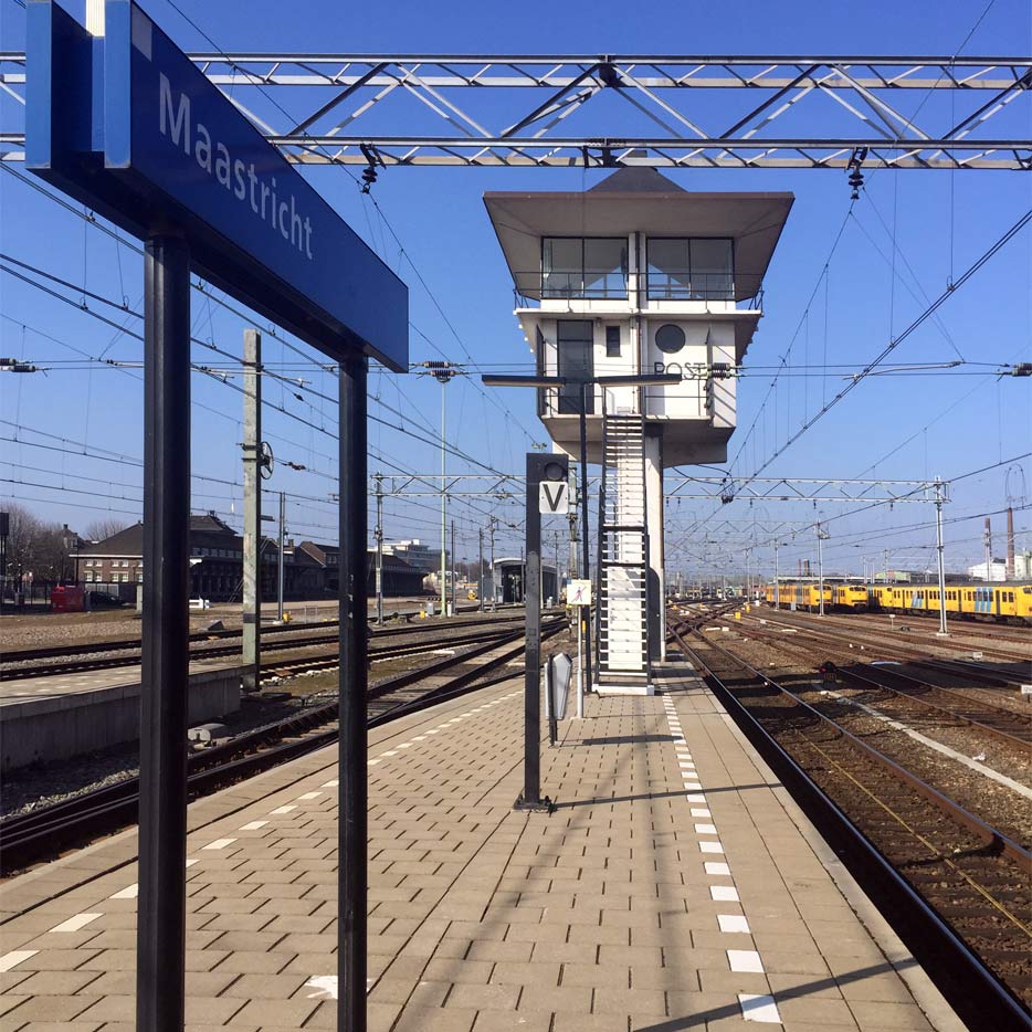
In the early 1930s the first signal box with an electrical installation was erected at Maastricht. Two 6 meter-heigh concrete columns on an underground foundation slab support a concrete box containing the 10,000 kg system. Round portholes, characteristic of Van Ravesteyn, were added to relieve the structure's bulk.
Above is the operating room, made almost entirely of glass, with the control panel of the signaling system sticking through the floor like the tip of an iceberg. Despite the heavy installation the signal box has an elegant, if somewhat top-heavy appearance.
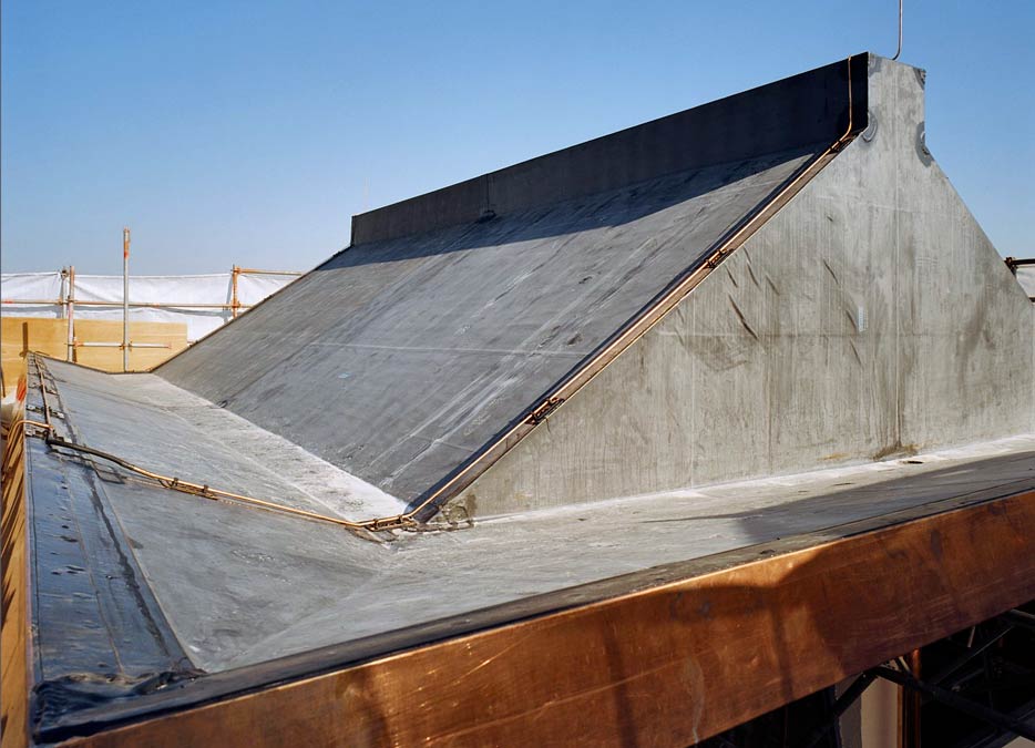
The roof of the signal box is shaped like a squashed letter W. The 'folded-up' steep sides of the roof are extended as an awning to prevent glare. The roof is supported by one concrete bearer, enabling glass walls that allow an almost unobstructed view of the tracks.
Monument
Because of automation and centralization in recent decades, many signal boxes have disappeared. The one at Maastricht served until 1985 and then fell into disrepair. Because of its architectural importance the listed building was restored in 2003. Today it is the only fully preserved signal box by Sybold van Ravesteyn.
Reinforced concrete structures can exhibit a much greater tenuity than brick constructions and must suffer resistance because of this feature. In this busy world, which is getting stuffed more and more, tenuity must be regarded as a very necessary virtue, which far from prevents the achievement of monumentality, taken in a finer sense…
Finally the appearance of concrete may be considered a material. There is a movement that distinguishes between 'noble' natural materials and 'ignoble', e.g. artificially prepared materials, and that calls concrete characterless… We cannot take these statements seriously, and must only consider them an exaggerated craving for 'nobility'.
Utrecht signal box
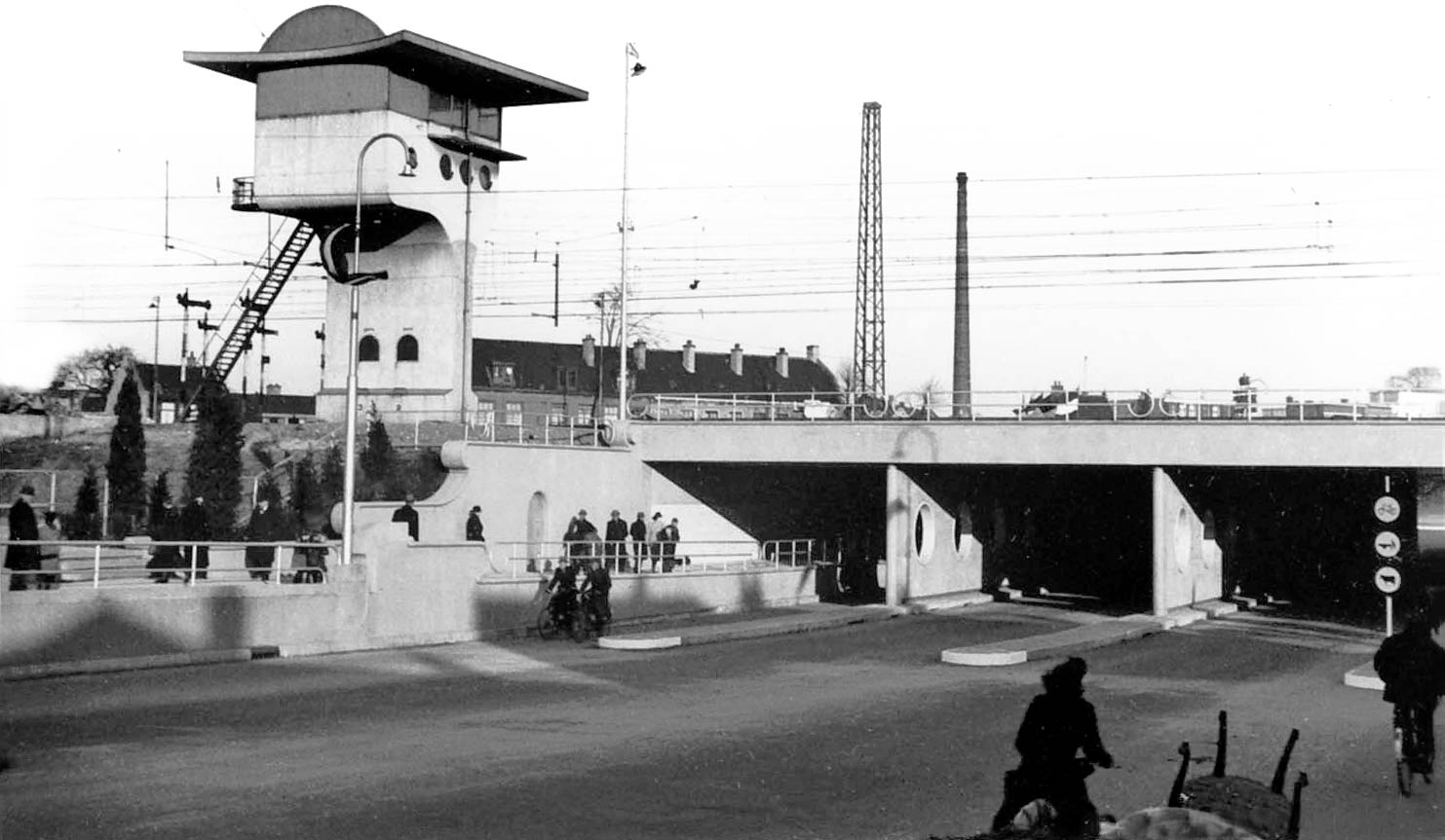
In 1938 Van Ravesteyn introduced his signature curved line on a new signal box at Utrecht. Unlike his neo-baroque buildings of the same period the signal box still met the requirements of functionalism. Nonetheless, due to its sculptural qualities, it matched well with the ornamented Leidseveer Tunnel and the likewise Utrecht Central Station, both designed by Van Ravesteyn in the late 1930s.
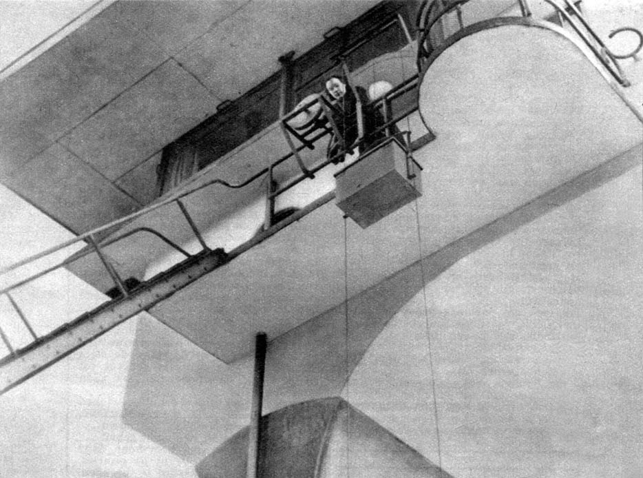
On a concrete base was a 5 meter-high hollow shaft containing all the cabling. On top of the shaft, just as in Maastricht, there was a separate floor for the electrical installation and a control room above that with windows on three sides. From below, with its closed north facade, it looked like a surrealist sculpture, a fluid form in which the bearer and the box seamlessly converged. The curved roof with its semicircular notch was like an ornate crown.
Dwelling
The signal box, nicknamed the dovecote, was never put into use due to the Second World War. Afterwards it served as a temporary home, to be demolished in the late 1950s. A signal box with the same design, albeit with a straight roof, located over a kilometer apart, was used as supervisor accommodation until its demolition in 1980.
Utrecht Central Station
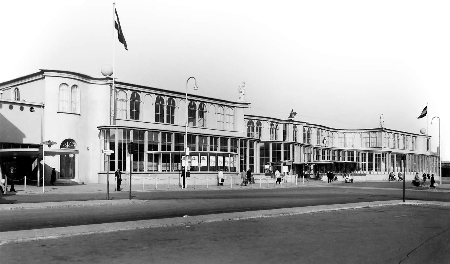
Although working for the railways for decades, and also independently as an architect of houses and offices, Van Ravesteyn had not yet designed a (large) station. When he added an undulating glass front to the Utrecht Central Station in 1937, this remained to be true; the old building was still behind it. The ground floor internally was completely renewed however. After a fire the original building was also replaced in 1939. This way an architectural unity of glass and plastered walls was finally created.
During his travels to Italy Van Ravesteyn was impressed by the baroque buildings he saw. In Utrecht this inspired him to not only use curved lines, but also ornaments, a taboo for his functionalist friends. On top of the station facade were two concrete spheres and three statues by Mari Andriessen entitled Safety, Phoenix and Speed.
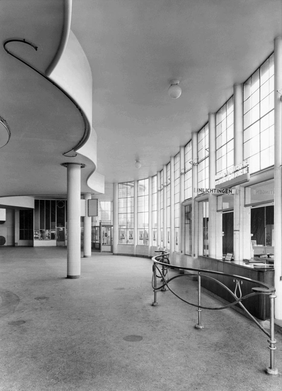
Interior
The curves of the facade were continued inside. The station hall was optically enlarged by revealing the undulating stucco wall of the superstructure in the higher glass annex. The ticket desks, information office, restaurant and kiosks also had rounded walls of light tiles, white plaster or glass. The curves contributed to a smooth and natural walking route.
Ornaments meet the spiritual need to give our environment a more natural shape, to resolve and display scale… Sometimes the function of ornaments is very concrete. Ornamentation on a building can tune it and enable the transition to the cityscape; it dissolves the building.
Mankind has form needs that cannot be explained by reason and that remain unsatisfied by too puritanical and functional architecture. The ban on the ornament pronounced by New Objectivity has been an attempt to disguise its spiritual poverty.
's-Hertogenbosch station
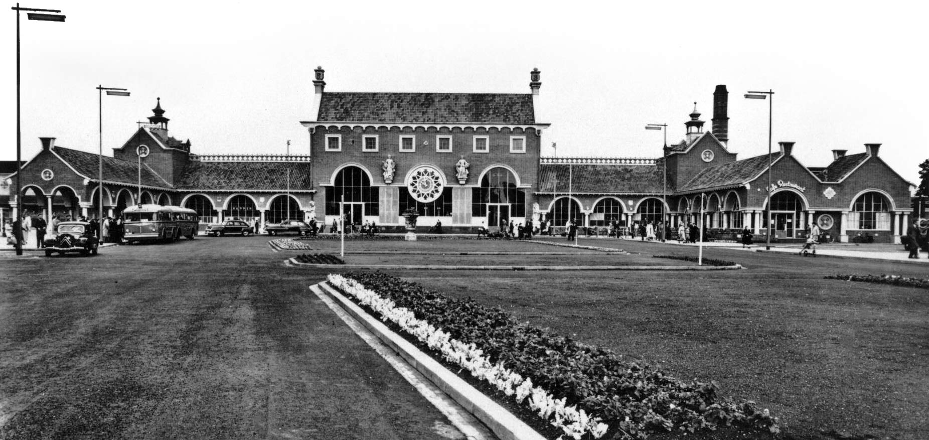
In the years immediately after World War II, Sybold van Ravesteyn worked on the reconstruction of railway stations. At Gouda, Roosendaal and Hook of Holland the damaged buildings were partially renewed; in 's-Hertogenbosch, Vlissingen and Nijmegen the ruined stations were almost entirely replaced. For this Van Ravesteyn combined his neo-baroque style with the brick masonry of the traditionalist Delft School, which was prevalent in the early postwar reconstruction period.
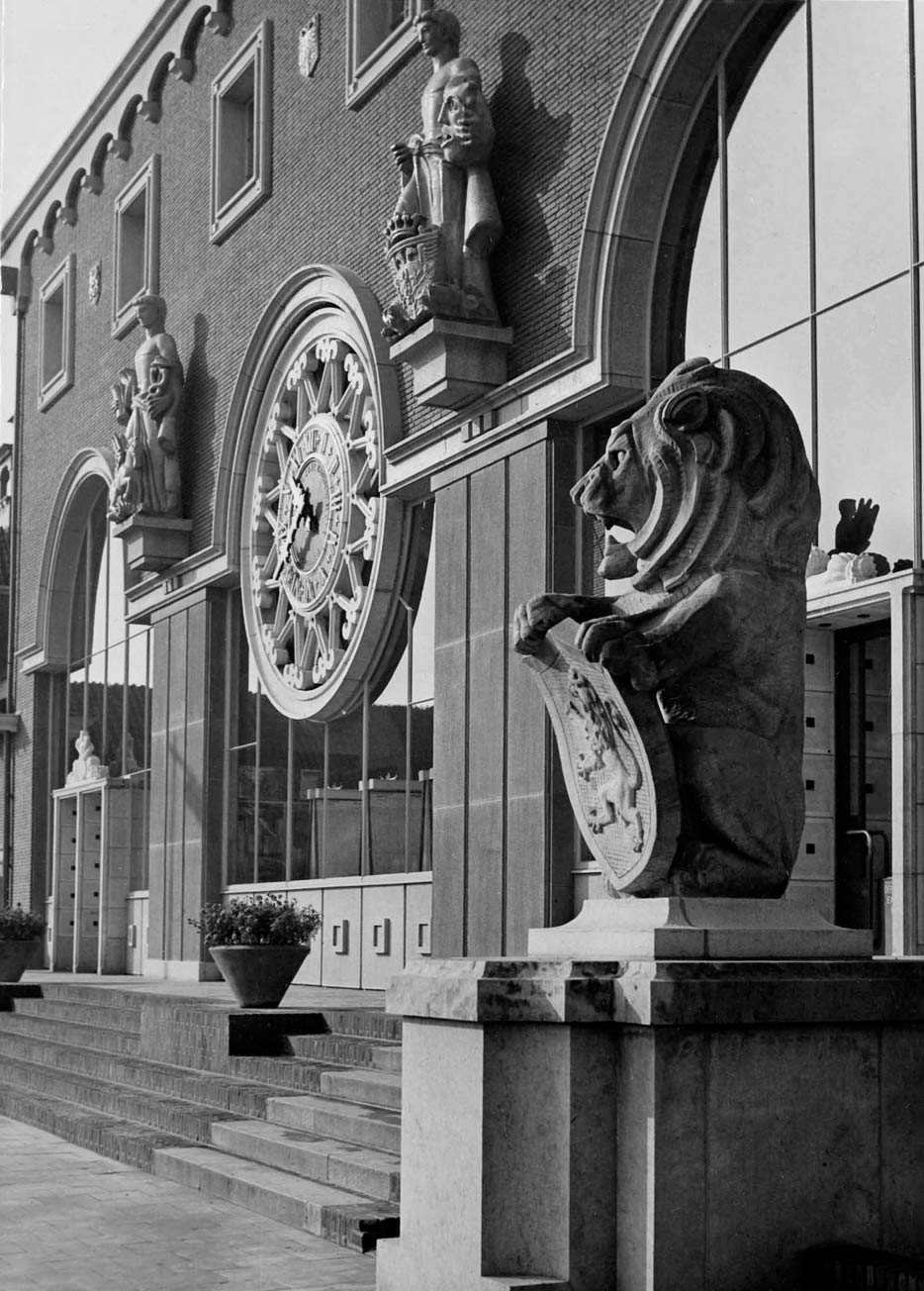
In 1951 Van Ravesteyn provided the new 's-Hertogenbosch station with a 85 meter wide front as an urban termination of the road from the city center. The station consisted of a central hall, two side wings and two perpendicular wings that 'embraced' the station square. Both in the monumental concourse and on the outside Romanesque colonnades were used. The building was adorned with lion sculptures, heraldic statues, rose windows and a large decorated clock.
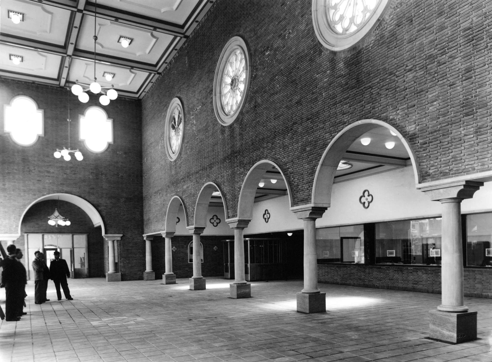
Dayfly
The general public appreciated 's-Hertogenbosch station while experts criticized the lavish ornamentation. Later on, the architect himself called it a "dayfly in my repertoire" and "a bit wild and over the top".
Despite local objections the building was demolished in 1998. The lions were reused in the new station.
Nijmegen station
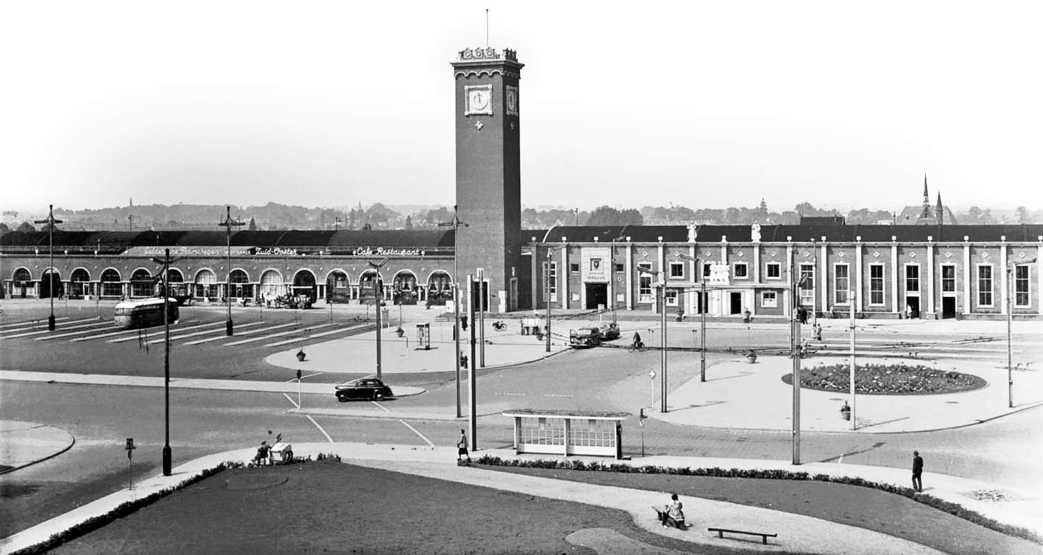
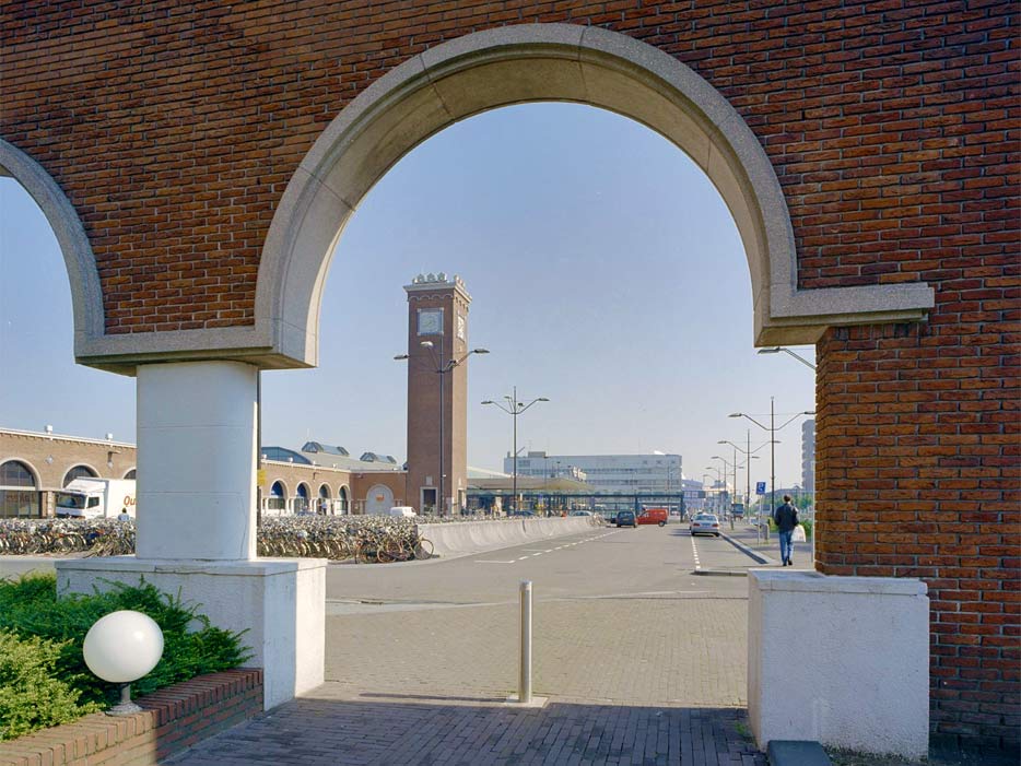
Nijmegen station (1954) has a 180 meter long facade of red brick that serves as a square wall. The architect was inspired by Italian squares. A 30 meter high campanile without a spire separates the bus stops from the actual station square. The tower also divides the higher reception building with limestone pilasters, and the lower part with the station restaurant, featuring round arches.
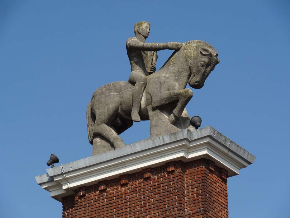
The arches of the left wing are continued on the south side in an open colonnade perpendicular to the building. It serves as a closure of the bus square and hides the station's loading area from sight. On a pylon at the end is an almost classic equestrian statue designed by Jo Uiterwaal.
Statues
Uiterwaal also created the other statues and reliefs at Nijmegen. Three women directly above the entrance were to represent the speed, security, and service of the railways. On the straight horizontal cornice simple ornaments were placed, apart from two statues of Faith and Science marking the entrance. Van Ravesteyn "always felt perfectly clear where ornaments should be placed or not" and according to him Uiterwaal was "gifted with a rare talent for form and composition".
Rotterdam Central Station
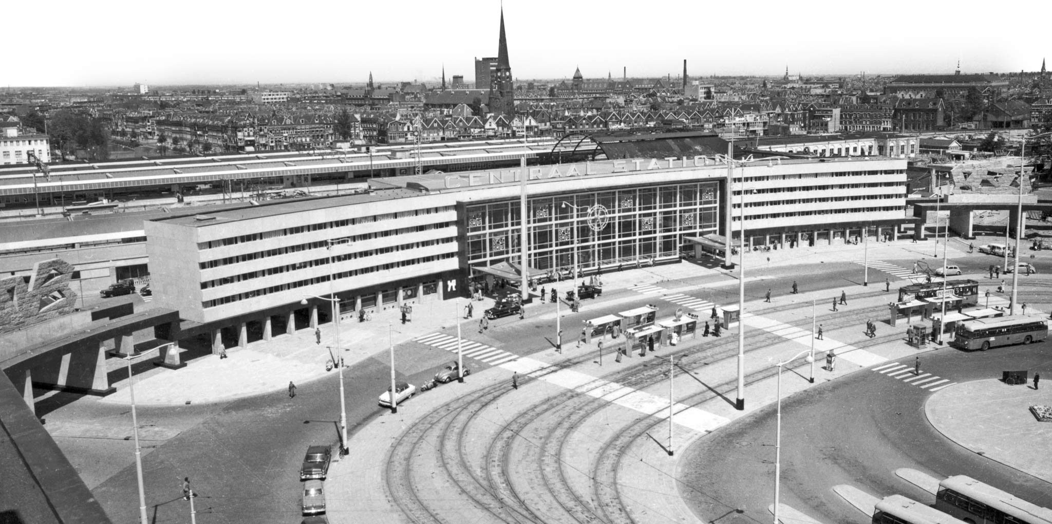
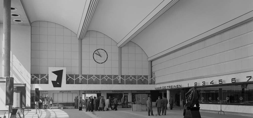
Shortly after the 1940 Rotterdam Blitz, Van Ravesteyn started working on a new central station. For a long time he held on to an 'Italianizing' design in the same style as Nijmegen station. The modernist plans for post-war Rotterdam forced him to change course. This led to a fruitful final stage of his career in which he managed to combine curved forms with functionalism.
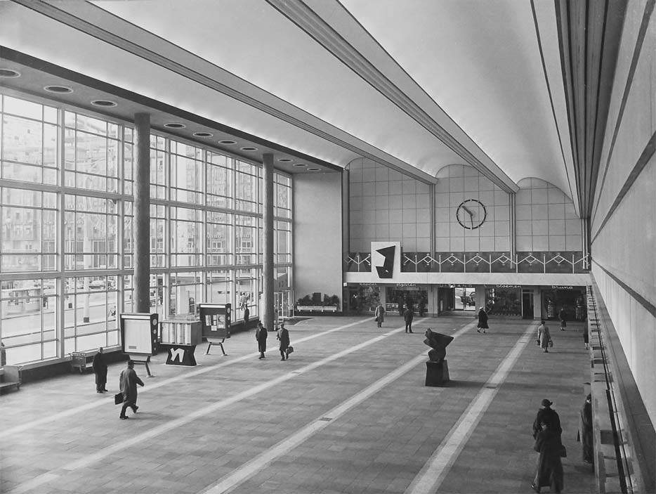
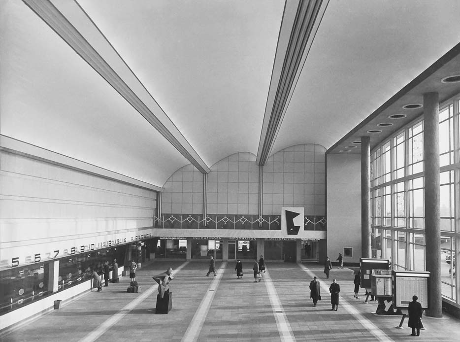
The glass-facaded entrance building — with a large vaulted concourse behind — had curved office wings of white granite on both sides. The budget only allowed for two floors, but two horizontal glass bands on each floor made the offices look higher. The architect had copied this trick from Roma Termini station.
On both ends short colonnades — granite underpasses — made the building look wider than it was. As final chords Van Ravesteyn envisioned sculptures by Henry Moore, whom he visited for this purpose. When this proved too expensive an employee, J.H. Baas, created flat sculptures in the same style. After the building's 2008 demolition these were relocated in the new station.
Canopies
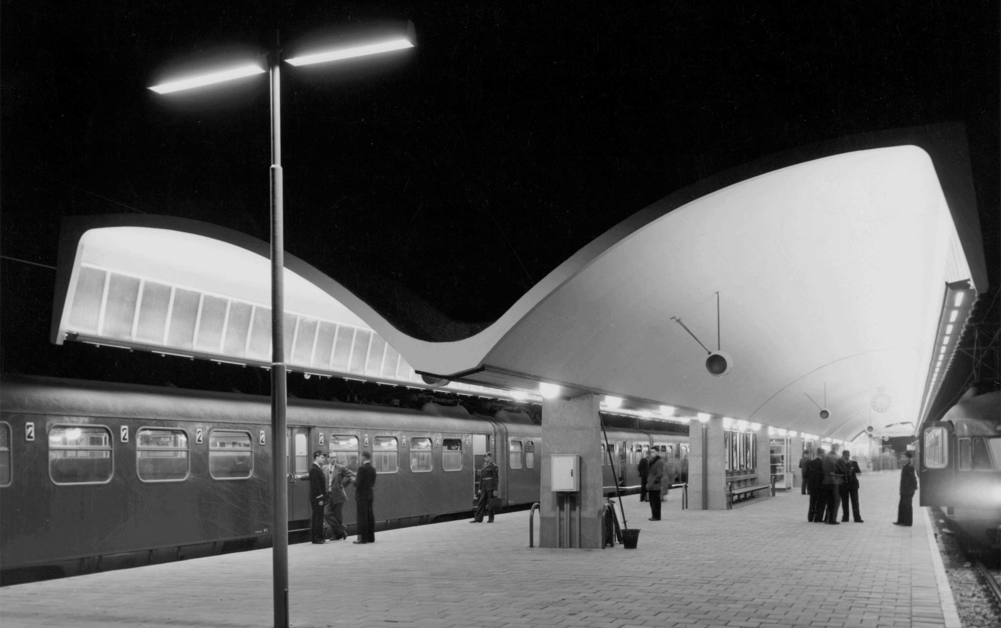
Because the tracks had to remain in use during construction, an overarching roof was not possible. For each of the six platforms Van Ravesteyn designed elegant butterfly-shaped canopies of thin, curved concrete shells.
The canopies were 200 meters long and 12 meters wide. The first platform, which had to connect to the station building, was given a partially inverted butterfly shape like a saw-tooth roof.
Rotterdam Bergweg station
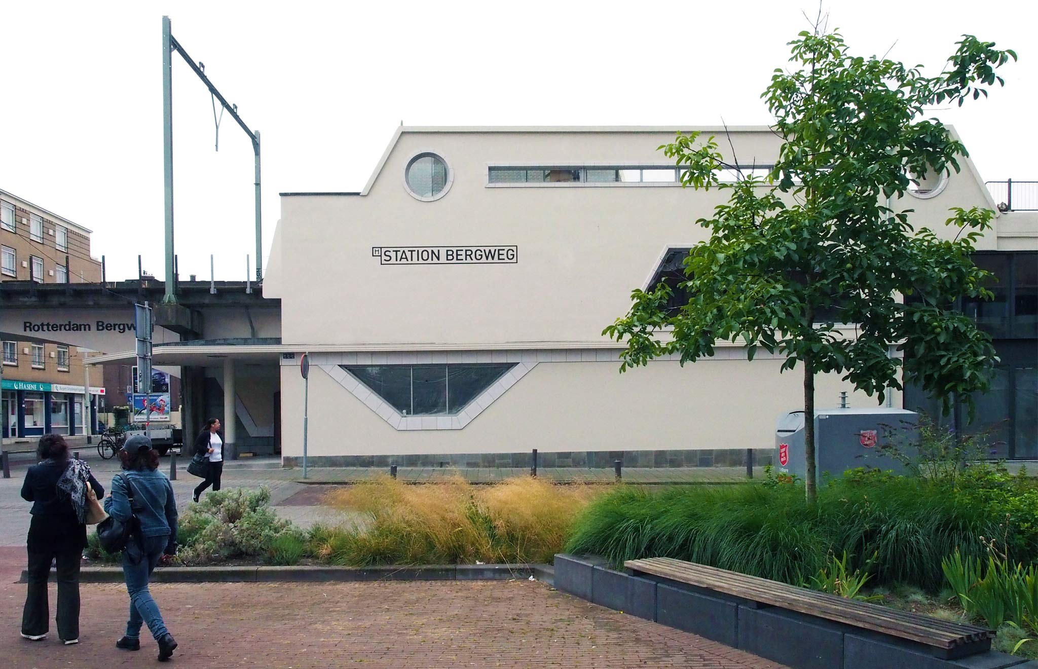
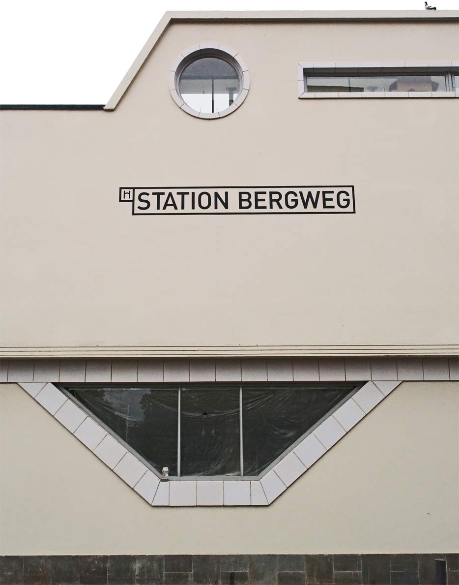
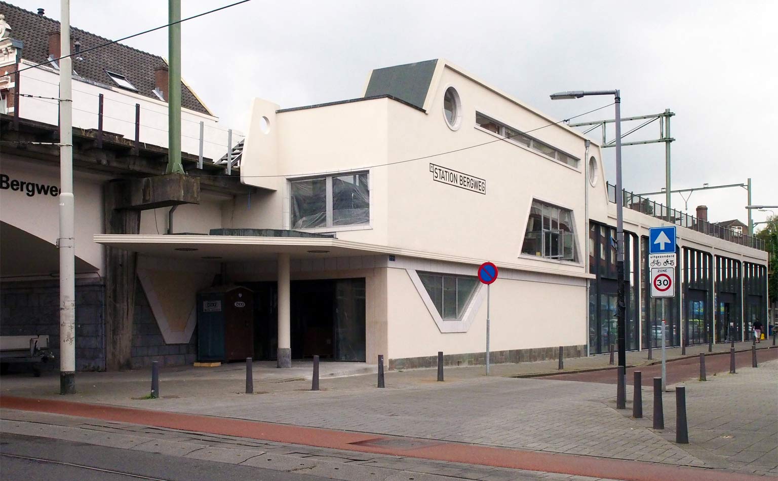
The last station by Sybold van Ravesteyn in 1960 was also one of his most peculiar railway buildings. Rotterdam Bergweg station on the regional Hofplein line is only as small as a subway station. Located on the elevated Hofplein Viaduct and originally closely surrounded by buildings, it had to be high, narrow and long.
The white stucco facade has round, rectangular and trapezial windows, determined by the functions behind such as the ticket offices halfway street and tracks. Its abstract forms — angular lines, but not rectangular — are reminiscent of the Purfina petrol stations and the Wageningen and 's-Hertogenbosch bus stations the architect designed in the same period.
Sybold Cafe
The last regular train ran on the Hofplein Viaduct in 2006, followed by the last light rail vehicle in 2010. Since then creative new uses have been sought for the viaduct and the vaulted spaces inside.
After years of disuse the Bergweg station was recently restored in a particularly beautiful way. Rumors suggest that it might soon house a cafe called Sybold after the architect's first name.
