Pictorial railway maps
Mid-century maps telling stories
 Nederlandse versie
In the mid-20th century pictorial maps in cartoonish styles were a popular way of promoting travel and tourism. In contrast to objective, realistic maps they appeal to emotions such as romance, fantasy and humor. They are used to tell anecdotes about a region's history, culture and landscape in a way attractive to old and young. These illustrated maps are meant to inspire, not to provide travel information.
Pictorial maps or Bildkarten seem to be the opposite of the schematic metro-like maps of railway networks from the same period, composed of straight lines and without any details. Schematic and pictorial maps share one thing though: they are only loosely bound to geographic reality. Their common goal is to convey a message — either the straightforwardness of a journey or the attractiveness of a region.
Early examples
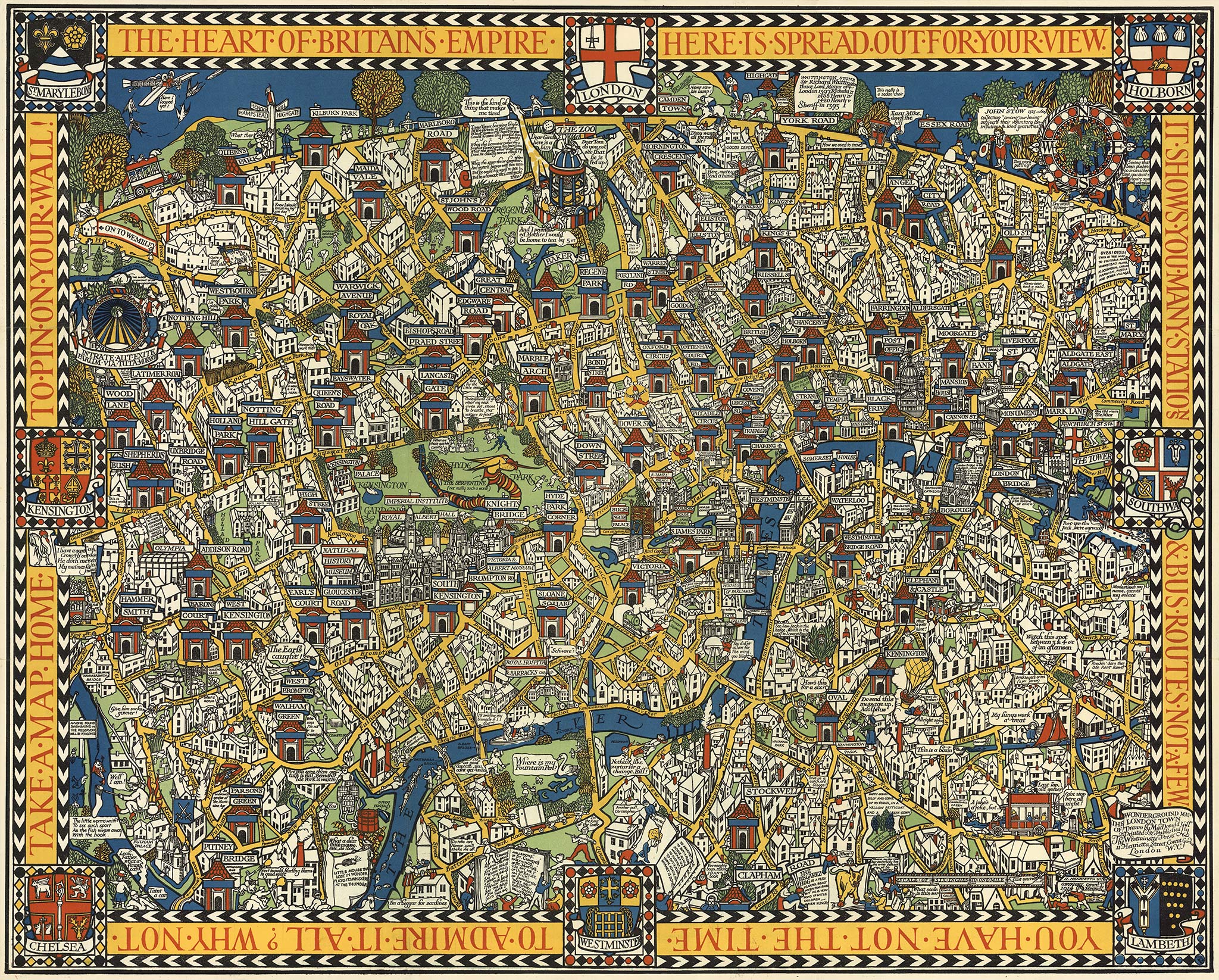
Illustrated maps are as old as cartography. Medieval maps were full of sea monsters and 17th-century city plans featured illustrations of buildings. In the 19th century, however, maps became scientific: more precise but also quite boring. Consequently, 20th-century pictorial maps were created by artists, illustrators and advertising designers. Very influential was the Wonderground Map that MacDonald Gill designed for the London Underground from 1914 onwards. It had a medieval atmosphere and the designer managed to match fantasy with accuracy.
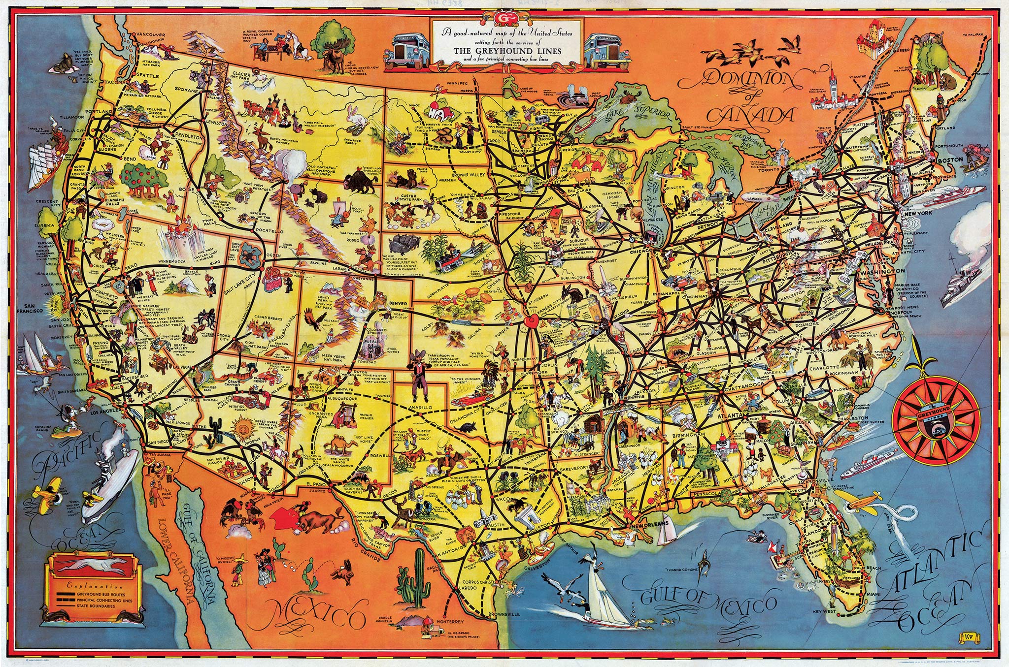
The pictorial map developed into a popular advertising medium in the United States. After 1925 cheerful and colorful maps promoted American cities, states, amusement parks and air lines. It was the golden age of pictorial maps, with highlights such as the 1933 Greyhound bus network map. Its conversational tone was not only evident from the illustrations, but also from captions like Thar's room in Texas for all of Yurrup and half of Africa, yes suh. In Europe, pictorial maps only really set foot after 1945, along with the popular culture of the liberators, although pre-war examples do exist.
The mechanisation of cartography that started in the 19th century and aimed at absolute objectivity had perforce to drop the easy 'conversational' tone of the old maps and became 'official' in the double sense of the term. Probably this was the reason why countries, industries and enterprises, abandoning the objective type of maps for their publicly purposes, turned once again to the pictorial map.
Pictorial cartography draws upon experiences accumulated throughout the lapse of centuries, if with entirely different aims; for its purpose is not to educate or instruct. Rather does it replace dry statistics and intricate lines with pictorial data, and by a skilful form of presentation induces people to 'read' the map again. The love of story-telling is common to all these maps.
United Kingdom
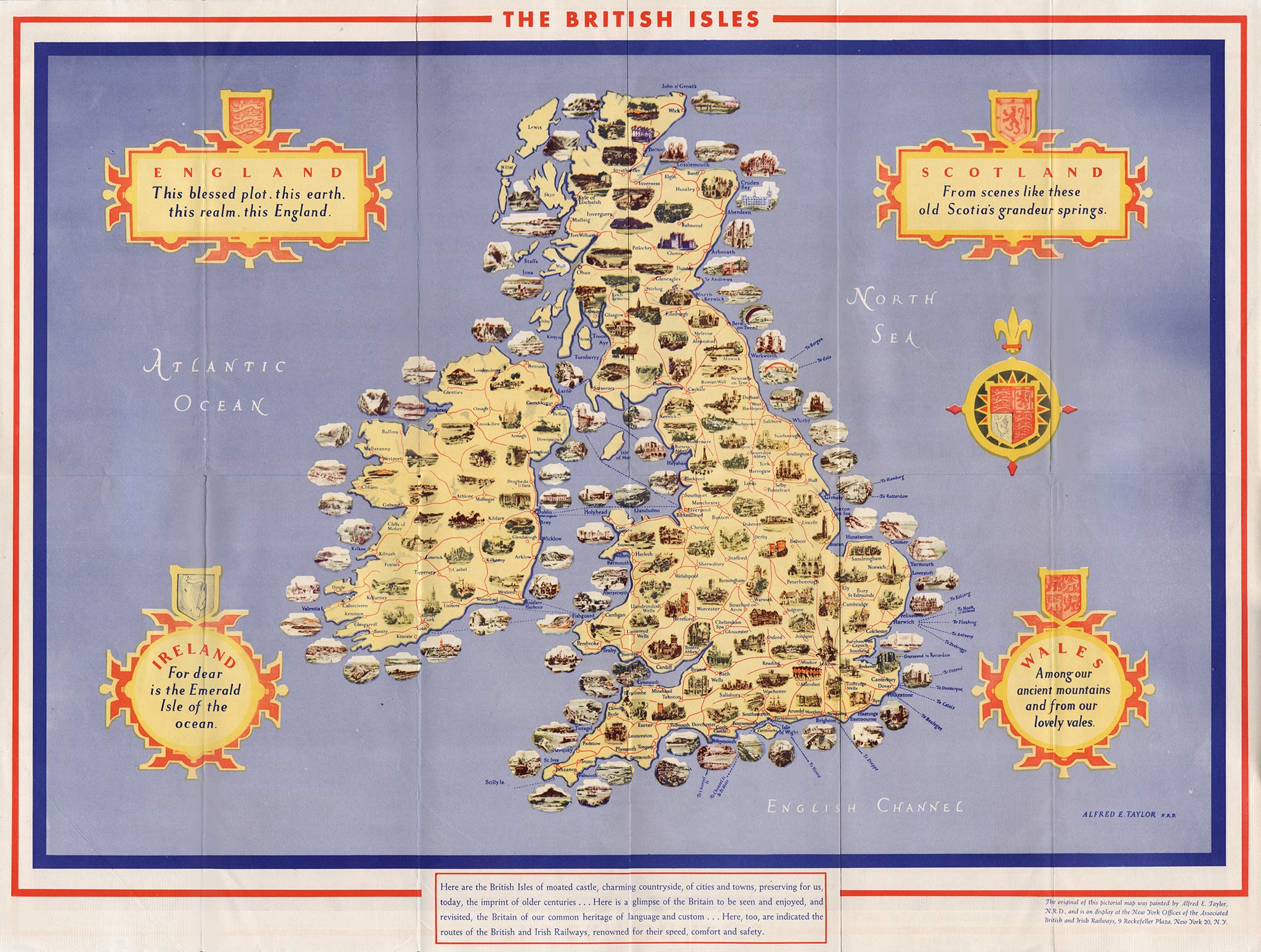
Pioneer mapmaker MacDonald Gill worked for the London Underground and British shipping and airline companies, but not for the railways. A pre-war example of a pictorial railway map is from Alfred E. Taylor for the joint British and Irish railway companies. The map had an American target audience and was a reduced version of the illuminated mural Taylor created for the 1939 New York World's Fair. It had 190 thumbnail illustrations of places of interest and was later transferred to the British railways' Rockefeller Plaza office.

In the years following the formation of British Railways in 1948, many posters appeared with pictorial maps of counties such as Yorkshire and Devon, or the countries of Scotland and Wales. Their style was mostly classic, combined with light historical captions, such as with the Pocklington church tower: had a 'flying man' in 1733.
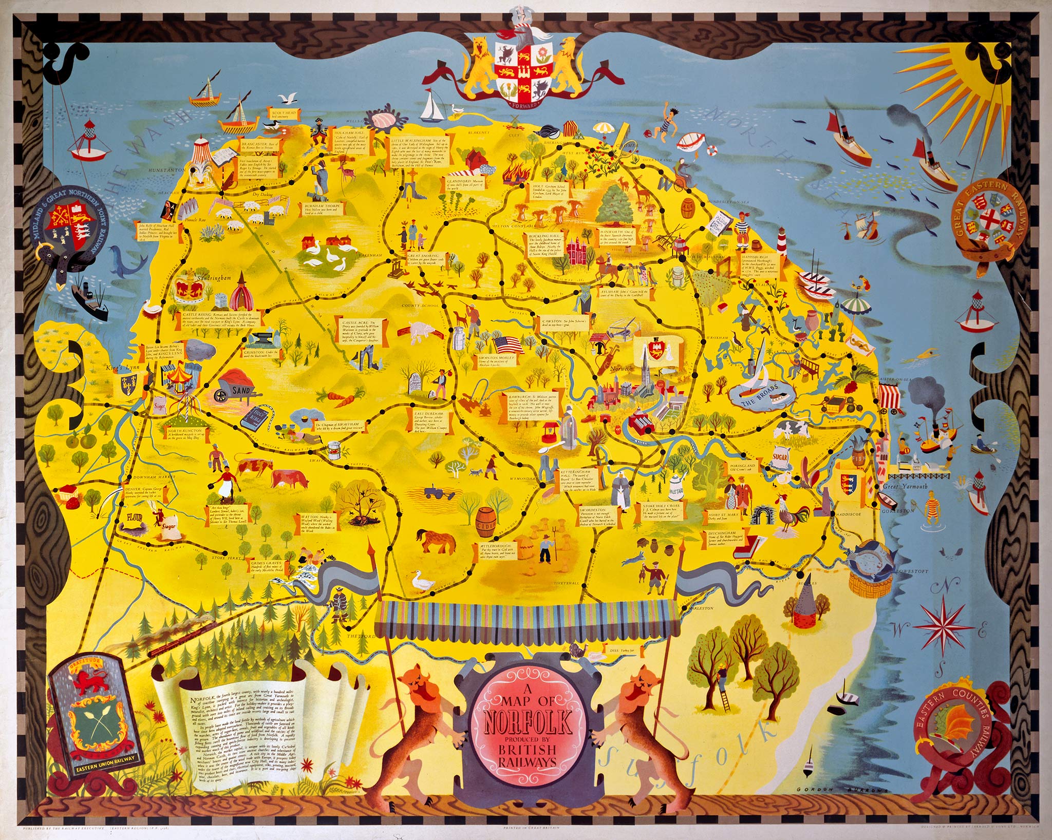
A 1955 pictorial map of Norfolk was striking in style and colors. It was created by art director Gordon Burrows, who succeeded in combining an historical atmosphere with a contemporary design and the joyfulness of children's drawings.
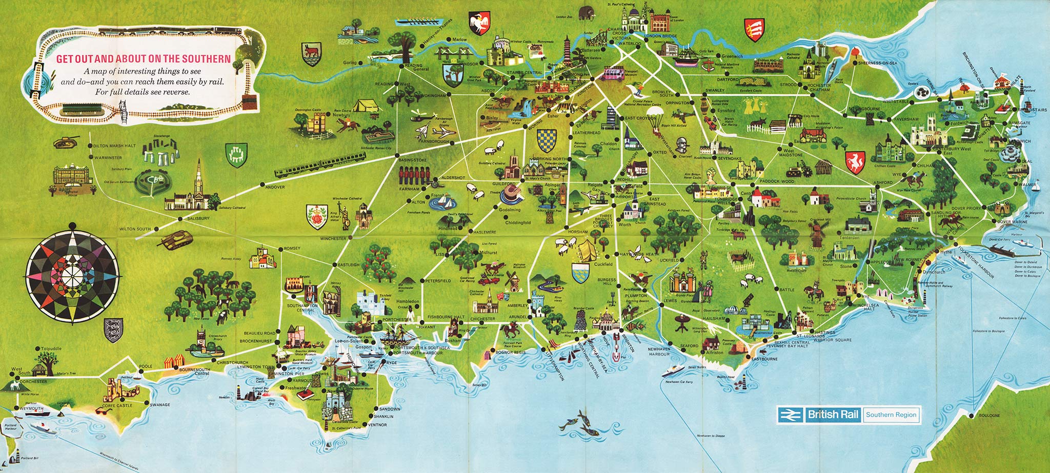
Southern
A foldable map of Southern England from 1966 shows that pictorial maps also fitted well with the new modernist British Rail corporate style
A very recognizable detail is Stonehenge, just below the cartouche with the motto Get out and about on the Southern. The designer is unknown.
France
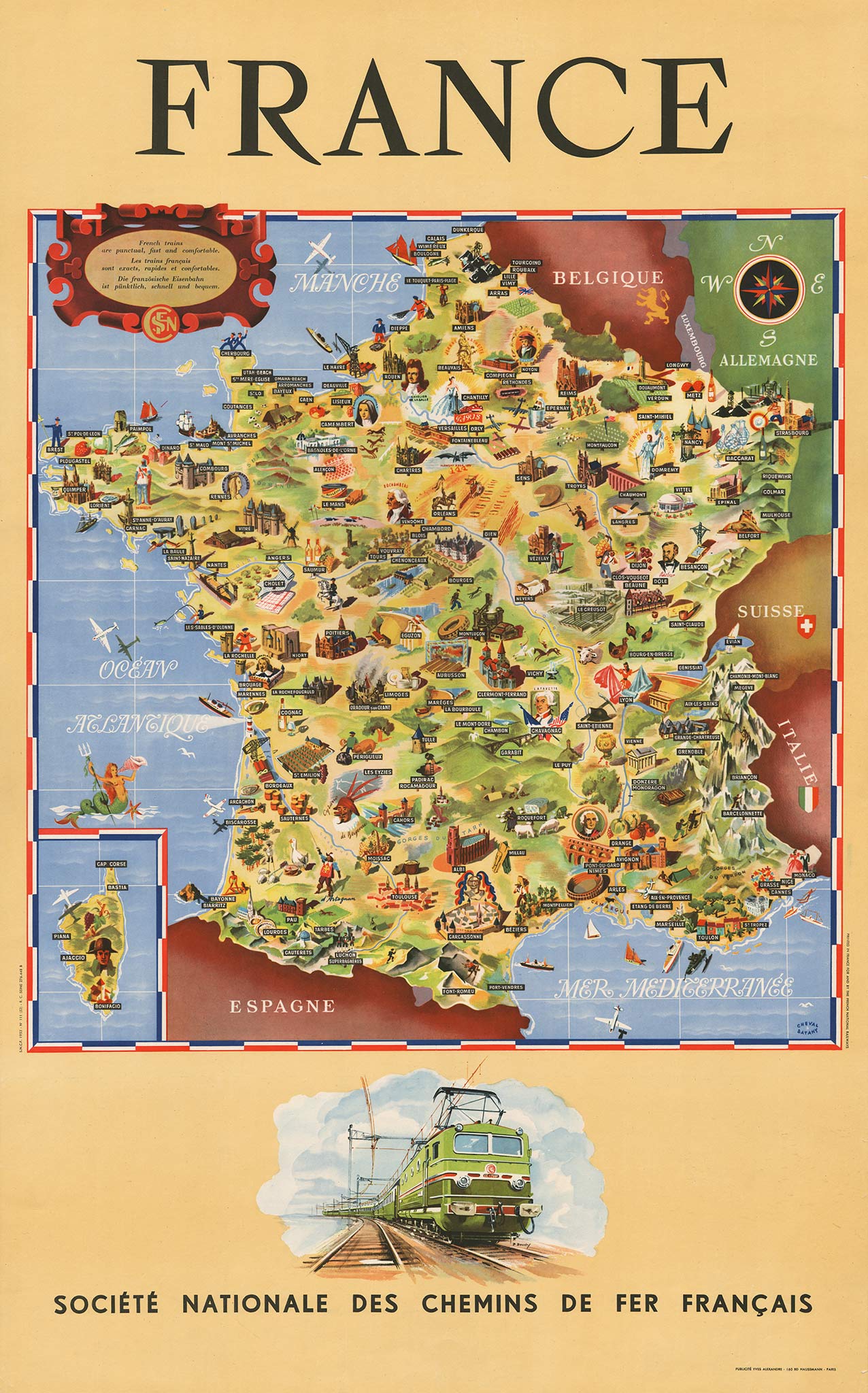
In 1951 the French Railways (SNCF) released a poster with a pictorial map of France that had no railway lines at all! Its goal was clearly not to plan routes but to encourage travel. An American aptly described the crowded but fairytale map: Once upon a time there was a castle. Its picture was sketched upon a large poster map — along with pictures of other castles, knights, cathedrals, bathing beauties, factories, and even a mermaid. This was written in The Rotarian magazine when it featured the image in 1953 because of a Rotary convention in Paris.
The pictorial map was created by Cheval-Batany, the designer duo Jean Cheval and Alex Batany. Although the result was nice, the map was not as refined as the illustrated planospheres by Lucien Boucher for Air France from the same period. The Cheval-Batany map actually dated from 1947, first printed on a poster along with several color photographs. Because this distracted from the detailed map it was re-released a few years later, at that time combined with an image of the electric CC 7001 locomotive by P. Bouvry.
Switzerland

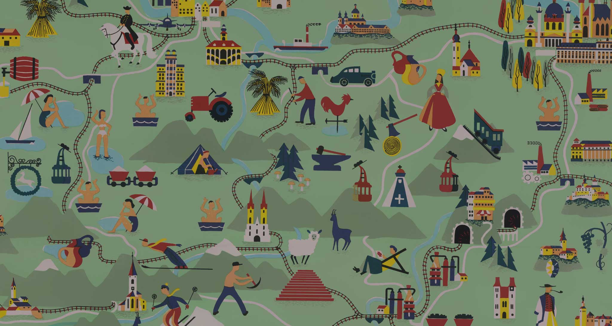
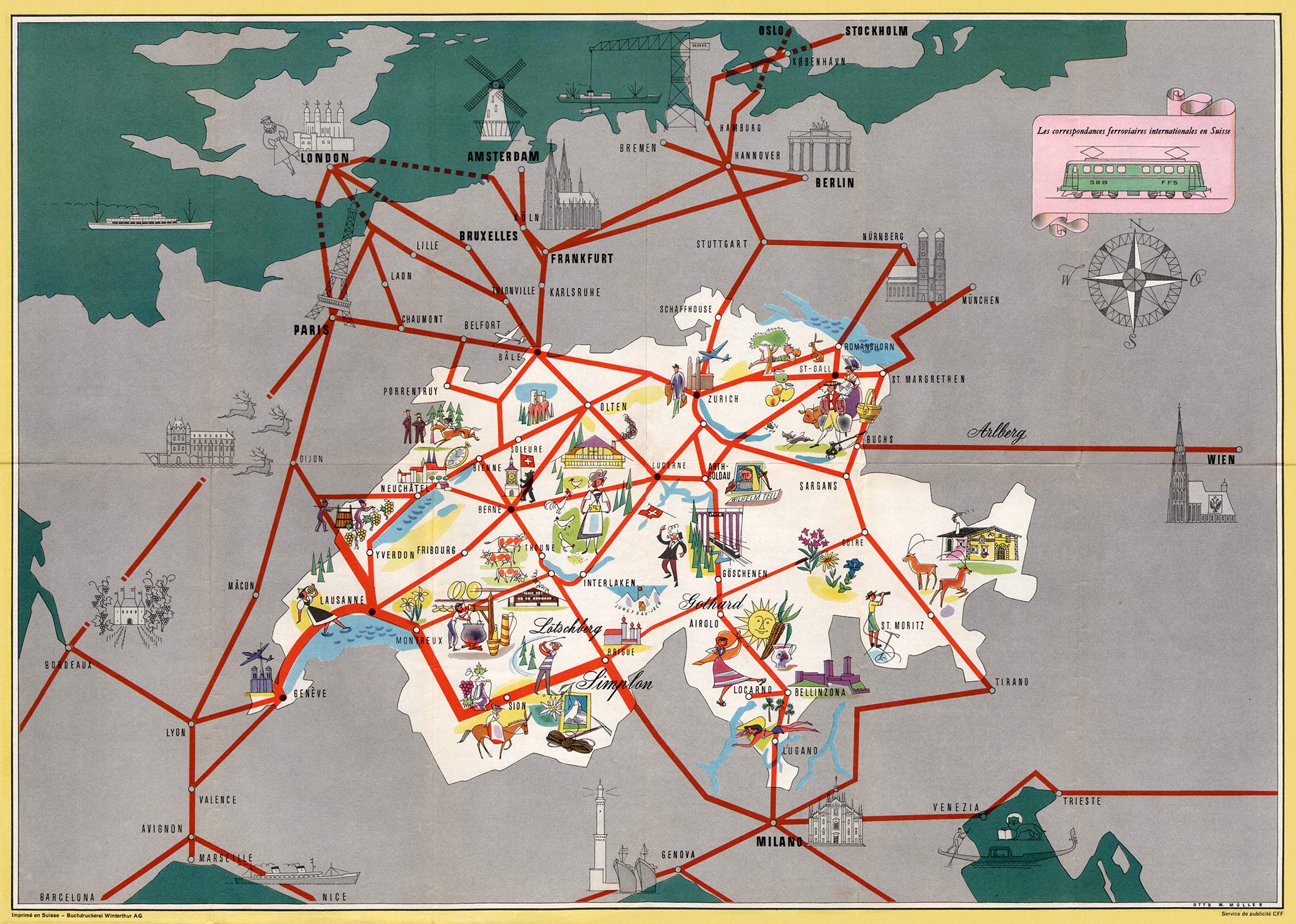
A great pictorial railway map from 1939 is titled Exploring Switzerland in English (one of the map's four languages). It was published by the Schweizerische Verkehrszentrale, the Swiss Tourism board.
The 1.16 meter-wide map is very detailed. Every Swiss village is pictured and all railways, as well as the larger stations. Between mountains, lakes, villages and cities are historic and folkloristic figures that are proportionately too large.
Remarkably enough the map is facing south instead of north; what looks like Lake Geneva at first glance is in fact Lake Constance. To avoid confusion a large compass is centered on the map. The unusual orientation can probably best be explained as a surprise effect.
The map was designed by Otto M. Müller (1913-2002), under supervision of cartography professor Eduard Imhof. Müller specialized in pictorial maps; he later created a Cheese map of Switzerland, for example.
International connections
In 1956 the Swiss Federal Railways (SBB) issued a pictorial map of international connections. Again, it was designed by Otto Müller, although his style of drawing had clearly developed. Foreign cities and regions were illustrated in black and white, while landmarks in Switzerland had colored images. The creator did not try to avoid clichés such as the Eiffel tower for Paris.
Austria
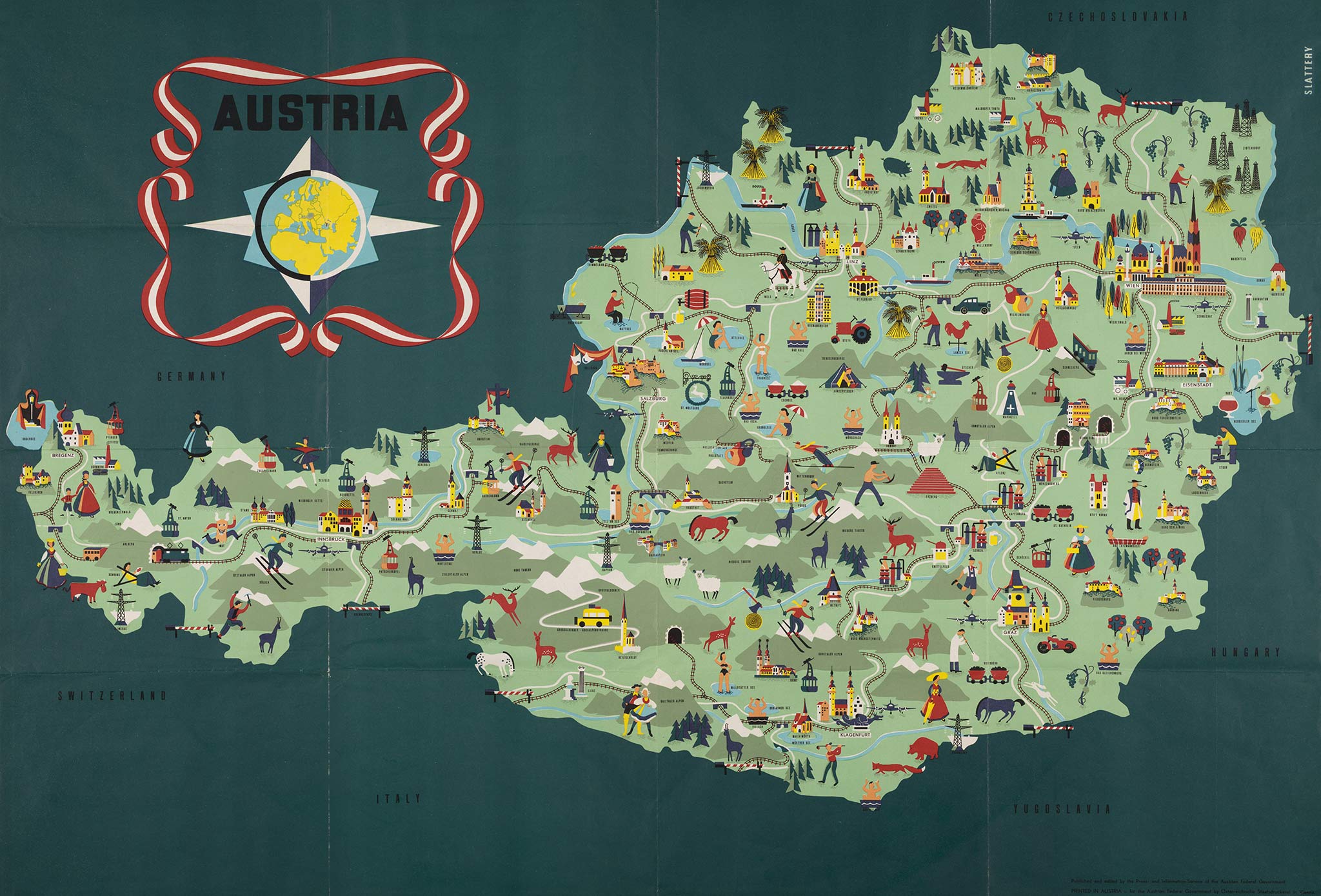
A large pictorial map to promote tourism in Austria was issued in 1952. Railway lines were also depicted — including their sleepers. At the time Austria was still divided into Allied occupation zones; the English-language map was probably partly intended for the British and American military. With the Marshall Plan the United States also contributed to the recovery of tourism in Austria.
Unlike other pictorial maps some illustrations were reused as a kind of icons. The same bathing man, for example, was used to indicate all spas. This also applies to skiers, although they were sometimes mirrored for variety. A nice detail is a train running through the Arlburg tunnel, with both the front and rear end visible. Since the tunnel is 10 kilometers long, this is an example of a — deliberate — lack of realism.
The map was published by the Press- and Information-Service of the Austrian Federal Government and designed by William G. Slattery (1929-). Bill Slattery was born in South Africa and studied at the Akademie für angewandte Kunst in Vienna in 1952-53.
After working as an art director in Zurich for several years, Bill Slattery left for the United States, where he would become successful as the creator of posters for Delta Air Lines.
Italy
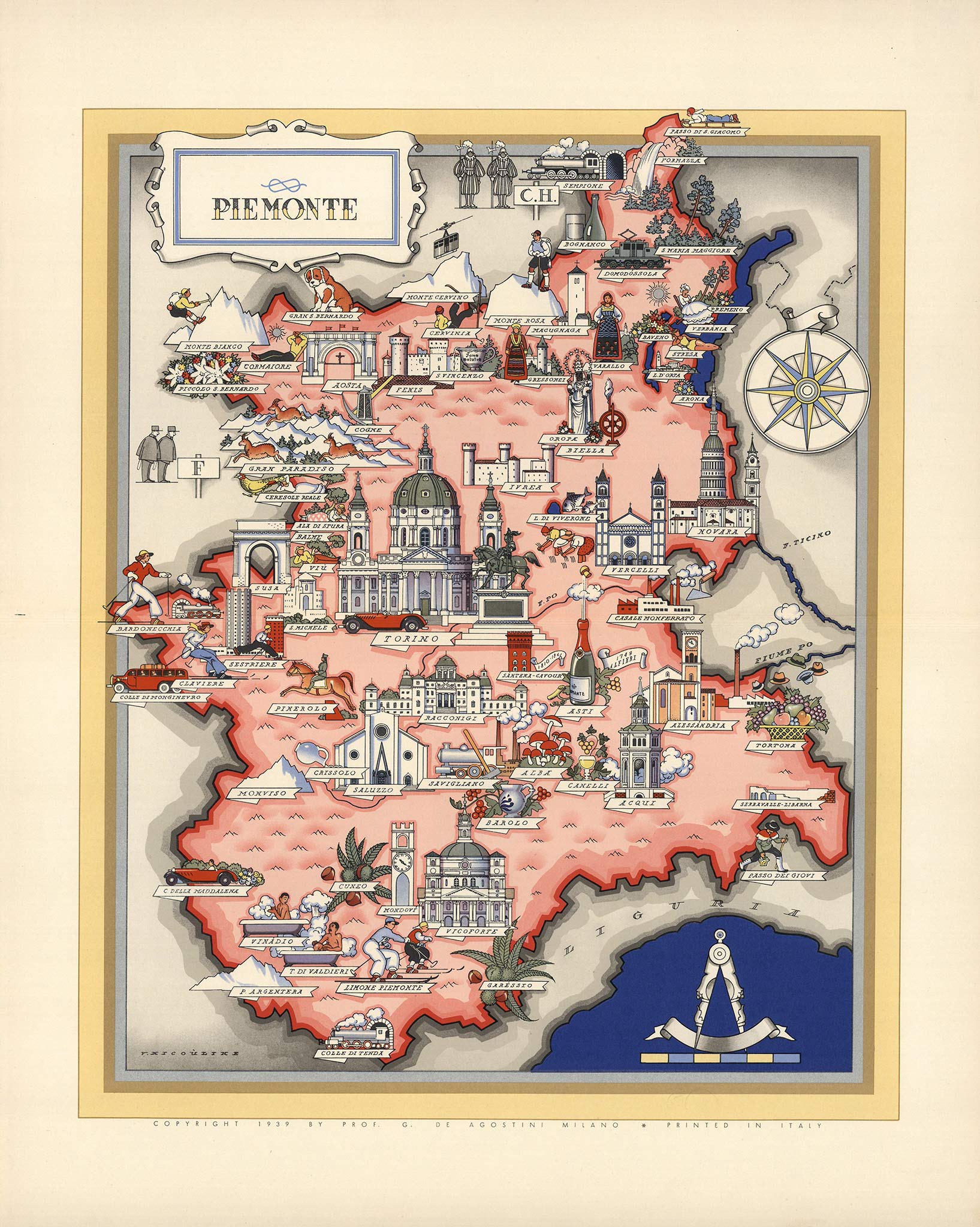
In 1938 the Russian-Italian Vsevolode Nicouline illustrated an 'artistic atlas' of Italy for prominent geographer and publisher Giovani De Agostini. Beautiful maps of the country's 21 regions feature monuments, folkore, industry and gastronomy. Railway lines are missing but railways are present in some ways. In Piemonte, for example, several railway tunnels with steam locomotives are depicted, as well as an electric locomotive at Domodossola. The railway from Switzerland through the Simplon tunnel was electrified up to this town.
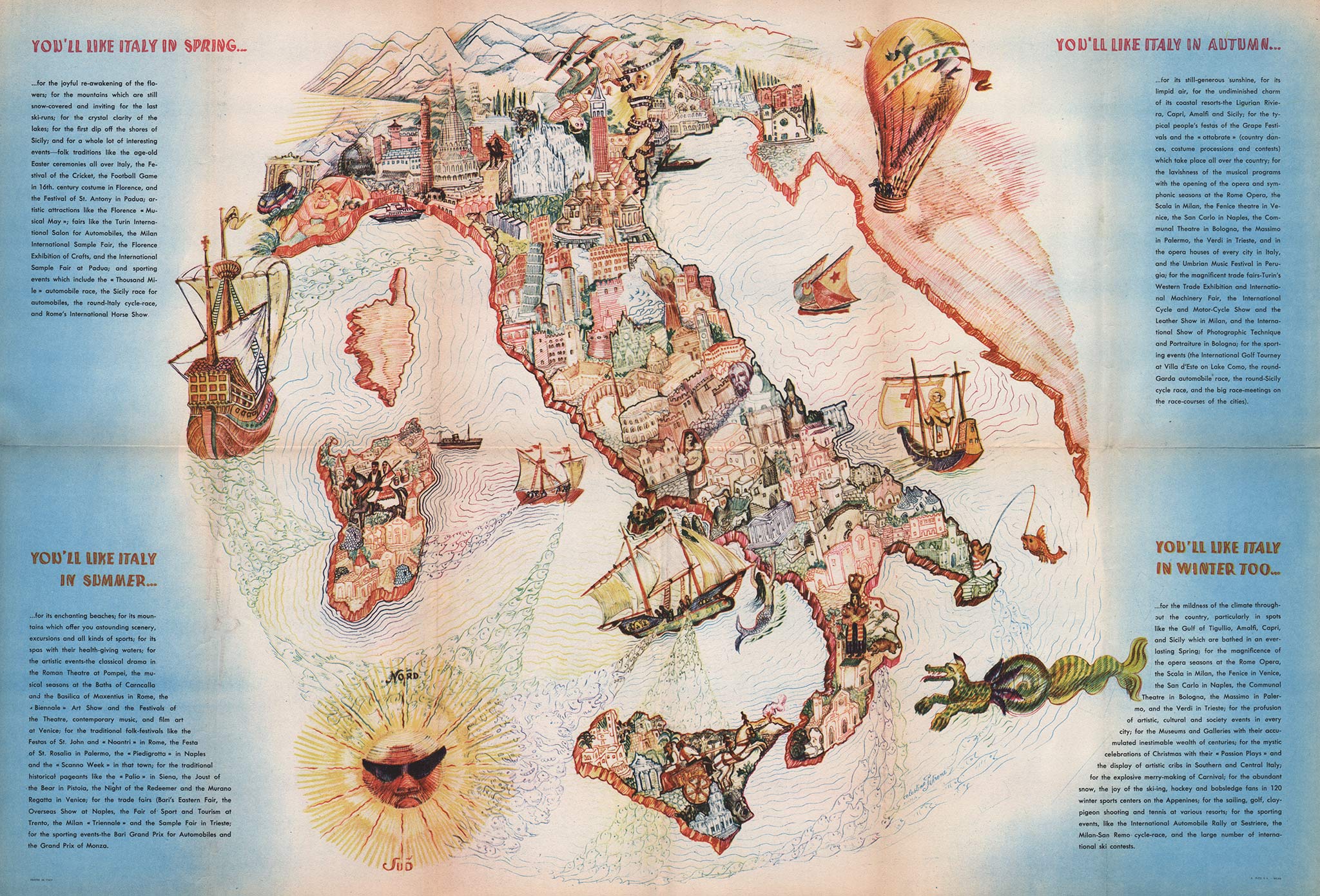
Perhaps the most beautiful pictorial map of Italy was published around 1950 in a tourist brochure titled Italy… four seasons of sunshine. The artful map was designed by Celestino Petrone (1904-1985), best known for his sculptures. The drawing uses a Mediterranean color palette and has no text labels: both the contours of Italy and the cities are recognizable enough.
In addition to classic ships, monsters and mermaids in the sea, modern modes of transport are also present, including a touring coach under the arch of Aosta and a steam engine exiting the Simplon tunnel.
Early in the present century a revival of the pictorial map set in. Countries, cities and health resorts were intent on keeping their travel publicity lively and interesting. Their folders, advertisements and articles were illustrated with maps and bird's-eye views which deliberately appealed to the sense of romance as a means of tempting the prospective traveller.
They were designed to speak for themselves and not to need the backing of textual matter. The variety of the expressive media at the artist's disposal prevents the pictorial map from becoming monotonous. It is contrived to satisfy the disere of the modern reader for quick and pithy information.
Germany
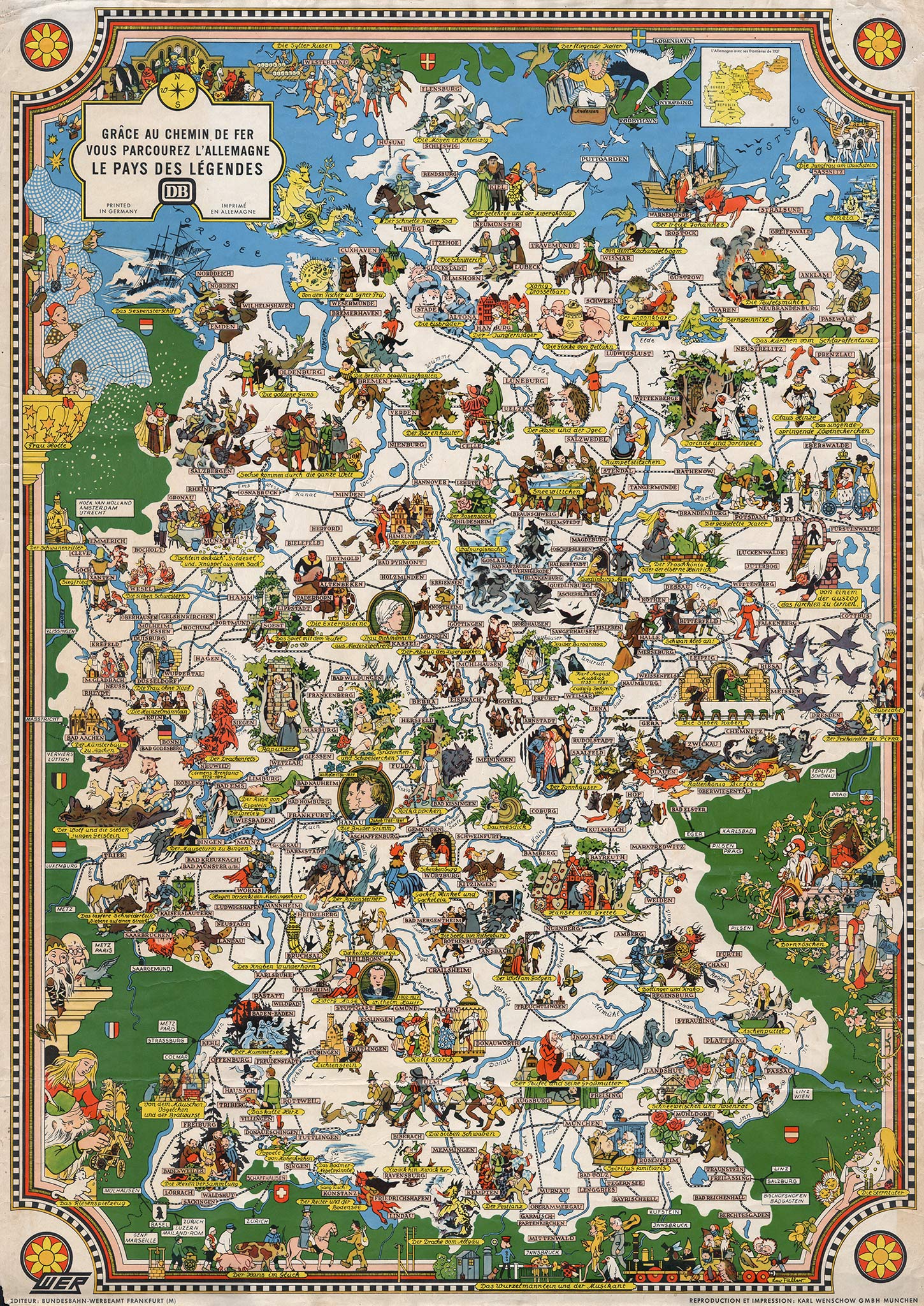

The most important German designer of Bildkarten was Leo Faller (1902-1969). He was a painter of landscapes, portraits and still lifes and also created murals in the Anhalter Bahnhof of Berlin. Faller designed many pictorial maps for the WER, the Werbeamt (advertising agency) of the Reichsbahn, later part of the Deutsche Bundesbahn (DB).
In the late 1930s a series of brochures was issued with fold-out illustrated maps of the Rhine valley, the Black Forest and Lake Constance, for example. In 1938 Faller created Die schöne Eisenbahnreise (The beautiful railway journey), a foldable map along with an illustrated booklet of the same title. The nice map shows the extent of Germany before World War II, including parts of Poland and the Baltic states as well as the Sudetenland that was just annexed by Hitler.
After the war Leo Faller designed several railway posters with thematic maps for the Bundesbahn, such as a gastronomic map of Germany and Ins Märchenland, a map of fairy tales and legends, including the Pied Piper of Hamelin. In 1955 he also created a snow-topped fold-out map of the German winter sports areas.
The Netherlands

In 1954 the Dutch Railways (NS) published a fold-out map with the title Railways in Holland (in four languages). One side had black-and-white photos with captions like 'Beautiful bridges span the rivers and canals so plentiful in Holland'. The pictorial map on the other side was created by Jan Rodrigo (1921-2013). He was an illustrator and painter of city views, landscapes and travel impressions. In the 1950s Rodrigo was employed as an advertising artist at the Propaganda Department of the Dutch Railways.
The map is adorned with buildings, costumes, agriculture and industry, supplemented with some fantasy figures like mermaids. Several trains run on the red railway lines: a freight train with a Class 1200 locomotive, a Blue Angel, an electric Mat '46 trainset and a steam train crossing the German border, probably the Rheingold Express. The new Eindhoven station is also visible, with a light bulb to mark the Philips headquarters, as well as the newly reclaimed Eastern Flevoland polder in the former Zuiderzee.